
Some kitchens shout in black and white. A soft contrast kitchen speaks in a lower voice. This is our complete guide to the gentle mix of light and deep tones, warm metals, and honest materials that makes a kitchen feel calm, collected, and quietly confident.
The Kitchen That Breathes
Soft contrast is the space between all white and full drama. It is the kitchen with creamy upper cabinets and deeper lowers in warm greige. The island in soft charcoal. Brass pulls that catch the morning sun. Nothing here is stark and nothing is timid. The dark tones ground the room. The light tones lift it. Together they create a rhythm your eye can follow from the doorway to the far wall.
It is a practical beauty too. White kitchens show everything. Dark kitchens can feel heavy by February. Soft contrast splits the difference. The lower cabinets, where splashes and scuffs live, wear a forgiving mid tone. The uppers and walls stay light, so the room never closes in. You get the depth of a moody kitchen and the airiness of a bright one, in the same four walls.
The style suits the way kitchens are actually used. This is the room where homework spreads across the island and coffee gets made half asleep. It needs to feel good at seven in the morning and at seven at night. Harsh black and white can feel severe under tired eyes. Soft contrast stays gentle. The tones are close enough to feel related, different enough to feel designed.
Start with the bones and let the contrast do the decorating. When the cabinetry already carries the design, you need less stuff on the counters and fewer decisions everywhere else. A wooden bowl of lemons. A folded linen towel. That is styling enough, because the room is already speaking.
This guide is one of our design guides, and we wrote it for the room that works hardest in your home. More design guides are on the way, each one built the same way. Slowly, carefully, and meant to last. If you are dreaming in farmhouse tones too, our light and airy spring farmhouse kitchen ideas are a lovely companion read.
Contrast should feel like morning light through a window, not a line drawn in the sand.
The Key Elements of a Soft Contrast Kitchen
1. Two Tone Cabinetry
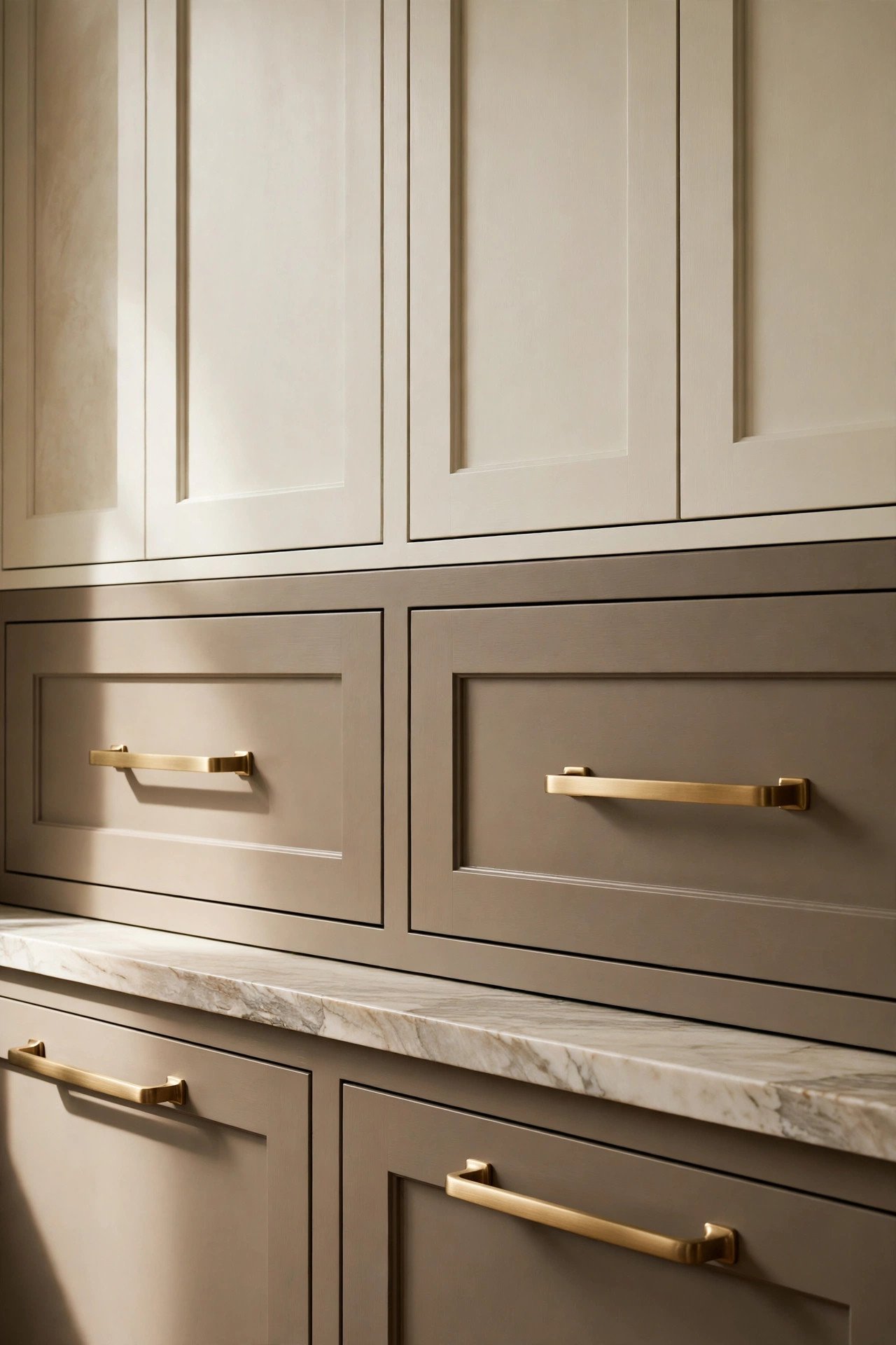
The signature move is simple. Light on top, deep below. Creamy white or warm white uppers keep the eye lifted and the room bright. Lower cabinets in warm greige, soft charcoal, or deep espresso bring weight to the base of the room, exactly where a kitchen needs it.
Keep the two tones in the same family and the contrast stays soft. A warm white pairs with a warm greige. A cool white wants a cooler slate. When undertones match, the combination feels intentional instead of accidental. This is the detail that separates a designed kitchen from a kitchen with two random paint colors.
Use the same door style on both tones. Shaker fronts are the classic choice, but a simple slab works beautifully in a more modern space. The shared shape is what makes the two colors read as one kitchen. Change the hardware finish between them and the unity breaks, so keep every pull and knob in the same metal.
Let the island be the third note if you want one. A charcoal island between cream uppers and greige lowers adds depth without noise. It becomes the piece the eye lands on, which is exactly what an island should do.
2. Honed Stone Countertops
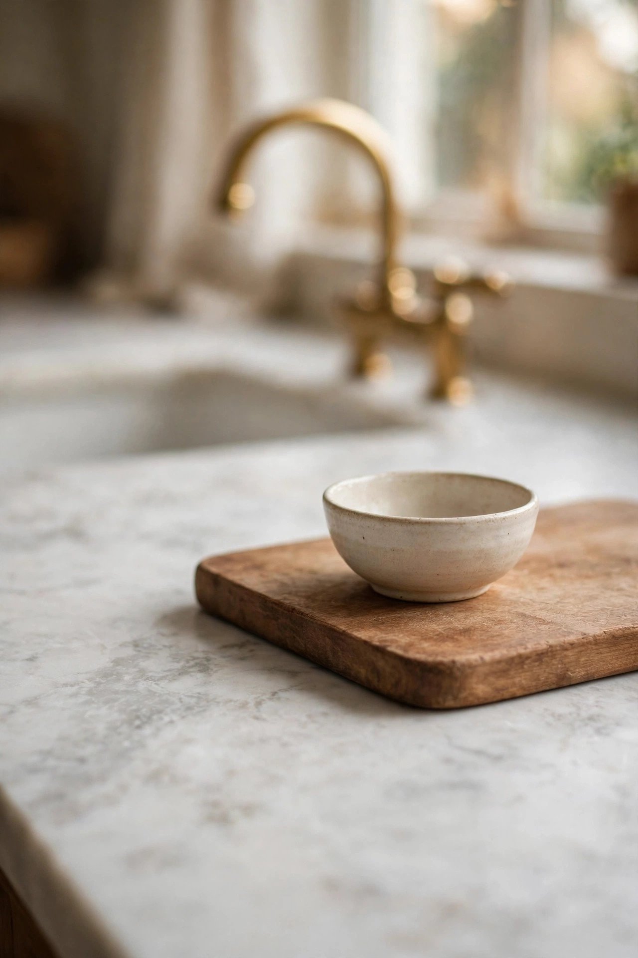
Honed stone is the quiet luxury of this kitchen. Marble, quartzite, or soapstone with a matte finish absorbs light instead of throwing it back at you. That softness matters in a room built on gentle contrast. A polished counter would shout over the cabinetry. A honed one hums along underneath it.
Choose veining that whispers. Soft grey movement in a white marble. Warm beige clouds in a quartzite. The stone should connect the light uppers to the deep lowers, with threads of both tones running through it. Hold the sample against both cabinet colors in your own light before you commit.
Seal it and stop worrying. Yes, marble marks. A honed finish hides a multitude of small sins, and the patina it develops is part of the charm. If the thought of a lemon ring keeps you up at night, quartzite gives you the look with a calmer temperament.
Run the stone up the wall behind the range for a full height slab moment. It is the one splurge that reads as architecture rather than decoration, and it ties the whole contrast story together in a single gesture.
3. Warm Brass Hardware
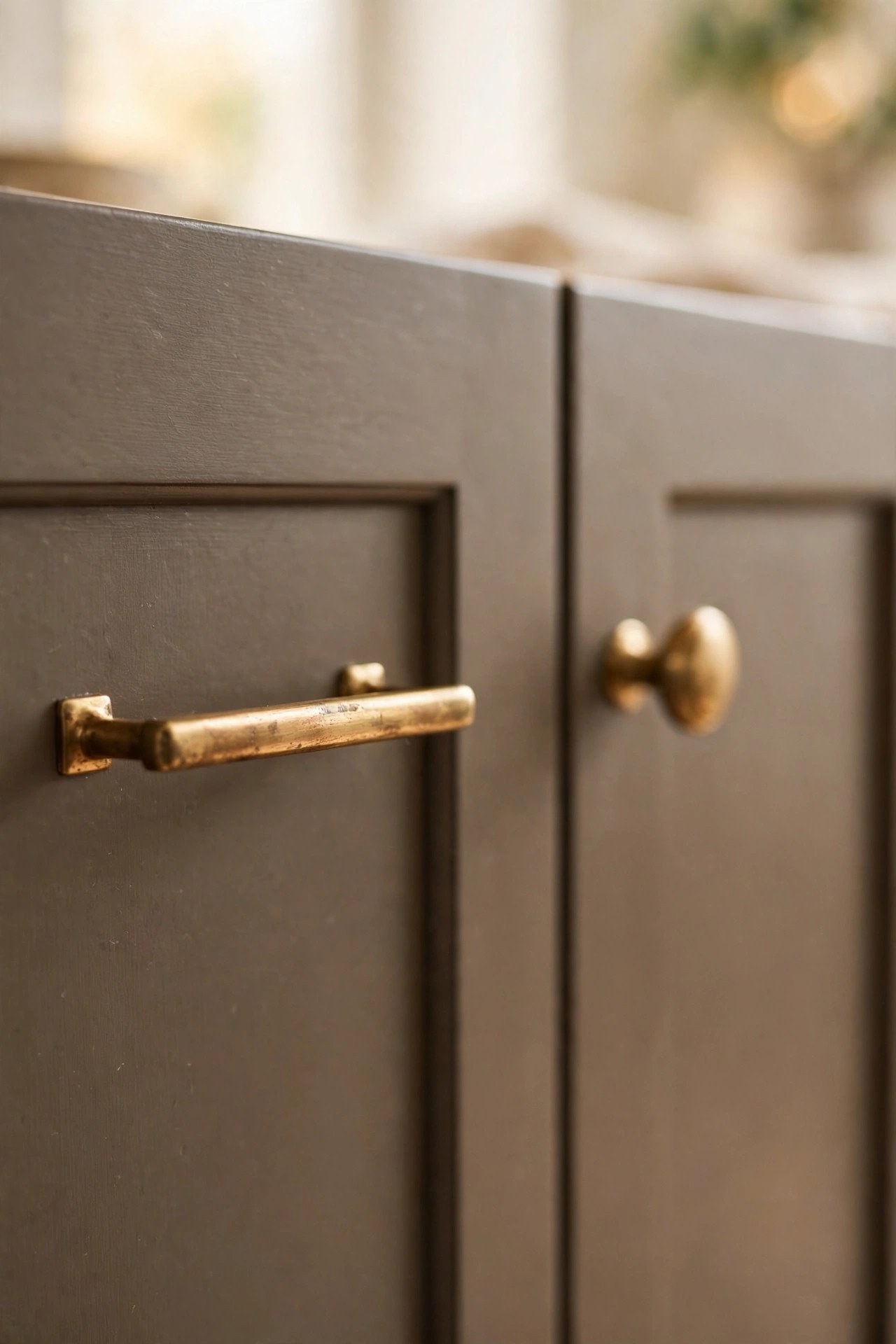
Hardware is the jewelry of the kitchen, and in a soft contrast kitchen it should glow. Unlacquered brass, aged bronze, or warm champagne bronze all bring the heat that painted cabinetry needs. Against cream and greige, brass reads as candlelight. Against charcoal, it reads as embers.
Go bigger than you think. Oversized bar pulls on drawers and proper knobs on doors give the kitchen a tailored feel. Small hardware disappears on deep toned cabinets, and disappearing is the opposite of the job. The metal is one of your contrast tools, so let it be seen.
Let unlacquered brass age. It will darken at the touch points and stay bright where hands rarely go, and that living finish is the whole point. If you love the aged look from day one, choose an antique brass finish and skip the waiting.
Match the faucet to the hardware family, but do not chase an exact match. Same warmth, slightly different tone, and the room feels collected rather than ordered from a catalog. Our organic modern living room ideas use the same mixed metal thinking to keep neutral rooms from feeling flat.
4. Layered Light in Warm Tones
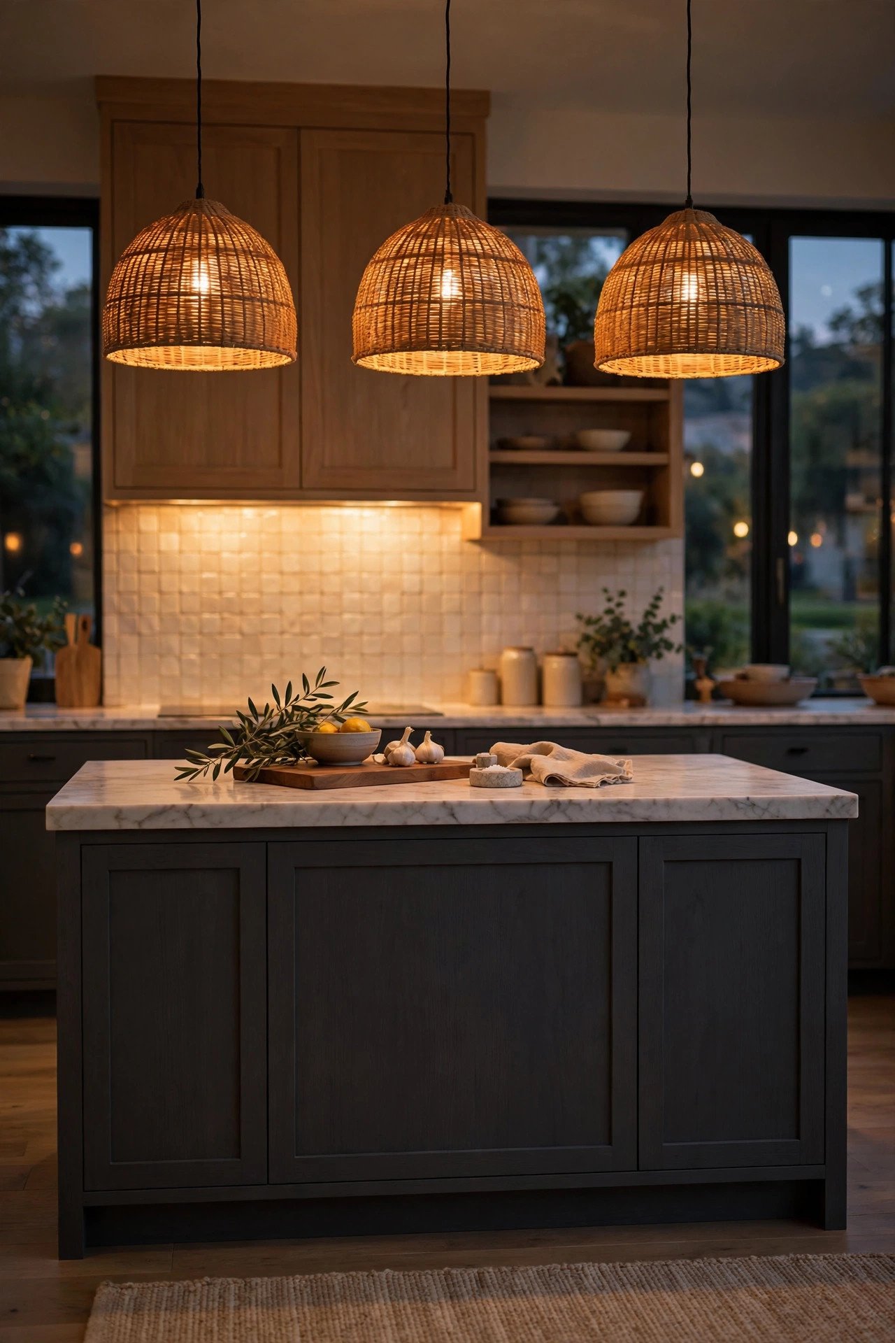
A contrast kitchen needs contrast in its lighting too. One bright ceiling fixture will flatten every tone you so carefully chose. Instead, build pools of warm light. Pendants over the island. A strip of under cabinet light that makes the backsplash glow. A small sconce that gives the room a heartbeat after dark.
Hang pendants low enough to matter. The bottom of the shade should sit about thirty inches above the island top, close enough that the light pools on the stone instead of scattering across the ceiling. Two or three pendants in a row create a rhythm that echoes the cabinetry below.
Keep every bulb warm, around 2700K, and put dimmers on everything you touch daily. At full brightness the kitchen is a workspace. Dimmed low it becomes the room everyone drifts toward after dinner. That transformation is worth more than any single fixture.
What you are avoiding is the cold blue white of a builder grade flush mount. It turns warm greige grey and makes brass look brassy in the bad way. Warm light is the filter this whole style was designed under.
5. Natural Wood to Warm It All
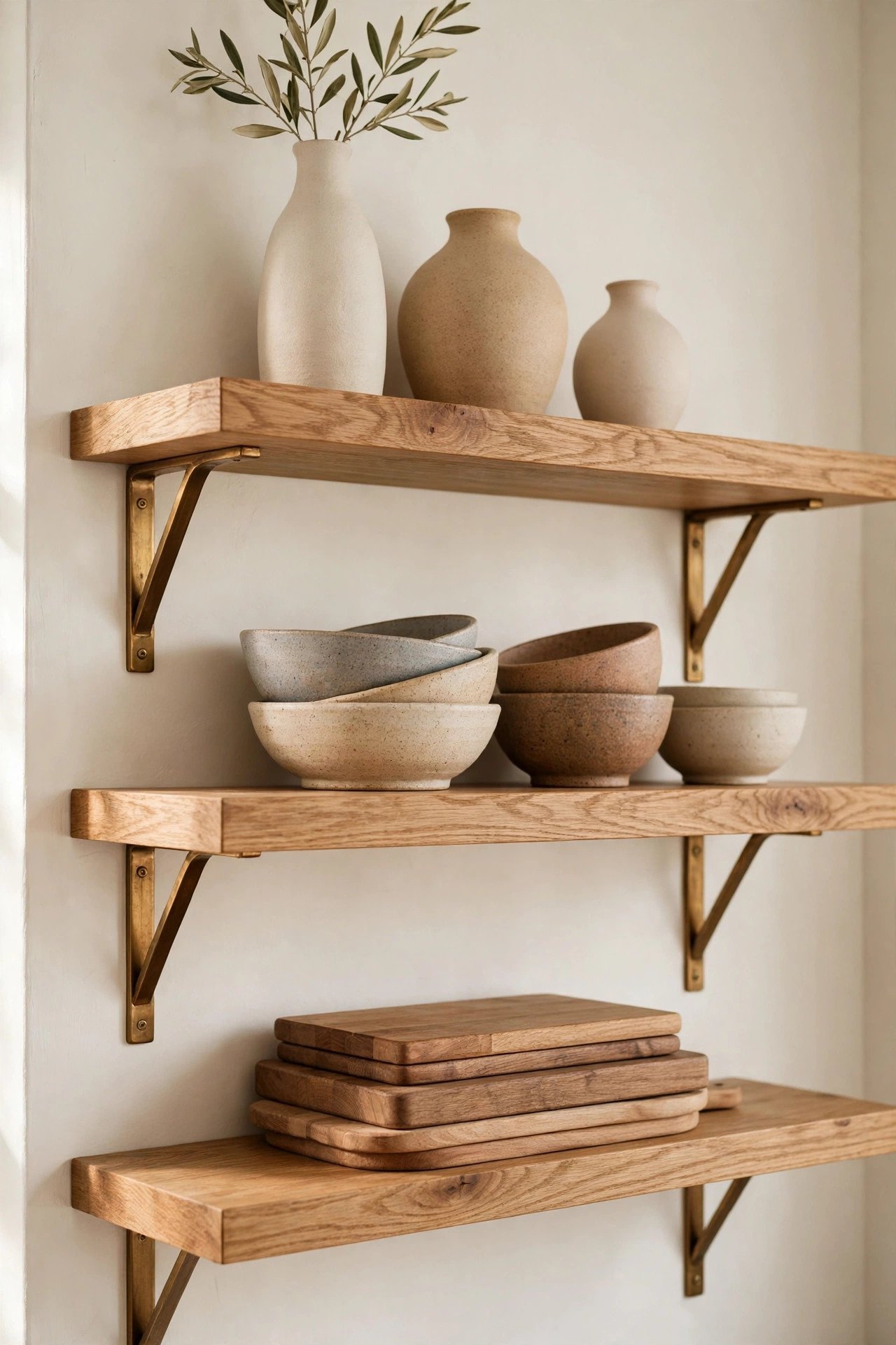
Painted cabinets need wood the way a song needs a bass line. White oak open shelves. A butcher block section of counter. Oak or walnut stools tucked under the island. Wood brings the organic note that keeps all the painted surfaces from feeling manufactured.
Choose oak with a visible grain and a natural finish. The grain is texture, and texture is what keeps a neutral kitchen interesting when the color palette stays quiet. A pale oak shelf against a charcoal wall is one of the prettiest moments this style offers.
Bring wood in at three heights for the layered look. Low in the stools. Mid in a cutting board leaning on the backsplash. High in the open shelves. When the same material appears at every level, the eye travels the whole room and the space feels complete.
Cutting boards do quiet work here. A stack of them against the backsplash adds warmth for the price of things you already own. Use them daily and let them scar. Like the stone, they get better with honest use.
6. A Handmade Tile Backsplash
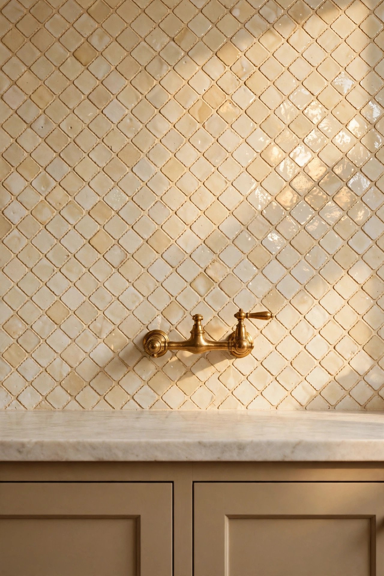
Handmade look tile is where the kitchen gets its soul. Zellige or handmade style subway tile has glaze variation that no machine made tile can fake. Each tile catches light a little differently, so the whole wall shimmers softly as you move through the room.
Keep the color in the light family. Creamy white, warm putty, or pale sage lets the deep lower cabinets be the dark note while the wall stays luminous. A dark backsplash with dark lowers is too much shadow in one place. The backsplash is the reflector in this lighting scheme.
Run it full height behind the range and to the ceiling if the budget allows. A full wall of handmade tile is the kind of detail people photograph. Everywhere else, a standard height run is plenty. The range wall is the stage. The rest is the chorus.
Choose a grout close to the tile color. High contrast grout turns handmade tile into a grid, and a grid is the opposite of handmade. Soft grout lets the glaze variation be the pattern.
The Palette
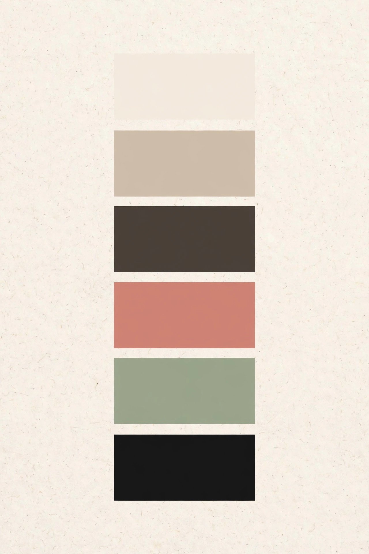
Every soft contrast kitchen is painted from the same small box of colors. Learn their names and where each one lives, and the room almost styles itself.
Whipped Cream goes on the upper cabinets and often the walls. It is white with warmth folded in, like cream poured into coffee. It keeps the room bright without the blue chill of a stark white. North facing kitchens especially need this warmth.
Warm Greige is for the lower cabinets. It sits exactly between grey and beige, which makes it the most forgiving dark in the decorating world. It hides scuffs, flatters wood floors, and never fights the brass.
Espresso Smoke belongs to the island or a pantry wall. A deep brown grey that reads almost black in evening light. It is the anchor of the room. Use it once, in one big gesture, and let it hold everything else.
Clay Bisque is your soft accent. A sunbaked terracotta pink for the small things. A folded towel. A handmade planter. The seat cushions on the stools. It keeps the neutrals from going sleepy.
Sage Mist is the quiet green that shows up in the details. A beadboard panel inside glass cabinets. The leaves of a potted herb on the sill. It is the garden peeking into the kitchen.
Ink Black appears in the thinnest lines. The faucet. The pendant cords. The frame of a small print. Just enough true dark to make the soft contrast look deliberate.
The rule is simple. Big surfaces stay in the first three colors. The last three show up in things you can lift with one hand.
Let the deep tones do the grounding and the light tones do the lifting.
How to Style It, Step by Step
Step 1. Choose your two cabinet tones first. Everything else answers to this decision. Paint large boards with your finalists and live with them for three days. Look at them in morning light, in evening light, and under the bulbs you actually use. The tones that still please you on day three are the ones.
Step 2. Plan the lighting before anything is installed. Mark pendant positions, under cabinet runs, and dimmer locations on the plan while the walls are still open. Lighting roughed in late is lighting compromised. This is the step most often skipped and most often regretted.
Step 3. Set the stone and the tile. Counters first, then the backsplash. These are the permanent textures, and paint colors can be adjusted to meet them but not the other way around. Photograph the installed stone in your light and carry that photo when you shop for everything else.
Step 4. Hang the hardware. This is the fastest transformation in the whole project. An afternoon with a drill and a template turns painted boxes into furniture. Step back after every ten pulls and check the line. Crooked hardware is visible from across the room.
Step 5. Layer in the wood and the textiles. Shelves, stools, cutting boards, linen towels, a runner that can handle crumbs. These are the soft notes that keep the contrast from feeling architectural and cold. A kitchen with no textile feels like a showroom.
Step 6. Style the open shelves, then edit. Group ceramics in odd numbers. Leave a third of every shelf empty. Then take one thing away. Whatever you remove, the shelves will be better for its absence. That final edit is what makes styling look effortless.
Designer Tips
Sample paint on boards, not just on the wall. A small swatch lies. Paint two foot boards and move them around the room for a few days. Colors shift dramatically between the shadow under the uppers and the light by the window.
Keep the contrast gentle. The two cabinet tones should feel related, like siblings. If you squint and they merge into one tone, they are too close. If they argue, they are too far apart. Aim for a clear but friendly difference.
Avoid pairing pure white with jet black. That is a different style entirely, and a harsher one. Soft contrast lives in the warm middle. Stark pairings under tired morning eyes feel severe, which is the opposite of the calm you are building.
Repeat each tone at least twice. The greige of the lowers should echo somewhere else, maybe in the runner or the shade of a pendant. Repetition is what makes a palette feel intentional instead of accidental.
Avoid mixing more than two metals. Brass hardware plus a stainless range is plenty. Add a third metal and the eye starts counting finishes instead of feeling the room. Two metals, confidently used, always win.
Hide the small appliances. The toaster and the coffee maker earn their counter space only while in use. A dedicated appliance garage or a pantry shelf keeps the sightlines clean. Clutter reads as noise, and this kitchen is built on quiet.
Test your lighting at night. Visit the kitchen after dark before you call it done. Turn on each layer separately and then all together. The room should feel like candlelight at its lowest setting. If any bulb feels blue, swap it before you live with it.
Avoid styling every shelf to the edges. Open shelves need air around the objects. When every inch is filled, the kitchen feels like a shop. Negative space is what lets the beautiful pieces be seen.
Finishing Touches to Shop
This guide contains affiliate links. If you buy through them, we may earn a small commission at no extra cost to you.
Once the bones of the kitchen are in place, a few considered pieces complete it. Each one below earns its place by being beautiful, useful, and built to stay. And when the seasons turn, our 5 Must Have Amazon Fall Decor Finds roundup has a few warm textures that layer into this palette beautifully.
Golden Warm Brushed Brass Bar Pulls, 10 Pack. The jewelry box moment. Weighty pulls with a soft brushed glow that flatter both cream uppers and deep lowers.
White Oak Floating Shelves, Set of 2. Solid oak with a natural finish and hidden brackets. The grain does the decorating all by itself.
Woven Rattan Dome Pendant Light. A warm globe of texture over the island. It throws beautiful shadows at night and reads as sculpture by day.
Stoneware Utensil Crock in Oatmeal. Keeps wooden spoons and whisks within reach while adding a soft handmade note to the counter.
Washed Linen Kitchen Towels, Set of 4. The textile layer this kitchen needs. Soft, absorbent, and prettier with every wash.
Handmade Look Ceramic Subway Tile. Glaze variation in every box, so the backsplash shimmers instead of sitting flat. Order samples first and look at them in your light.
Soft Contrast Kitchen Q and A
Will deep lower cabinets make my kitchen feel small?
Not when the uppers stay light. The eye reads the bright upper half of the room as the size of the room. Deep lowers actually add depth, the way a darker floor makes walls feel taller. Keep the walls and ceiling light, and a small kitchen will feel grounded rather than cramped.
Can I get this look without replacing my cabinets?
Yes, and paint is the hero here. If your boxes are solid, a professional quality paint job in two tones costs a fraction of new cabinetry. Paint the uppers Whipped Cream and the lowers Warm Greige, swap the hardware for brass, and the transformation will startle you. Even painting just the island Espresso Smoke gives you the contrast story in a weekend.
What countertop works best with soft contrast?
A honed stone with soft veining that touches both your light and deep tones. White marble with grey movement is the classic. Quartzite is the practical cousin. What matters most is the finish. Honed or leathered, never polished. Shine fights the softness everywhere else in the room.
Is unlacquered brass hard to maintain?
It asks for nothing at all. Unlacquered brass darkens where touched and stays bright elsewhere, and that patina is the desired finish. If a spot ever bothers you, a little lemon and salt buffs it bright again. Never use harsh polish on the whole piece or you will erase the character you waited for.
How do I keep open shelves from looking cluttered?
Edit to the pieces you actually love and use daily. Group in odd numbers, vary the heights, and leave a third of each shelf empty. Corral the small things on a tray so they read as one object. And style with the seasons lightly. A small pumpkin or a sprig of dried botanicals in fall keeps shelves feeling alive, which our pumpkin decor ideas explore in full.
Does this style work in a galley kitchen?
Beautifully. A galley is a corridor, and contrast gives a corridor rhythm. Keep the long walls light and let one run of lowers go deep. Run the backsplash full height on one side to draw the eye down the room. Skip the island pendants and use a slim row of flush mounts or a track with warm bulbs instead.
Until the Next Guide
A soft contrast kitchen is not finished in a weekend. It is gathered slowly, one considered choice at a time, and it gets better as it gets cooked in. Start with the two tones. Add the light. Let the brass age and the stone patina and the wood scar.
This guide is one of our design guides, and more design guides are on the way. Each one follows the same idea. Fewer, better choices. Rooms that calm the people in them. If you love this kind of warmth, our warm minimalist living room ideas for fall carry it right through to the next room. We hope this one brings a little more ease to the hardest working room in your home.