
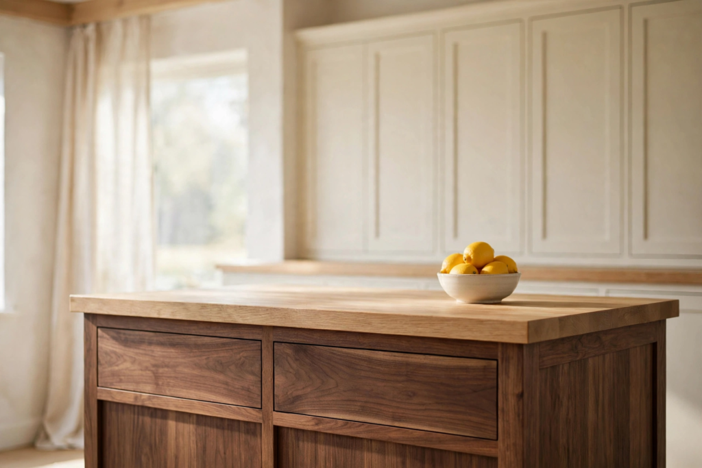
Picture your kitchen at six in the evening in October. The light has gone low and honey colored. Something is simmering on the stove. The room feels like a held breath, warm and a little bit golden. That is the feeling I chase in every kitchen I design. Not stark. Not cold. Just calm, with enough depth to make you want to linger.
That feeling has a name now. Soft contrast. It is the backbone of warm minimalism, and it is everywhere this season. Instead of the old black and white drama, you pair warm whites and oatmeals with one rich dark note. Walnut. Chocolate brown. Olive. A whisper of charcoal. Then you warm the whole thing up with brass and wood and linen so the dark never feels harsh. Contrast should whisper, not shout. That is the whole philosophy in one line.
I spent weeks studying this look, pinning and unpinning, until I had 19 kitchens that get it exactly right. Some are full renovations. Some are a single weekend project. Every one of them feels like that October evening. And if you want to understand the style from the ground up, my Soft Contrast Kitchen design guide walks through the palette, the pairings, and the rules that make it work.
Let us start with the cabinets, because that is where the contrast lives.
Love these ideas? Get more every week.
Join the newsletter for seasonal decor and cozy home inspiration.
Contrast you can live with
The fastest way into this style is a two tone cabinet scheme. Light up top, dark down low. It grounds the room without making it heavy, and it hides real life beautifully. A dark lower cabinet forgives fingerprints and scuffs in a way white never will. Trust me on this one.
1. The Walnut Island Warm White Kitchen
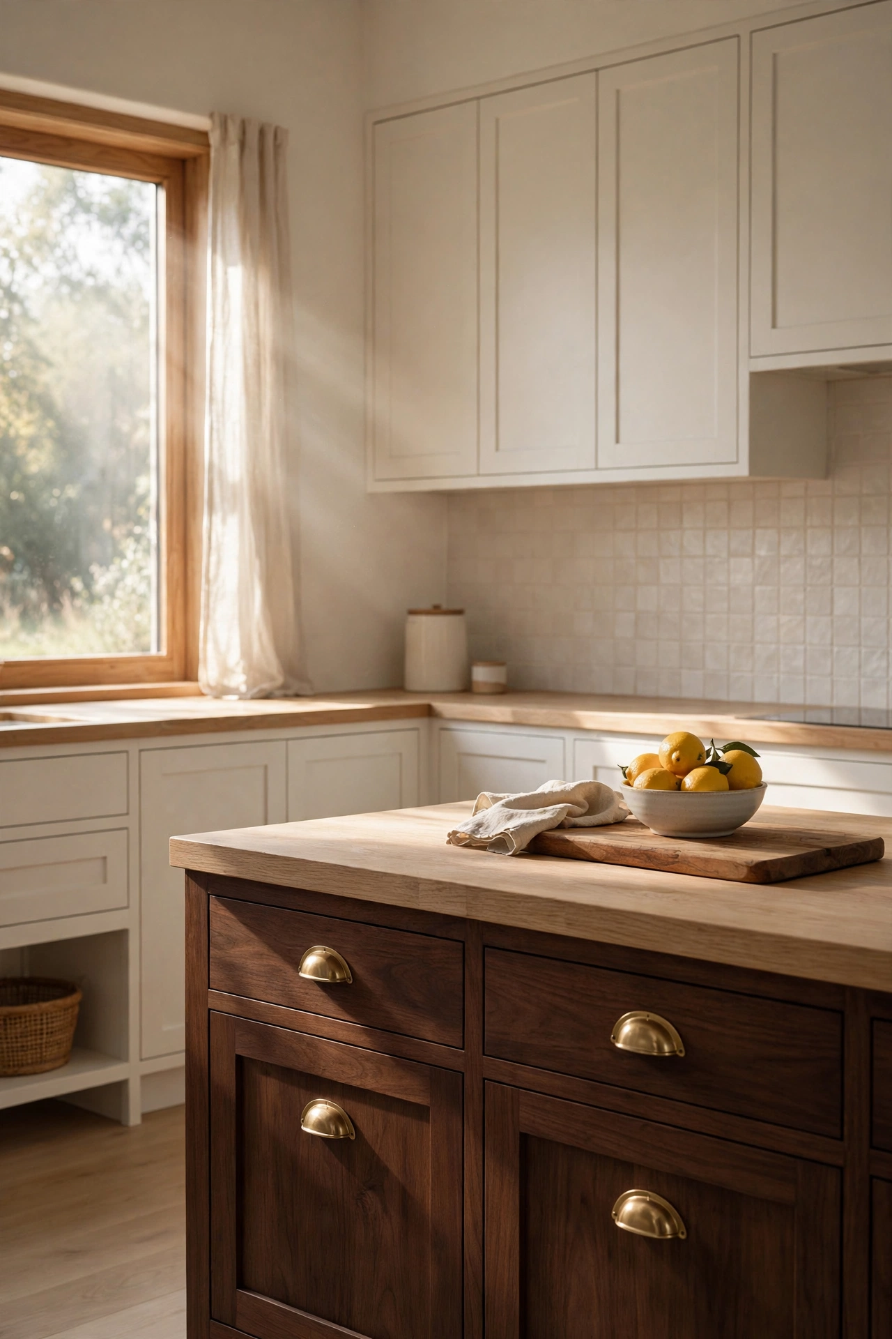
This is the kitchen I would build tomorrow if someone handed me a blank floor plan. Warm white shaker cabinets around the perimeter, clean and quiet. Then the island. Deep walnut, rich as coffee, with brass cup pulls that catch the morning light. The counter on the island is thick white oak, which keeps the whole thing from going too dark. It is the perfect triangle. Light walls, warm wood, one dark note.
What I love most is how the island feels like furniture, not cabinetry. The brass pulls give it that old world jewelry feeling. The oak top softens the walnut underneath. And because the perimeter stays light, the room still feels bright and open. One dark note grounds the room. That is the rule working exactly as it should.
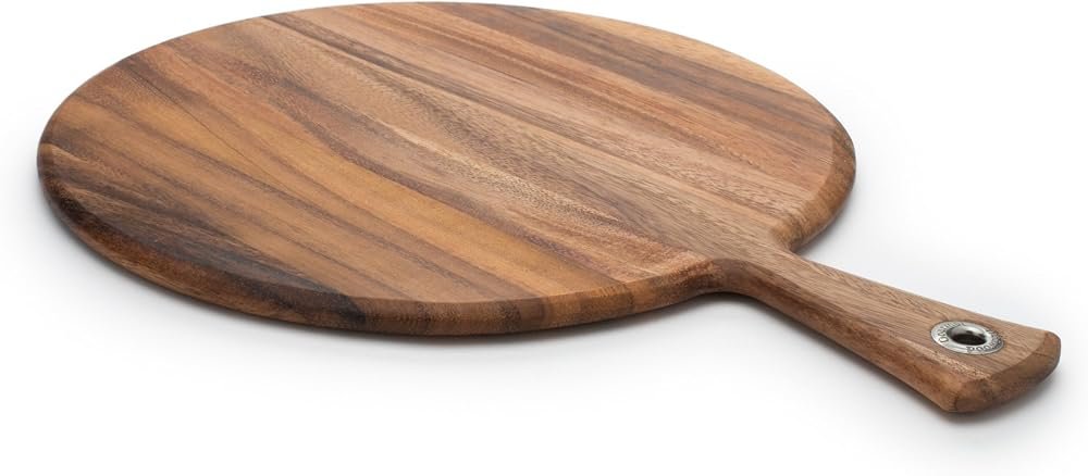
Style it simply. A wooden cutting board. A small bowl of lemons. Maybe a linen towel draped over the oven handle. This kitchen does not need much. It is already saying everything.
Shop This Look
This post contains affiliate links. If you buy through them, I may earn a small commission at no extra cost to you.
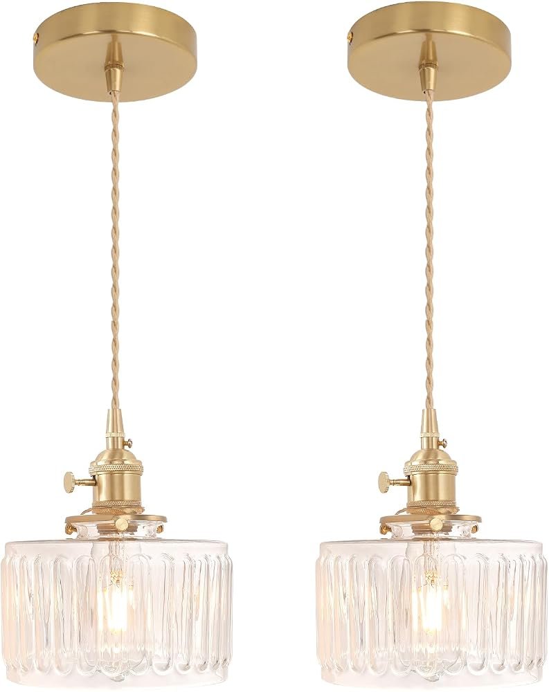
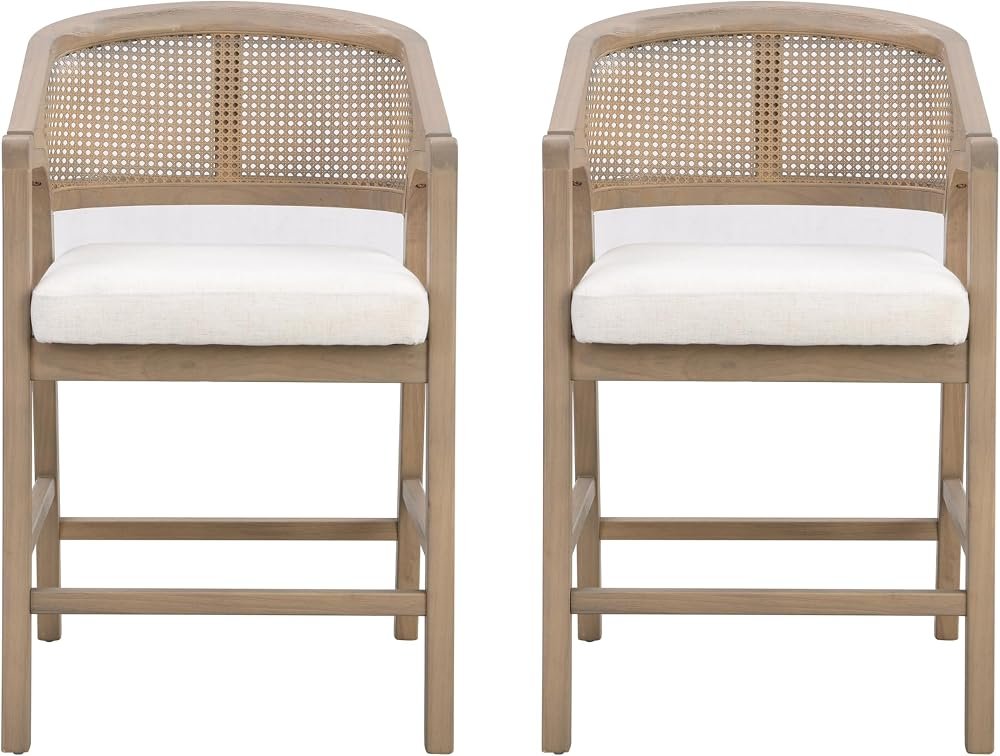
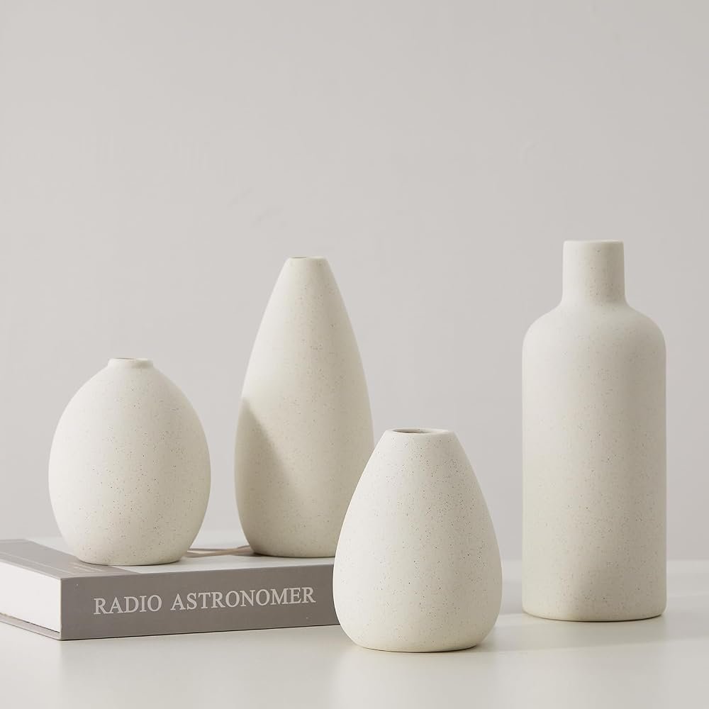
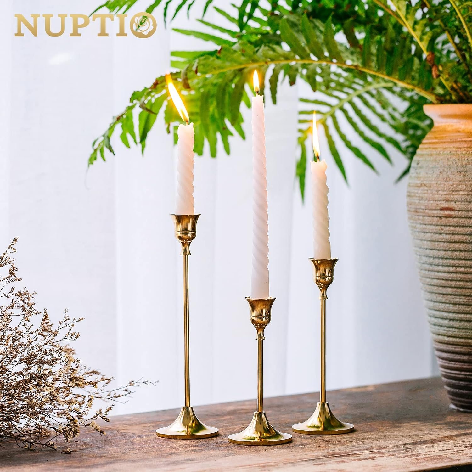
A few favorites featured in the ideas above:
2. Chocolate Brown Lowers with Cream Uppers
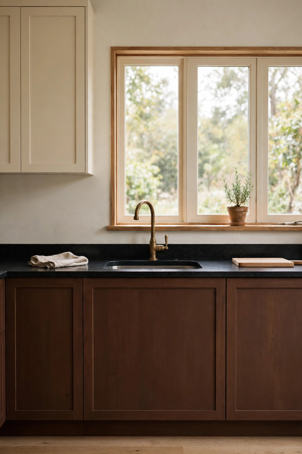
If the walnut island is the gateway, this is the full commitment. Chocolate brown lower cabinets, warm cream uppers, and honed black granite in between. It sounds like a lot of dark. It is not. Because the uppers stay light, the room breathes. Your eye travels up to the brightness and rests there.
Here is my rule for two tone cabinets. Keep the dark low and the light high. Dark lowers anchor everything. Light uppers lift the ceiling. Flip them and the room feels like it is pressing down on you. This pairing also loves brass. An aged brass faucet against chocolate brown is one of those combinations that makes guests ask who your designer is.
A small potted herb on the sill finishes it. Something green and alive against all that warmth. Basil or thyme, nothing fussy.
3. The Rust Plaster Range Hood
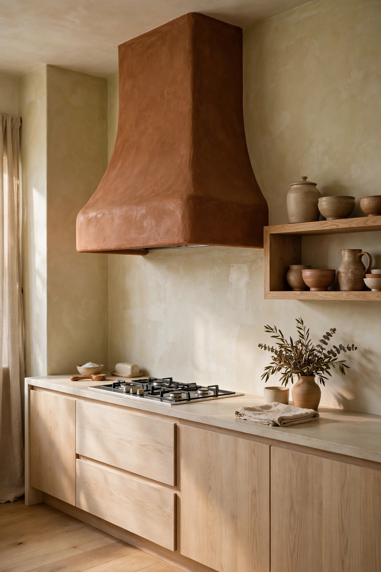
Every kitchen needs one moment of drama. This one puts it over the range. A rust colored plaster hood, hand troweled, sitting against limewashed warm white walls. It is earthy and sculptural at the same time. Like something you would find in an old farmhouse in Tuscany, except it works perfectly in a new build too.
The magic here is texture. The plaster has that soft, uneven finish that catches light in the prettiest way. Pair it with a white oak open shelf holding handmade pottery and you have a corner that looks collected over years. Nothing in this kitchen is shouting. The rust is doing all the talking, quietly.
Plaster hoods also age beautifully. They develop a patina instead of showing wear. If you have kids who love to touch everything, this is your friend.
4. Charcoal Island with Camel Leather Stools
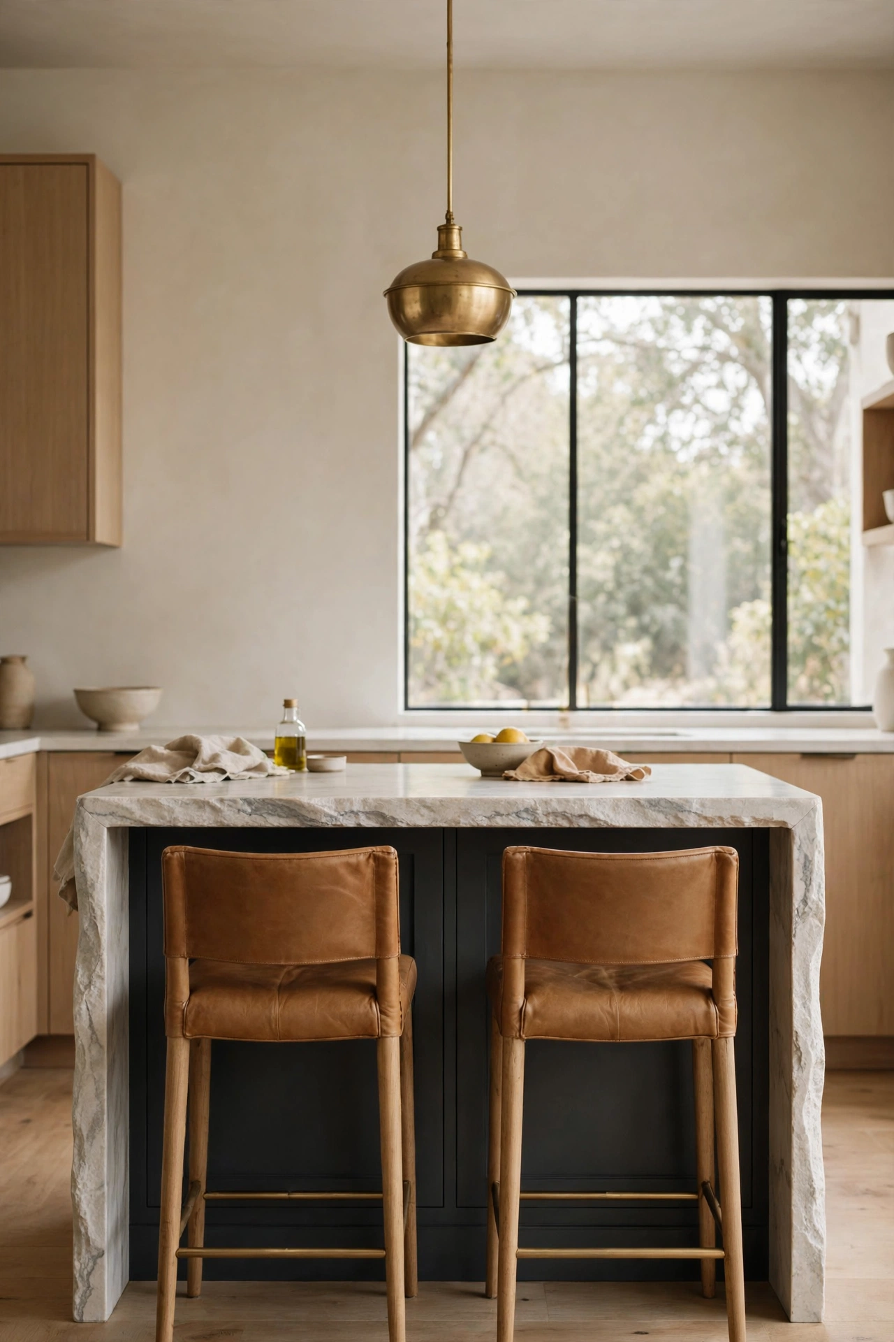
Charcoal is the bravest dark in this post, and these stools are why it works. A charcoal island with a waterfall stone counter could go cold and modern fast. Then you tuck in two camel leather bar stools and hang one unlacquered brass pendant above, and suddenly it is warm and inviting. Wood is the warm neutral that makes dark feel soft. Leather does the same job.
I love the waterfall counter here. It gives the island a tailored, finished feeling, like a really good blazer. The brass pendant is the jewelry. One pendant, not three, because the island is not that big and restraint is the whole point of this style.
If you already have a dark island that feels a little stark, this is your fix. Warm stools, warm metal, done.
5. Olive Cabinets with Honed Black Granite
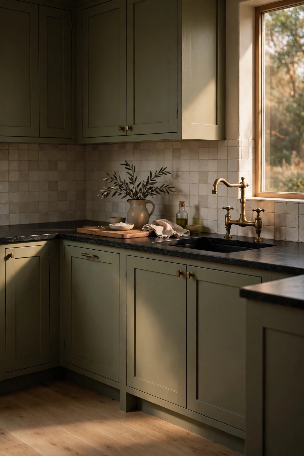
Olive is the color I recommend to everyone who says they want color but are scared of it. It reads as a neutral. It sits next to cream and wood without arguing. And against honed black granite, it looks expensive in a way that is hard to explain until you see it.
The honed finish matters here. Polished black granite is shiny and formal. Honed is matte and soft, with this beautiful depth that drinks the light. Paired with olive shaker cabinets and an aged brass bridge faucet, it feels like a kitchen that has always been this way. White oak floors keep everything from going too moody.
This is also the most forgiving palette in the post for real life. Olive hides crumbs. Honed granite hides smudges. Brass hides water spots. It is a working kitchen that photographs like a magazine.
Surfaces and structure
Once the cabinets are set, the surfaces do the softening. Tile, stone, and open shelving are where soft contrast gets its warmth. This is also where you can play without a renovation. A new backsplash or a set of shelves can change the whole temperature of the room.
6. The Burgundy Coffee Nook
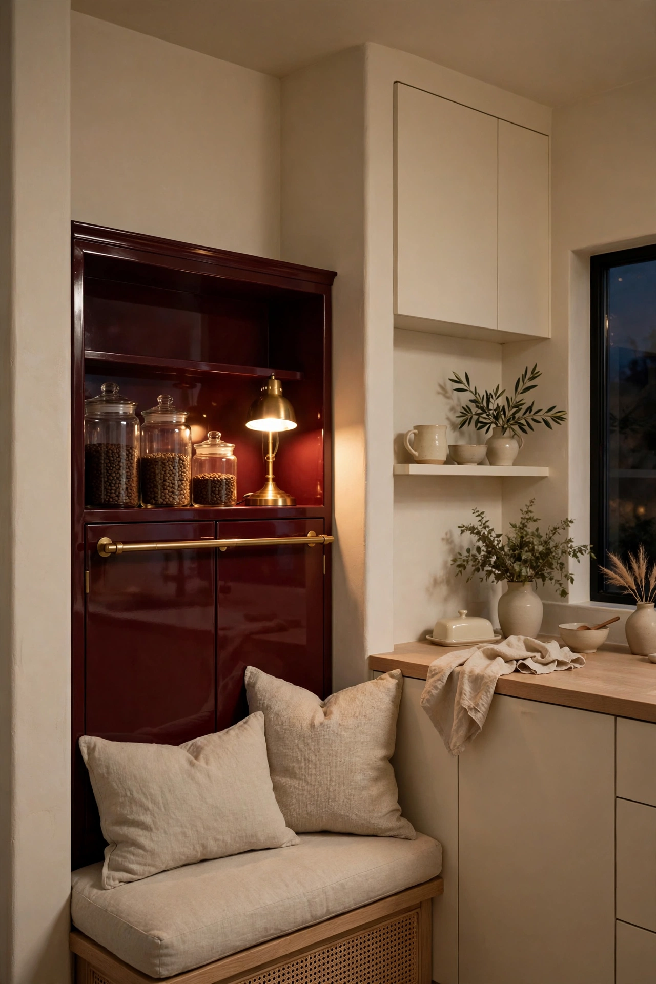
Burgundy in a kitchen sounds wild until you see it done right. Here it is not on the cabinets. It is one lacquered coffee nook tucked into a corner of an otherwise cream kitchen. A little jewel box. Brass rail, glass jars of beans, a small lamp glowing warmly in the evening. It feels like a secret.
This is my favorite trick for people who love deep color but fear commitment. Give it one contained moment. A nook, a pantry door, the inside of a hutch. You get all the richness with none of the risk. And in the evening, when that little lamp is on, it is the coziest corner in the house.
The lacquer finish is key. Matte burgundy can look flat. Lacquer bounces the lamplight around and makes the color feel alive.
7. Oatmeal Tile and Oak Open Shelves
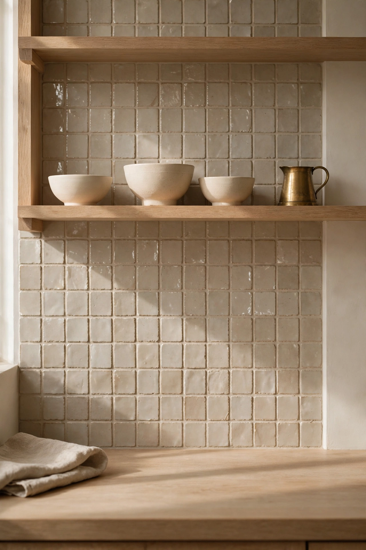
Sometimes contrast is not about dark at all. It is about texture. Oatmeal handmade look tile with all its beautiful uneven edges, white oak shelves, cream stoneware, and one small brass pitcher. Everything is light. Everything is warm. And yet the wall has so much going on that the kitchen never feels flat.
I love open shelves in this style because they let you rotate the seasons. Right now it is cream stoneware and dried grasses. In December it can be pine and brass candlesticks. The shelves are the wardrobe of the kitchen. Change the accessories and the whole room feels new.
Keep the styling loose. Stacks of bowls, a few pitchers, nothing lined up like soldiers. Soft contrast is relaxed by nature.
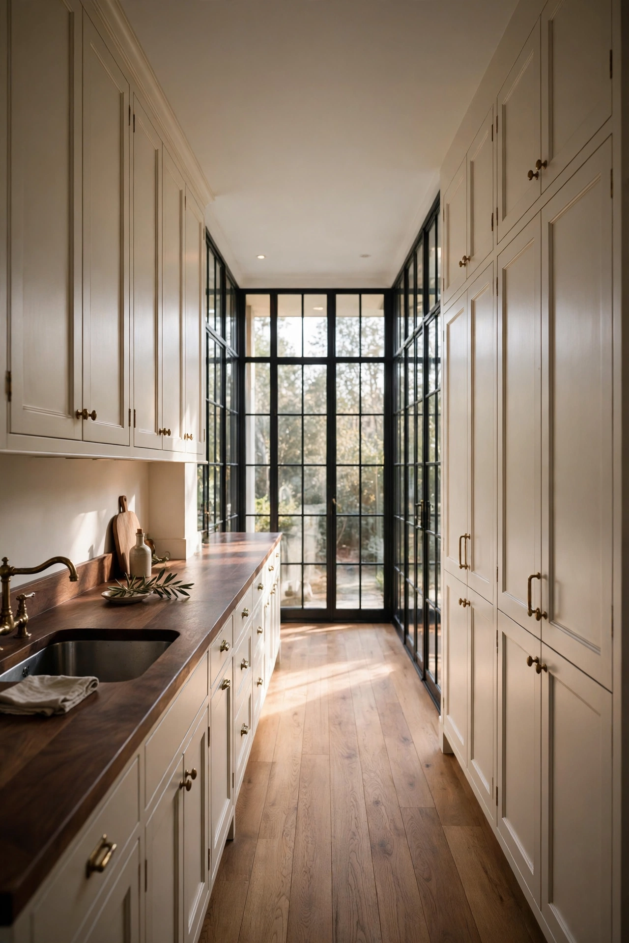
8. The Galley with Black Framed Windows
Small kitchens can do soft contrast beautifully. This galley is proof. Warm white cabinets, a dark walnut counter on one side, and tall black framed windows at the far end pulling daylight all the way down the room. The windows are the dark note here, not the cabinets.
Black window frames are one of my favorite moves in a light kitchen. They add structure and a little bit of edge without any heaviness. They also make the view look like art. Even if your view is just the backyard fence, a black frame makes it feel intentional.
The long perspective of a galley is a gift. Keep the counters clear and let the light do the decorating. This kitchen needs almost nothing on it to look stunning.
9. The Walnut Butlers Pantry
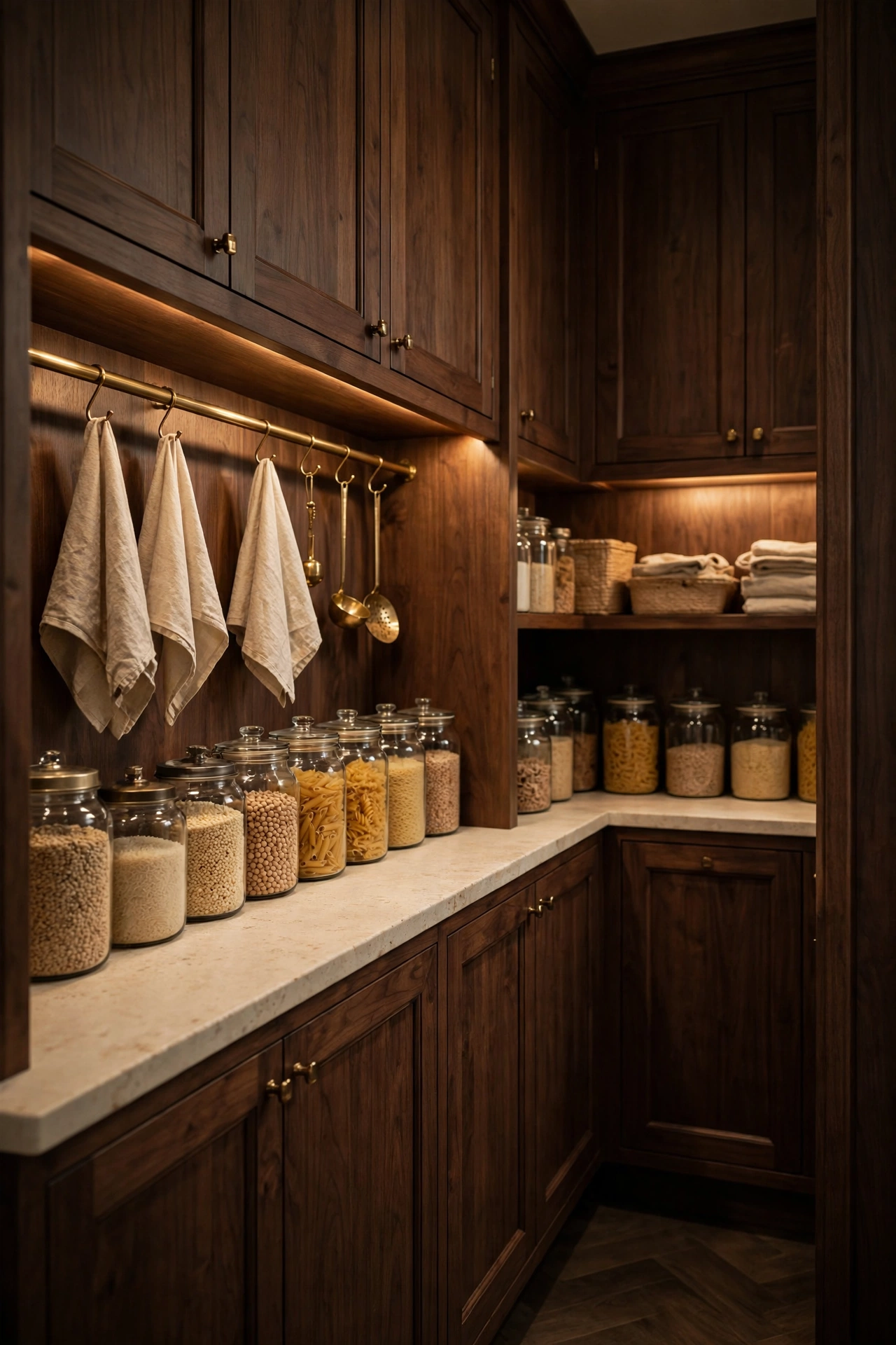
If you have the space, a butlers pantry in deep walnut is pure luxury. This one has a brass rail with hooks, cream stone counters, and glass jars of grains lined up like a beautiful little shop. The undercabinet lighting makes everything glow.
Here is why I love dark in a pantry. Pantries are small and enclosed, so a rich color makes them feel intentional instead of forgotten. It is a jewel box you walk into. And because it is a separate room, you can go as dark as you want without affecting the main kitchen at all.
Decant your staples into glass jars. It sounds fussy and it takes one afternoon, but it transforms a pantry from storage into a room you want to show people.
10. Cream Cabinets and Dark Soapstone
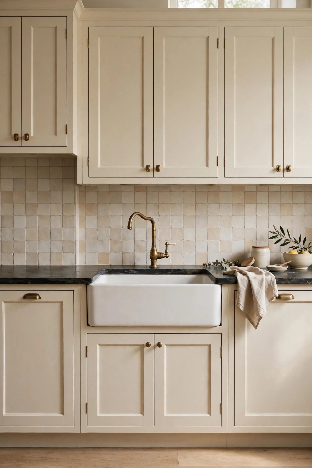
Soapstone is the quietest luxury in this post. Dark, matte, soft to the touch, with a patina that deepens over the years. Paired with cream shaker cabinets and an aged brass gooseneck faucet, it creates a kitchen that feels like it has been loved for a hundred years.
What I love about soapstone is that it does not try to impress. It is not shiny. It does not have dramatic veining. It just sits there, dark and calm, making everything around it look better. Scratches and marks blend into the patina instead of standing out. For a family kitchen, that is freedom.
A white farmhouse sink completes the picture. The white against the dark stone is the softest contrast of all. Gentle, timeless, done.
Floors, beams, and bones
Contrast does not only live in the cabinets. Floors and ceilings can carry the dark note too, which frees up the cabinets to stay light and bright. If you love the idea of contrast but want an airy kitchen, put the depth under your feet or over your head.
11. Muted Terracotta Floors
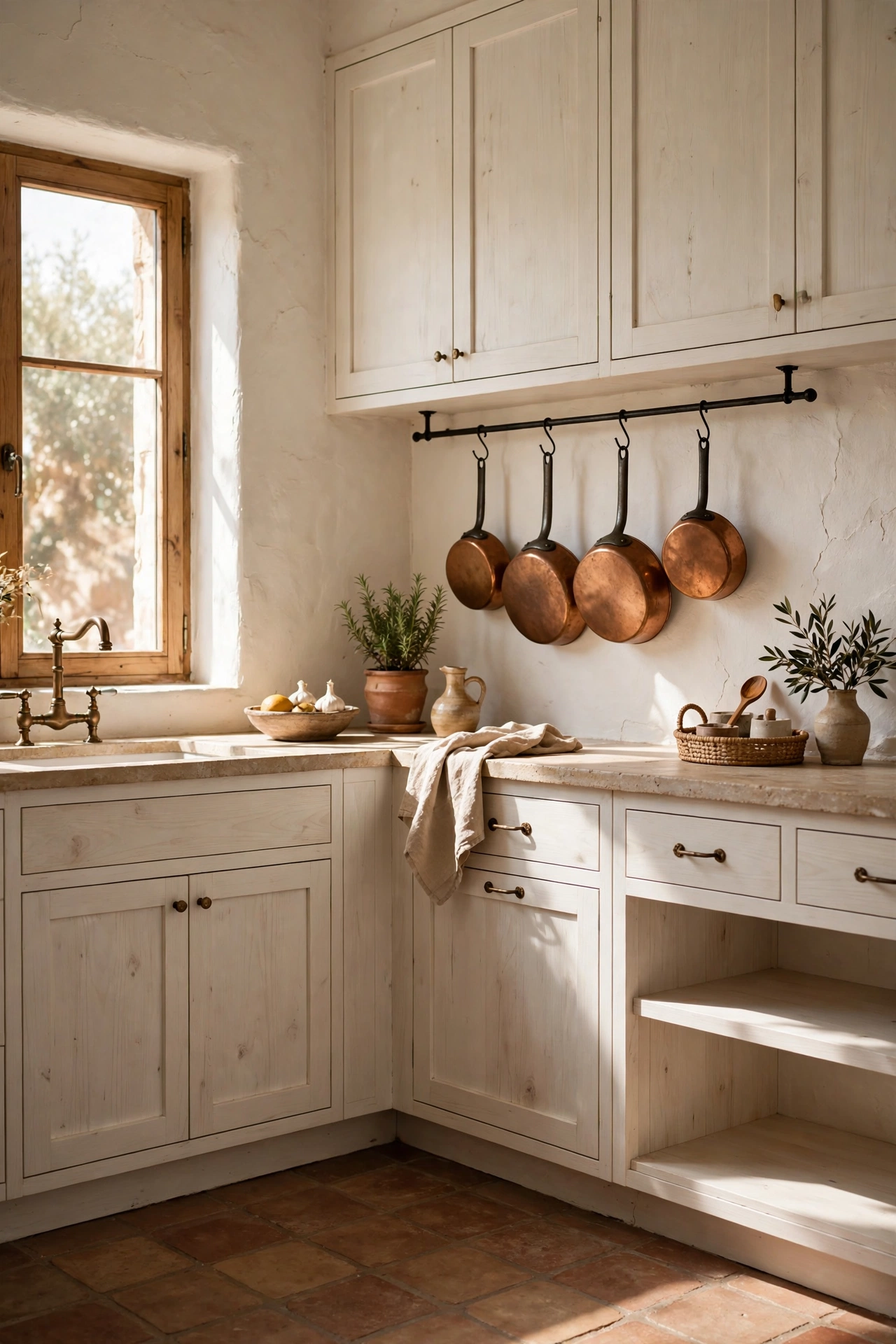
Terracotta floors are having a real moment, and the muted version is the one to choose. Not bright orange. Soft, dusty, sun baked. Paired with ivory plaster walls and a simple white oak kitchen, they bring a Mediterranean warmth that no cabinet color can match.
I love how terracotta grounds a light kitchen. All that ivory and oak could float away. The floor holds it down. An iron pot rail with copper pans adds a little more warmth up high, so the eye travels the full height of the room.
Terracotta is also wonderfully forgiving. It hides crumbs, it loves bare feet, and it looks better with age. Seal it well and it will outlive us all.
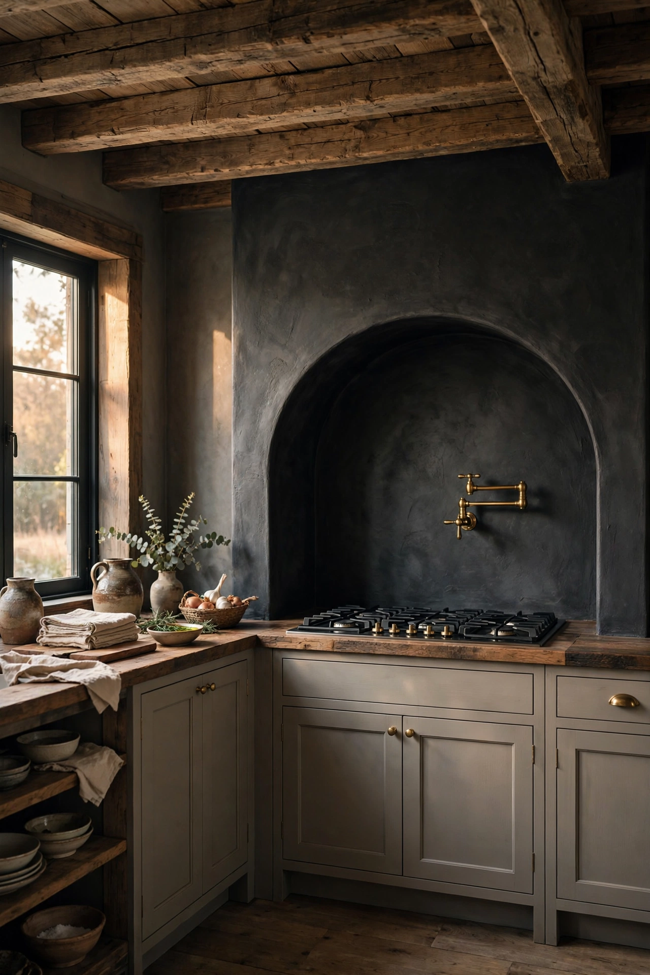
12. The Charcoal Range Alcove
This one is for the romantics. A charcoal plaster range alcove with a soft curved surround, reclaimed oak beams overhead, and a brass pot filler on the wall. It is dramatic. It is also deeply cozy, like cooking inside a hug.
The curve is what makes it soft. A square charcoal box could feel severe. The arched surround turns it into something sculptural and gentle. The oak beams add that rustic warmth that keeps the charcoal from going cold.
A range alcove is a bigger project, but it changes the architecture of the room. It becomes the thing people remember about your kitchen. If you are renovating anyway, this is where to spend the money.
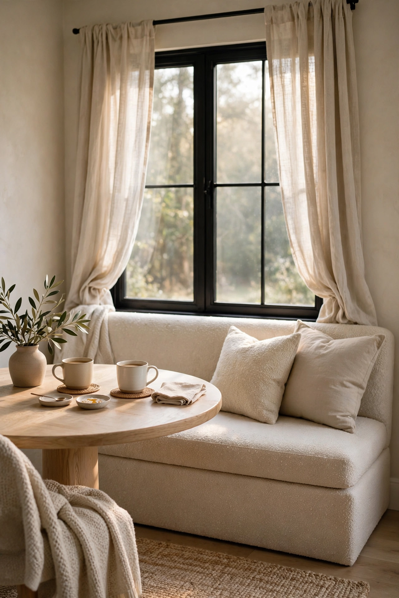
13. The Oatmeal Boucle Breakfast Nook
Every kitchen needs a soft place to land. This breakfast nook is mine. An oatmeal boucle bench, a round white oak table, a black framed window with linen curtains that move in the breeze. Morning coffee here tastes better. I am convinced.
Boucle in a kitchen sounds impractical until you choose a performance fabric. They make them now, and they wipe clean. The texture is worth it. That nubby oatmeal fabric against smooth oak and crisp linen is the kind of contrast you feel more than see.
Keep the table simple. Two coffee cups. A small vase with whatever is blooming. This corner is about slowness, not styling.
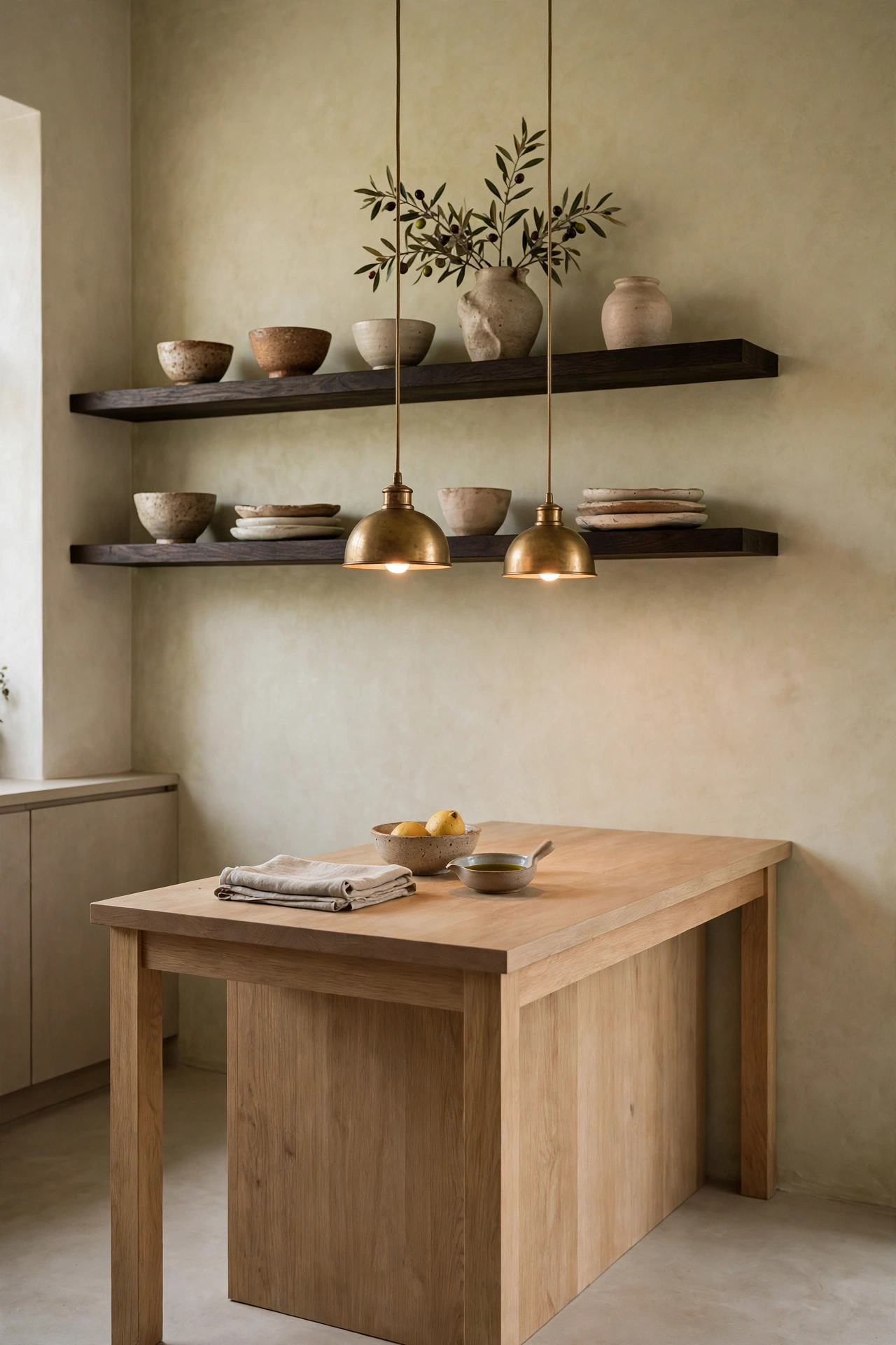
14. Dark Floating Shelves on Limewash
Here is contrast at its quietest. Limewash walls in the softest warm white, dark stained floating shelves, handmade ceramics, and two small brass dome pendants glowing over a simple oak island. Nothing is loud. Everything is considered.
Limewash is the secret ingredient. It has this cloudy, Old World movement that flat paint cannot touch. Against dark shelves, it makes the wall feel alive. The shelves themselves become little stages for your prettiest things.
This is the most minimalist kitchen in the post, and it still feels warm. That is the power of getting the undertones right. Warm wall, warm wood, warm metal. The dark is just an accent, not a statement.
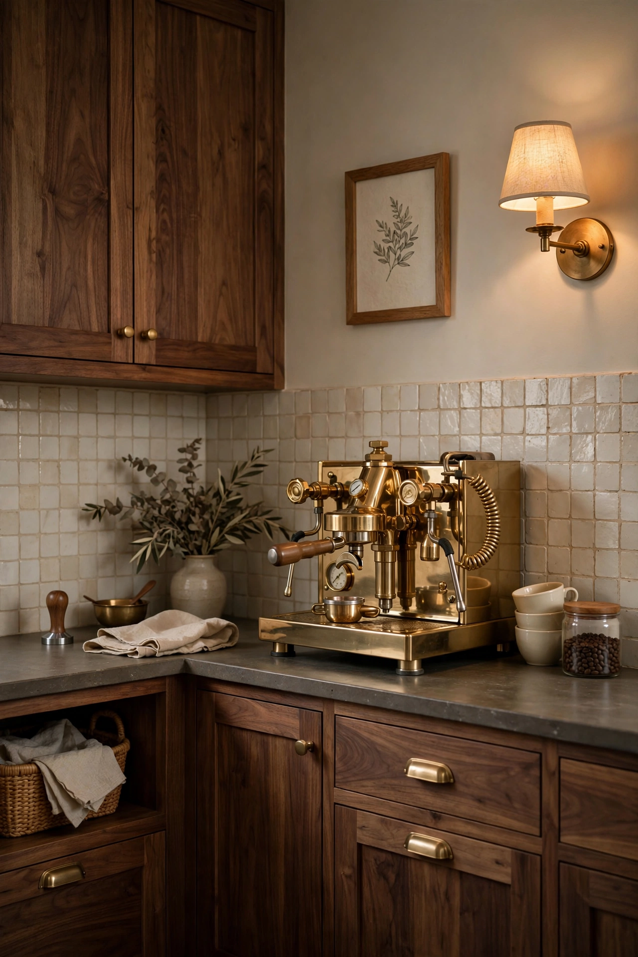
15. The Walnut Coffee Bar Corner
A dedicated coffee bar is the little luxury that makes mornings feel ceremonial. This one is walnut cabinetry, a brass espresso machine, cream handmade tile, and a small art print in an oak frame. It looks like a tiny cafe tucked into your kitchen.
What makes it work is treating it like a real vignette, not an appliance garage. The tile backsplash defines the zone. The art makes it feel decorated. The brass machine is beautiful enough to leave out. Everything has a place, and the place is pretty.
If you do not have room for a full bar, steal the idea in miniature. One walnut shelf, cream tile behind it, your prettiest mugs. Same feeling, smaller footprint.
Warmth in the details
The last group is about atmosphere. Beams, evening light, and the little corners that make a kitchen feel like home. These are the ideas that turn a beautiful kitchen into your favorite room.
16. Cream Kitchen with a Dark Beam Ceiling
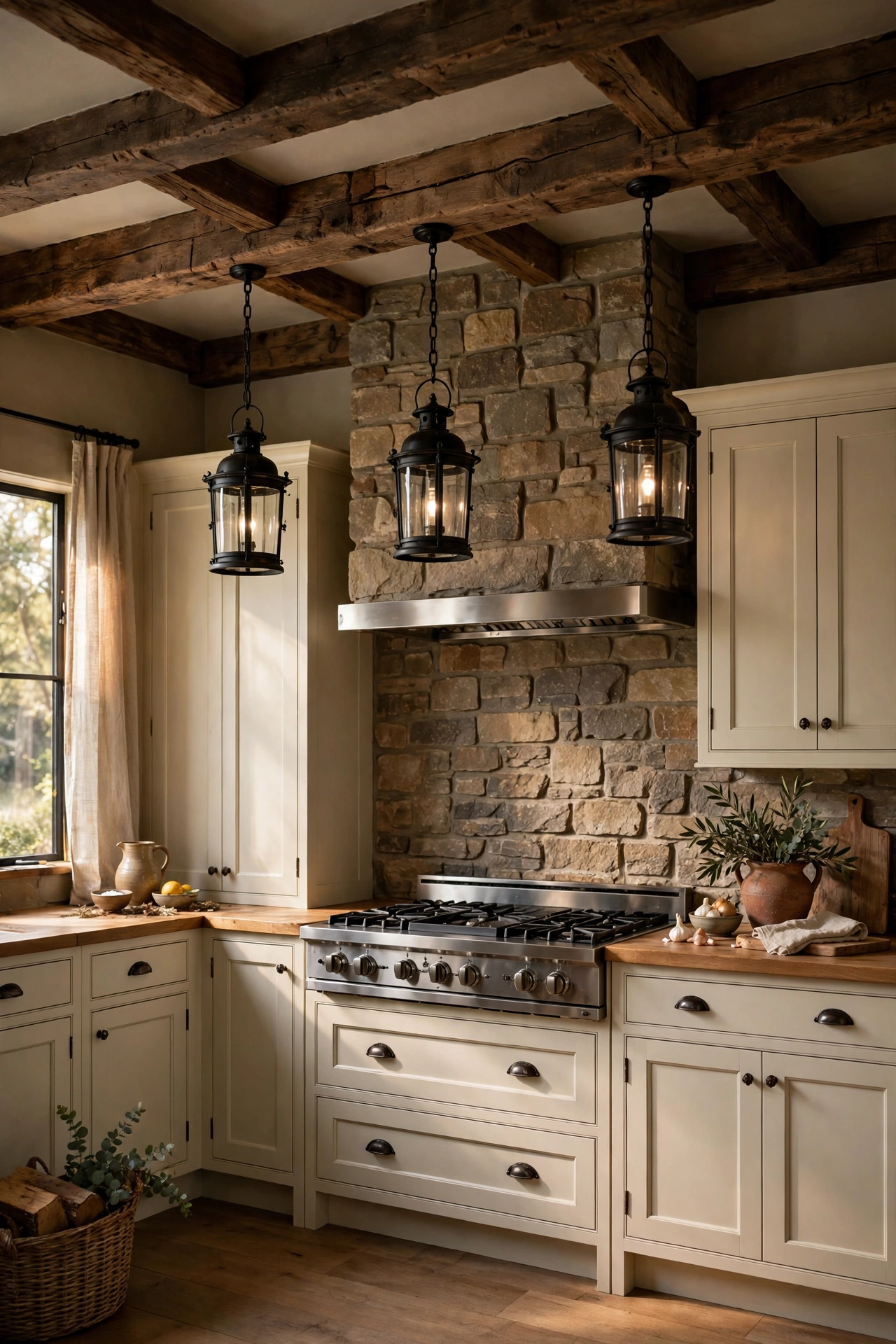
Put the contrast overhead and the whole room changes. Cream shaker cabinets, a stone clad range wall, and a dark wood beam ceiling with black iron lantern pendants hanging down. It is rustic without being a theme. Grounded without being heavy.
I love a dark ceiling in a kitchen with good natural light. The beams draw your eye up and make the room feel taller, which sounds backwards but it works. The darkness above makes the cream cabinets below feel even brighter. Contrast should whisper, not shout, and this is the whisper at its most architectural.
If real beams are not in the cards, boxed beams in a dark stain give you the same look for a fraction of the cost.
17. The Olive Island at Dusk
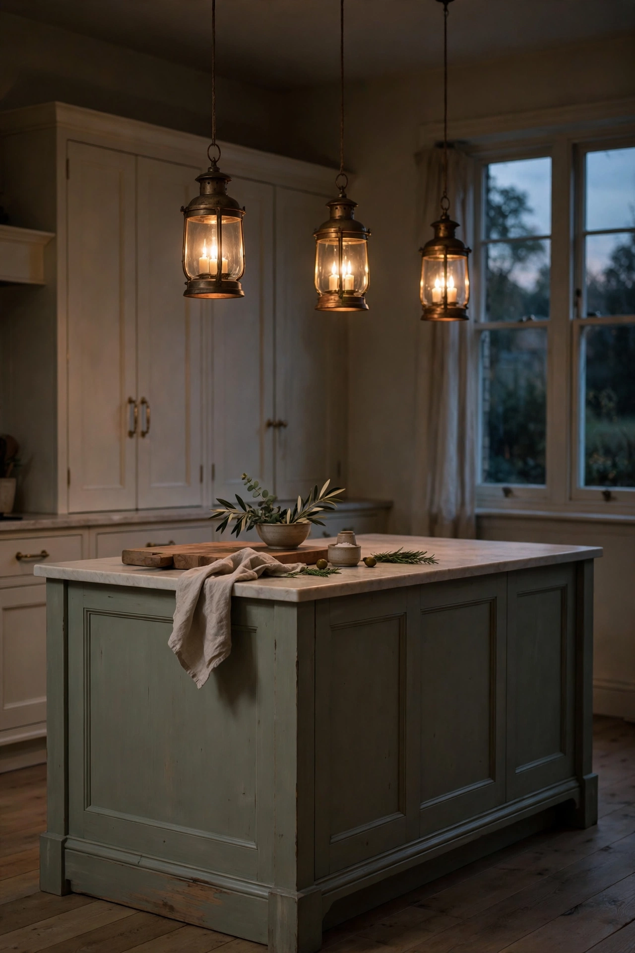
Some kitchens are made for mornings. This one is made for evenings. A muted sage olive island, brass lantern pendants glowing warm above it, cream cabinets fading into soft shadow. It is the kitchen equivalent of candlelight.
Evening is when soft contrast truly shines. Daylight flattens everything a little. Lamplight brings out the depth in dark cabinets and makes brass glow like jewelry. If your kitchen gets used most after five, design for that light. Choose pendants with warm bulbs, add undercabinet lighting, and let the dark notes do their best work after dark.
This is also the easiest mood to test. Swap your bulbs to warm white and add one lamp to the counter. You will see the difference tonight.
18. The Chocolate Brown Banquette
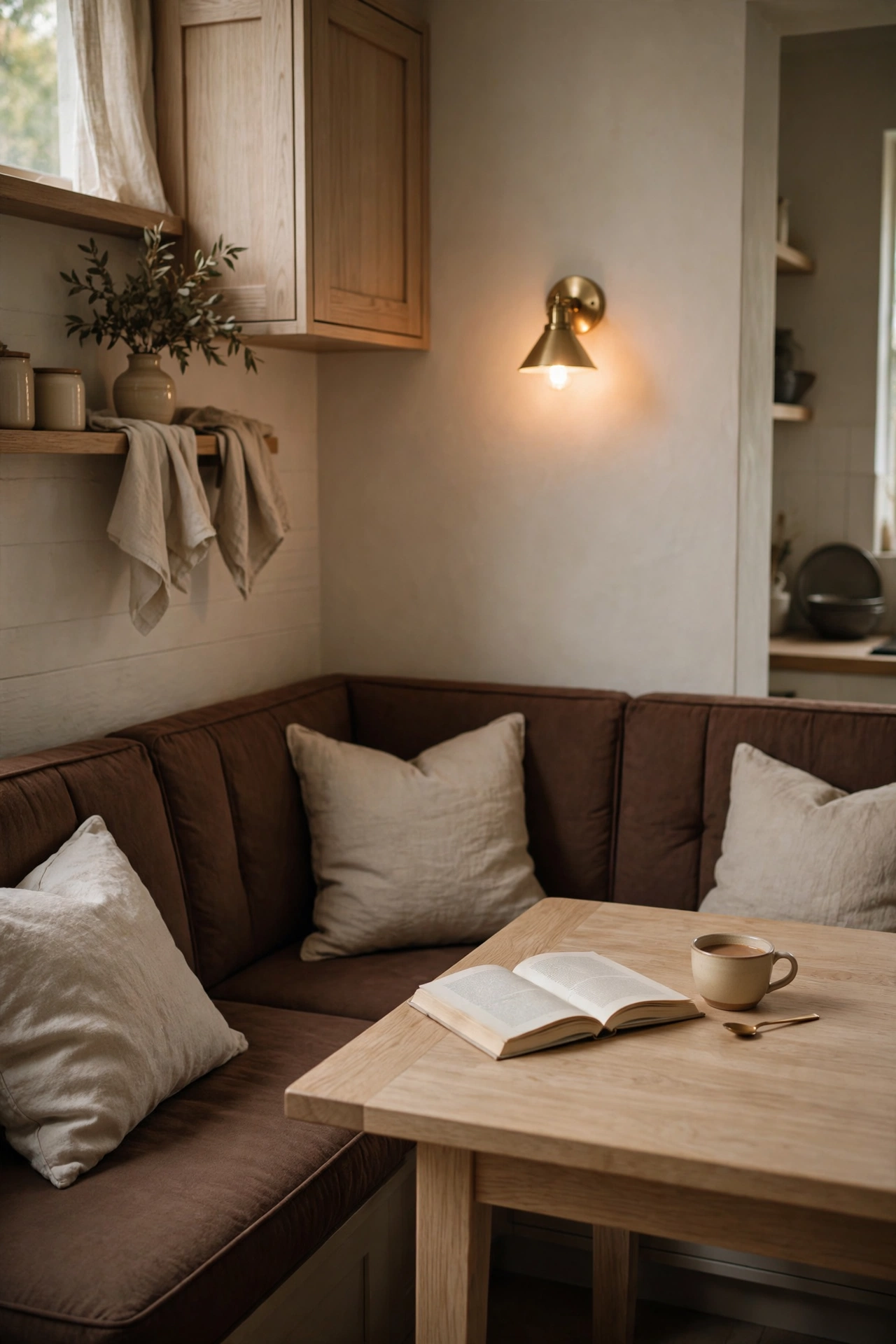
A built in banquette in chocolate brown with natural linen cushions is the coziest seat in the house. Add a white oak table, a small brass sconce glowing on the wall, and suddenly the kitchen has a living room corner. Homework happens here. Long coffees happen here. Midnight snacks definitely happen here.
Dark upholstery is the smart choice for a banquette. It hides everything life throws at it. The linen cushions keep it soft and touchable. And the brass sconce gives it that evening glow that makes everyone want to linger.
If you are short on space, a banquette actually seats more people than chairs. It tucks against the wall and frees up the walkway. Small kitchens, take note.
19. Golden Hour in an Ivory Kitchen
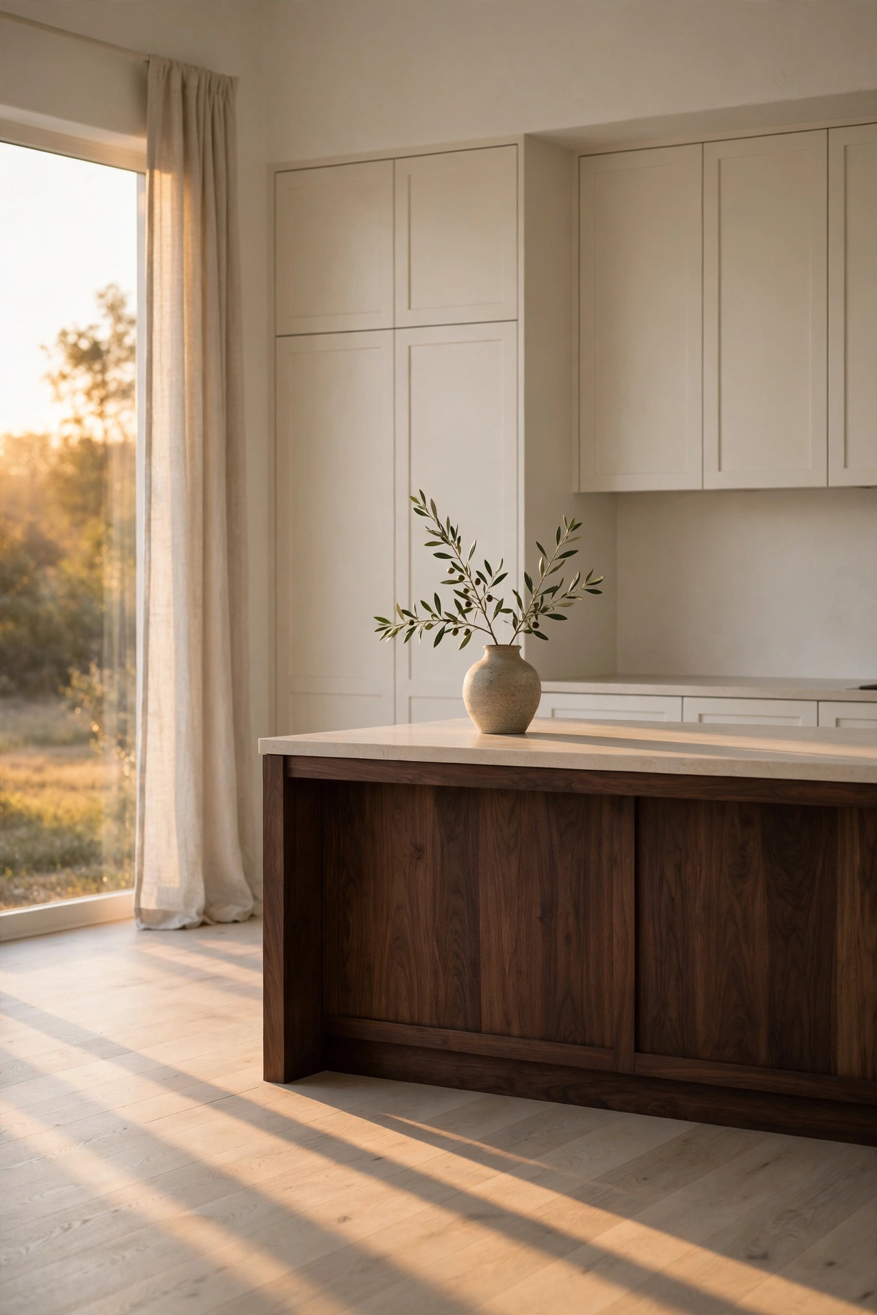
We are ending where we began. With light. An ivory kitchen at golden hour, a dark walnut island, one olive branch in a stoneware vase, and long shadows stretching across white oak floors. Nothing styled to death. Nothing competing. Just a quiet room doing what it does best.
This is the whole philosophy in one image. One dark note grounds the room. Warm materials do the rest. You do not need nineteen ideas. You need the right palette, good light, and the confidence to leave some space empty.
Start with one change. Paint the island. Swap the hardware. Add the brass pendant. Soft contrast is forgiving that way. Every small move in the right direction makes the room feel warmer.
More Favorites
This post contains affiliate links. If you buy through them, I may earn a small commission at no extra cost to you.
A few more favorites from the ideas above:
Bring the warmth home
You do not need all 19 ideas. Please do not try all 19 at once. Pick the one that made you exhale when you saw it. Maybe it is the walnut island. Maybe it is the little burgundy coffee nook that feels like a secret. Start there.
The formula for a soft contrast kitchen is simpler than it looks. Warm white on the big surfaces, one dark note to ground the room, wood and brass and linen to keep everything soft. Contrast should whisper, not shout. Wood is the warm neutral that makes dark feel soft. Keep those two ideas in your pocket and you cannot go wrong.
If this palette has you wanting more, my light and airy spring farmhouse kitchen post keeps the brightness going, and the Soft Contrast Kitchen design guide has the full palette and pairings if you want to go deeper.
Start with one dark note, warm it up with brass, and let the evening light do the rest. Your kitchen will thank you.
With love and light
Get Fresh Home Ideas Every Week
Seasonal decor ideas, organizing tips, and cozy home inspiration, straight to your inbox.
More Kitchen Ideas You Will Love
Keep browsing for more seasonal inspiration: