
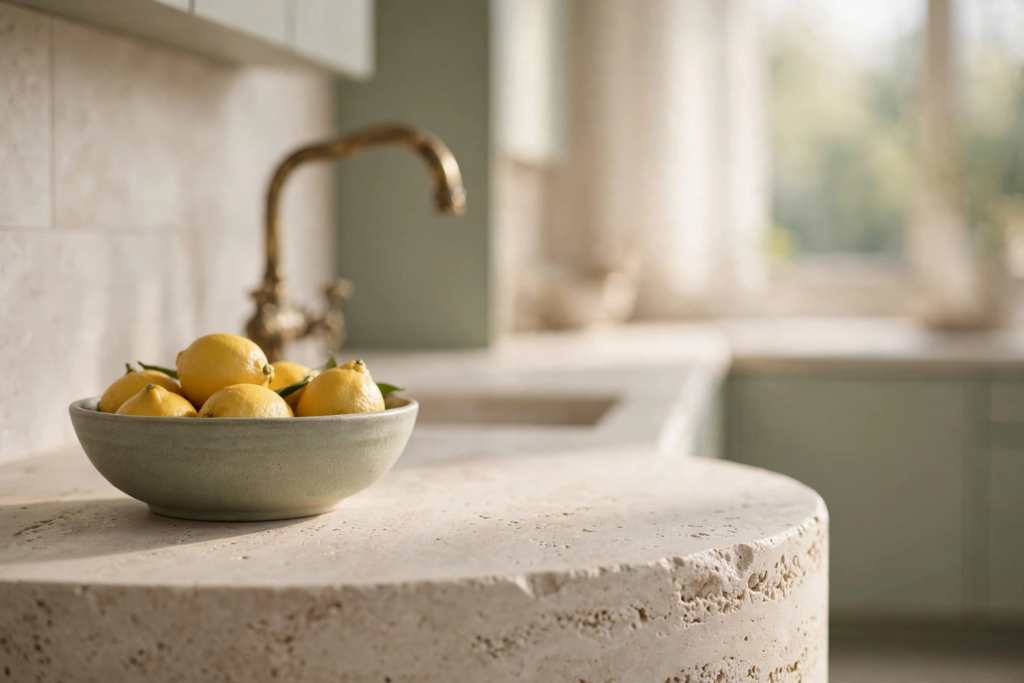
Picture your kitchen on a quiet Sunday evening. The light is low and golden. Something garlicky is roasting in the oven. The stone counters are cool under your palms. The room feels calm and a little bit glamorous, like a flat in Milan crossed with a farmhouse in Provence. That is the feeling I chase in every kitchen I design. Not cold and minimal. Not fussy and traditional. Just warm, tailored, and quietly luxurious.
That feeling has a name. European contemporary. It is the style behind all those kitchens you save and cannot explain. Flat front cabinets with no visible hardware. Honed stone that looks like it was cut from a hillside. Warm wood everywhere. Brass that glows like candlelight. It is having a real moment right now, and honestly it deserves it. After years of cold gray minimalism, everyone is craving rooms with soul again. The whole philosophy rests on one sentence I say to every client. Let the materials be the decoration. When the stone is beautiful and the wood is warm and the brass has a patina, you do not need much else. The room dresses itself.
I spent weeks studying this look until I had 19 kitchens that get it exactly right. Some are full renovations. Some are a single weekend and a brave paint choice. Every one of them feels like that Sunday evening. And if you want to understand the style from the ground up, my European Contemporary Kitchen design guide walks through the palette, the materials, and the rules that make it work.
Let us start with the bones, because in this style the architecture does the heavy lifting.
Love these ideas? Get more every week.
Join the newsletter for seasonal decor and cozy home inspiration.
The bones come first
European contemporary kitchens are built, not decorated. The cabinetry is flat and quiet. The appliances hide. The lines run long and unbroken. Get these five ideas right and everything you layer on top will sing.
1. Handleless Walnut Slab Cabinets
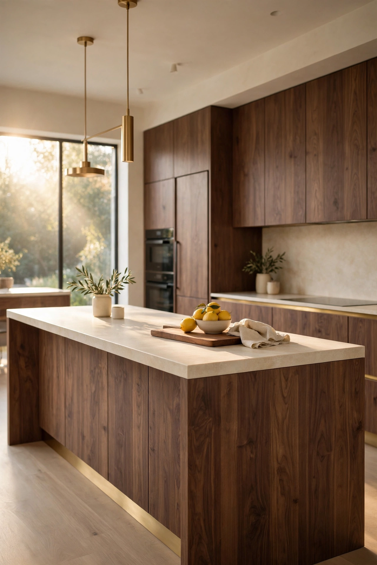
This is the kitchen I picture when someone says European contemporary. Flat walnut slab cabinets with no handles at all. You open them with a fingertip on a beveled edge or a soft push latch. The fronts run in one long unbroken plane, and the grain of the walnut flows across them like water. Then the island. A waterfall of the same walnut, dropping straight to the floor, topped with honed cream stone.
What makes it work is restraint. One hero per kitchen. Here the hero is the wood itself, so everything else whispers. The walls are warm white limewash. The floor is pale oak. The only jewelry is a thin brass toe kick that catches the light when you walk in. It sounds simple. It is anything but. The beauty is in the precision. Every edge lines up. Every gap is even. That quiet perfection is what makes the room feel expensive.
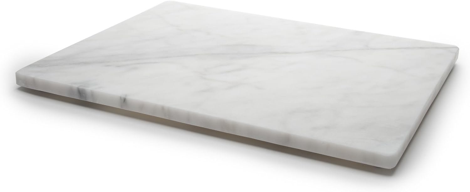
Style it the way a Milanese nonna would. Almost nothing on the counters. A wooden cutting board leaning against the stone. A small bowl of lemons. Maybe a linen towel folded over the oven rail. The room is already saying everything it needs to say.
Shop This Look
This post contains affiliate links. If you buy through them, I may earn a small commission at no extra cost to you.
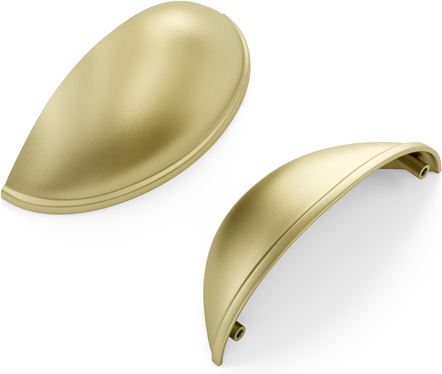
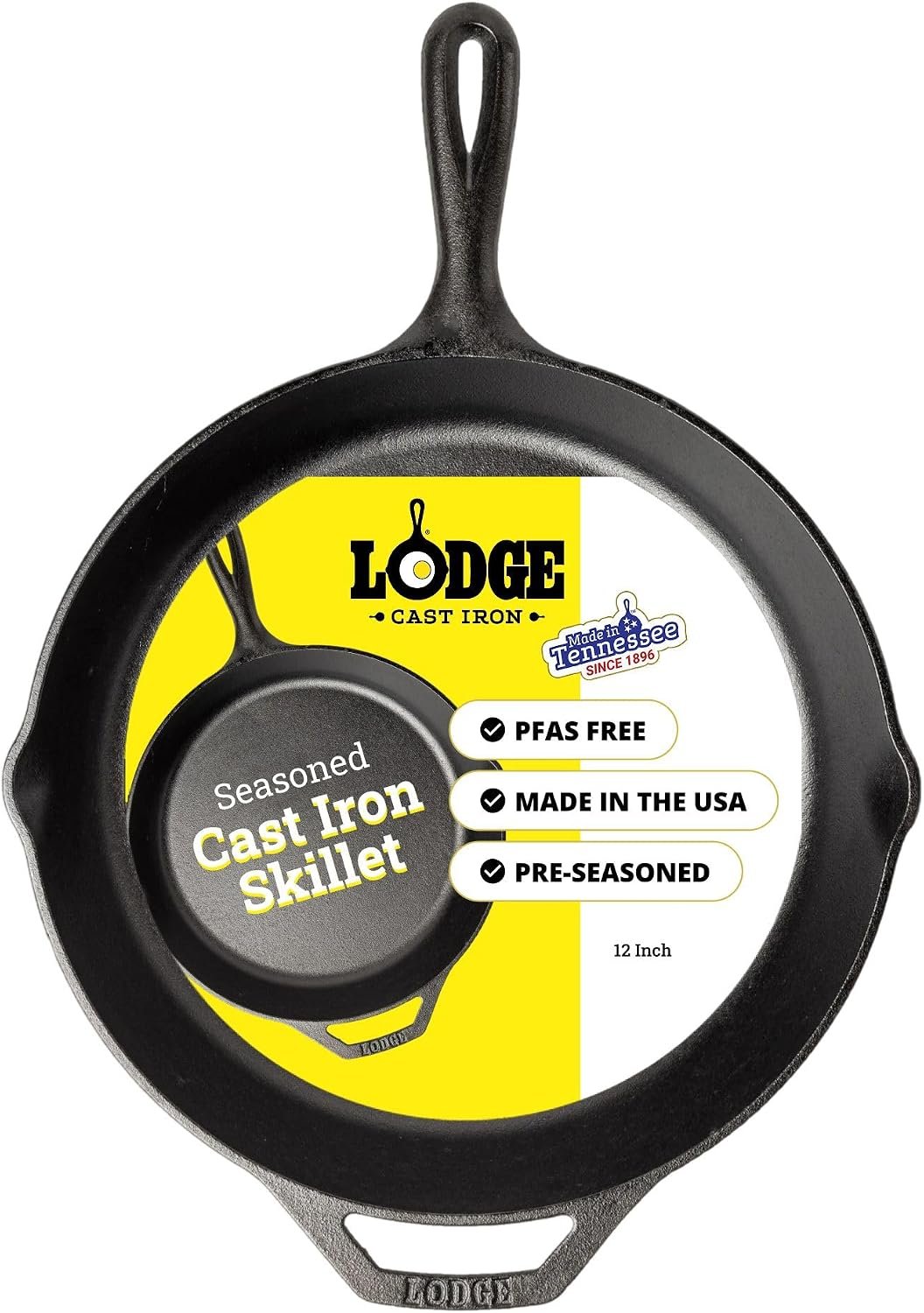
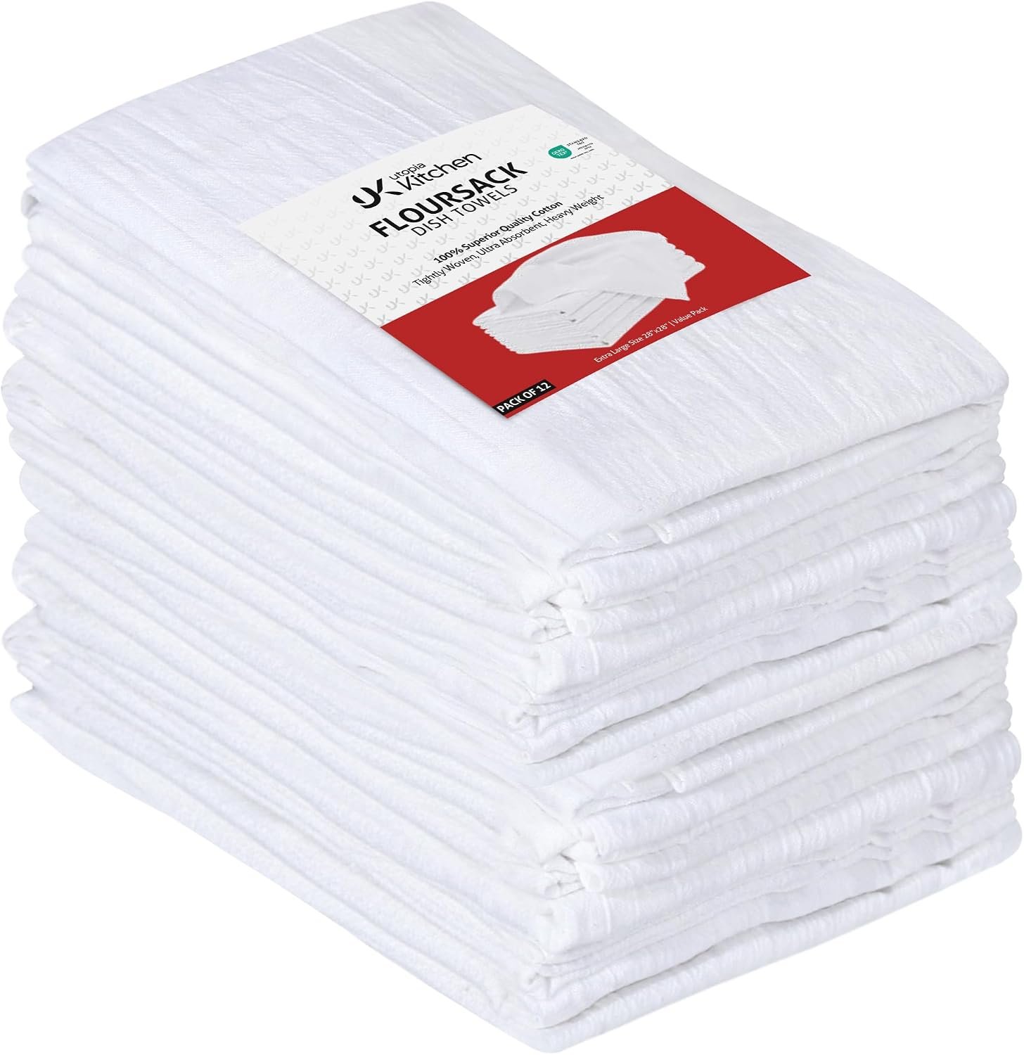
A few favorites featured in the ideas above:
2. The Fluted Oak Island
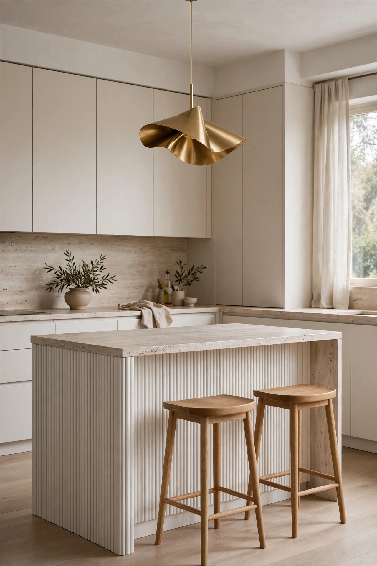
If flat slabs feel too quiet for you, fluting is your answer. A fluted oak island front has all that beautiful vertical rhythm, like corduroy made of wood. It catches light and shadow all day long, so the island changes as the sun moves. Pair it with warm white flat front perimeter cabinets and a honed travertine top, and you have texture without clutter.
Fluting is one of those details that reads as custom even when it is not. You can buy fluted panels and apply them to a standard island base. The trick is keeping the flutes fine and even, not chunky. Fine flutes feel European. Chunky flutes feel like a tiki bar. Stain the oak in a medium warm tone so it glows against the white cabinets.
I love this island with two simple oak stools and one sculptural pendant above. Nothing else. The fluting is the whole show. Let the materials be the decoration. That is the principle working right here in front of you.
3. Appliances That Disappear
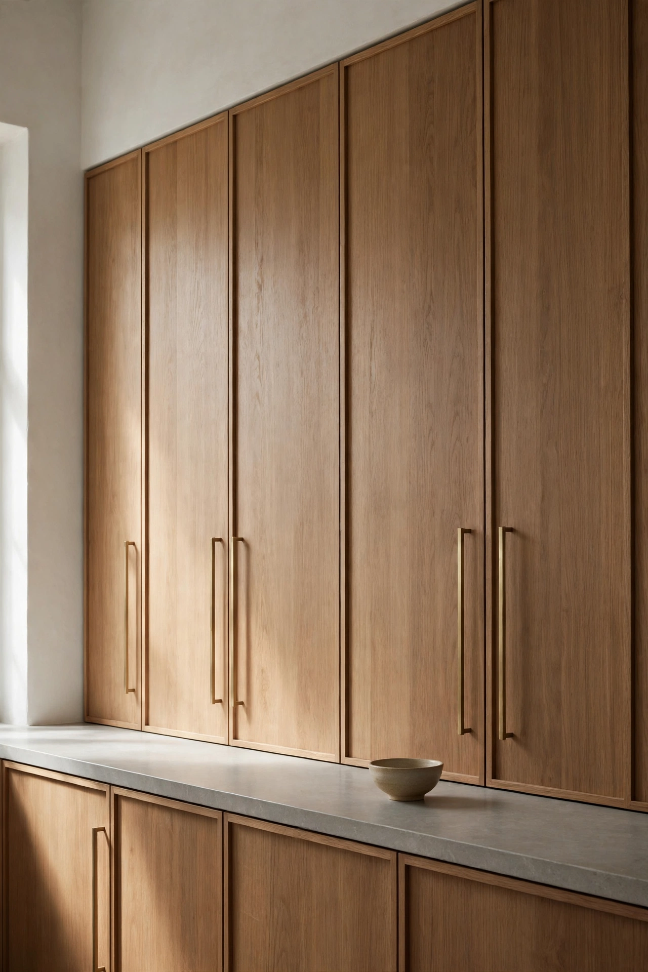
The most European thing you can do in a kitchen is make the appliances vanish. Panel ready fridge behind oak fronts. Dishwasher disguised as a cabinet. Even the ovens tucked into a tall run of walnut so the wall reads as furniture. Hide the work, show the beauty. That is the whole idea.
This works best when you commit fully. One paneled appliance next to a stainless range looks like a mistake. All paneled, all the way, and the kitchen becomes a calm run of wood and stone with no visual noise. The fridge handles are the giveaway, so use long slim brass pulls or integrated channels that match the cabinetry.
The payoff is a kitchen that feels like a living room. You can host a dinner party and the kitchen does not scream kitchen. It just glows quietly in the background while everyone talks. If you entertain a lot, this is the single best investment on this list.
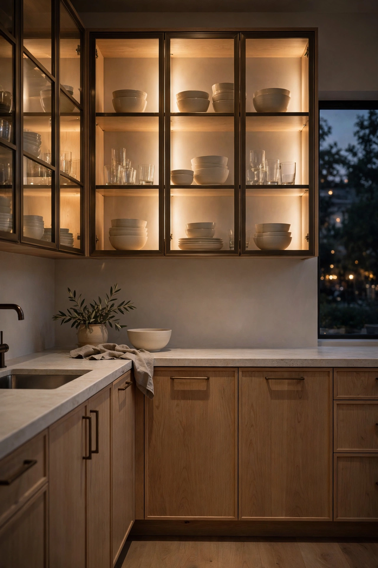
4. Glass Front Cabinets That Glow
Every European contemporary kitchen needs one moment of softness, and lit glass cabinets are it. Take one run of upper cabinets, glaze the fronts, and put warm interior lighting inside. Fill them with cream stoneware and clear glass, nothing colorful, nothing cluttered. At night the whole wall glows like a lantern.
The styling inside matters more than the cabinets themselves. This is not the place for your mismatched mugs. Stack white bowls. Line up simple glasses. Leave breathing room between groups. The lit interior turns everyday dishes into a display, which is very European. Beautiful things you actually use, shown off instead of hidden.
Keep the frames slim and dark. Bronze or blackened steel frames around the glass look tailored and modern. And put the lights on a dimmer. Full brightness for cooking, low glow for evenings when the kitchen becomes the backdrop to dinner.
5. The Long Galley with Steel Windows
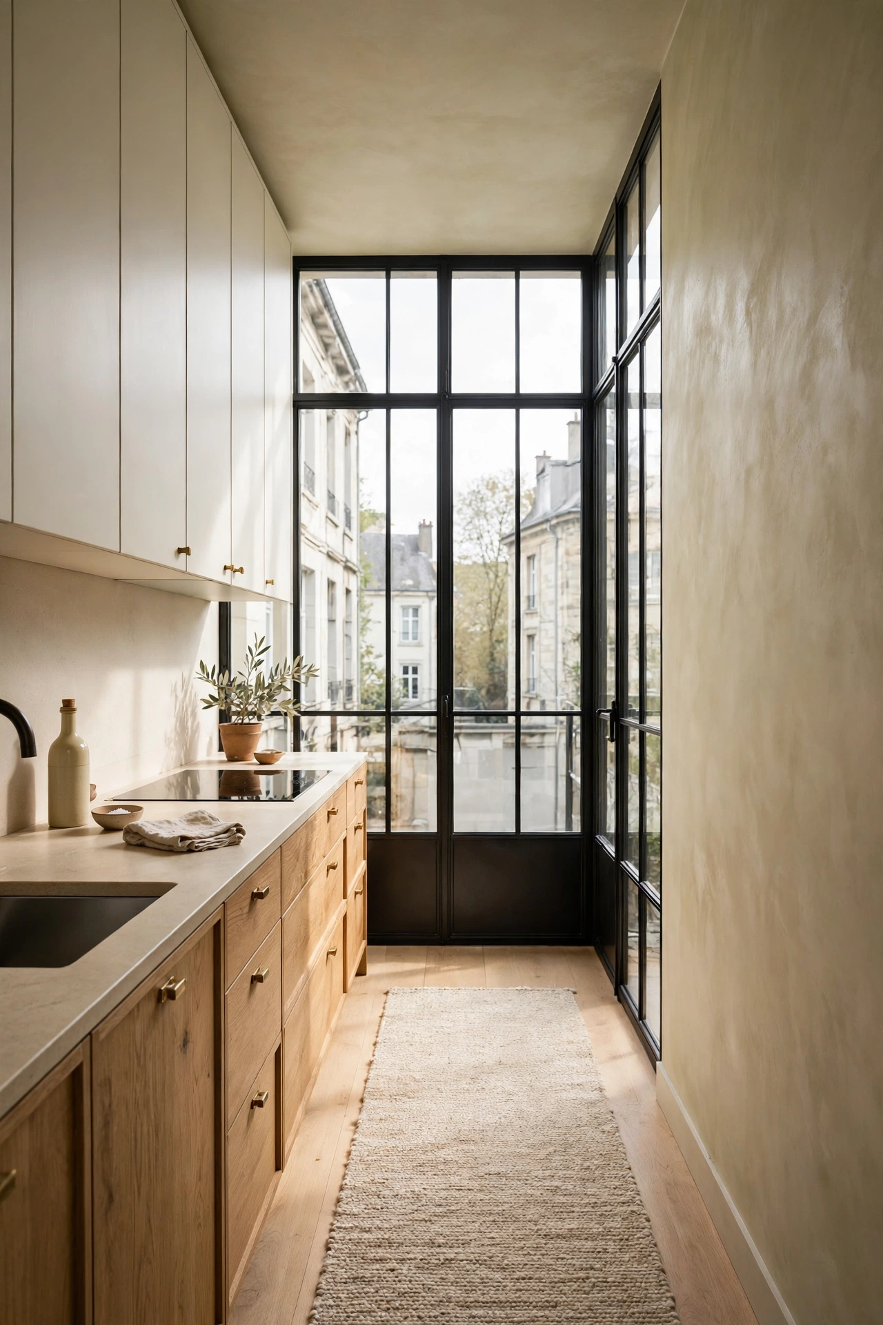
Not every kitchen is big, and European contemporary loves a small space done well. A long galley with black steel framed windows at the end is pure magic. The windows pull the eye through the room and flood it with light. Oak lower cabinets keep it warm. Warm white uppers keep it bright. Limewash walls add that soft old world texture.
The trick in a galley is keeping one side quiet. Put all the tall storage and appliances on one wall. Keep the other side low and simple, just lowers and a beautiful stone counter. The room feels twice as wide when one side stays below eye level. A long runner in oatmeal wool softens the floor and ties it together.
I adore this layout for real life. Everything is within two steps. Cooking in a galley is efficient in a way big kitchens never are. You pivot, not marathon. And those steel windows make washing dishes feel almost romantic. Almost. Small does not mean lesser. It means every choice matters more.
Stone does the talking
In European contemporary design, stone is not a surface. It is the jewelry, the art, and the architecture all at once. These five ideas let the stone carry the room.
6. A Full Slab Travertine Backsplash
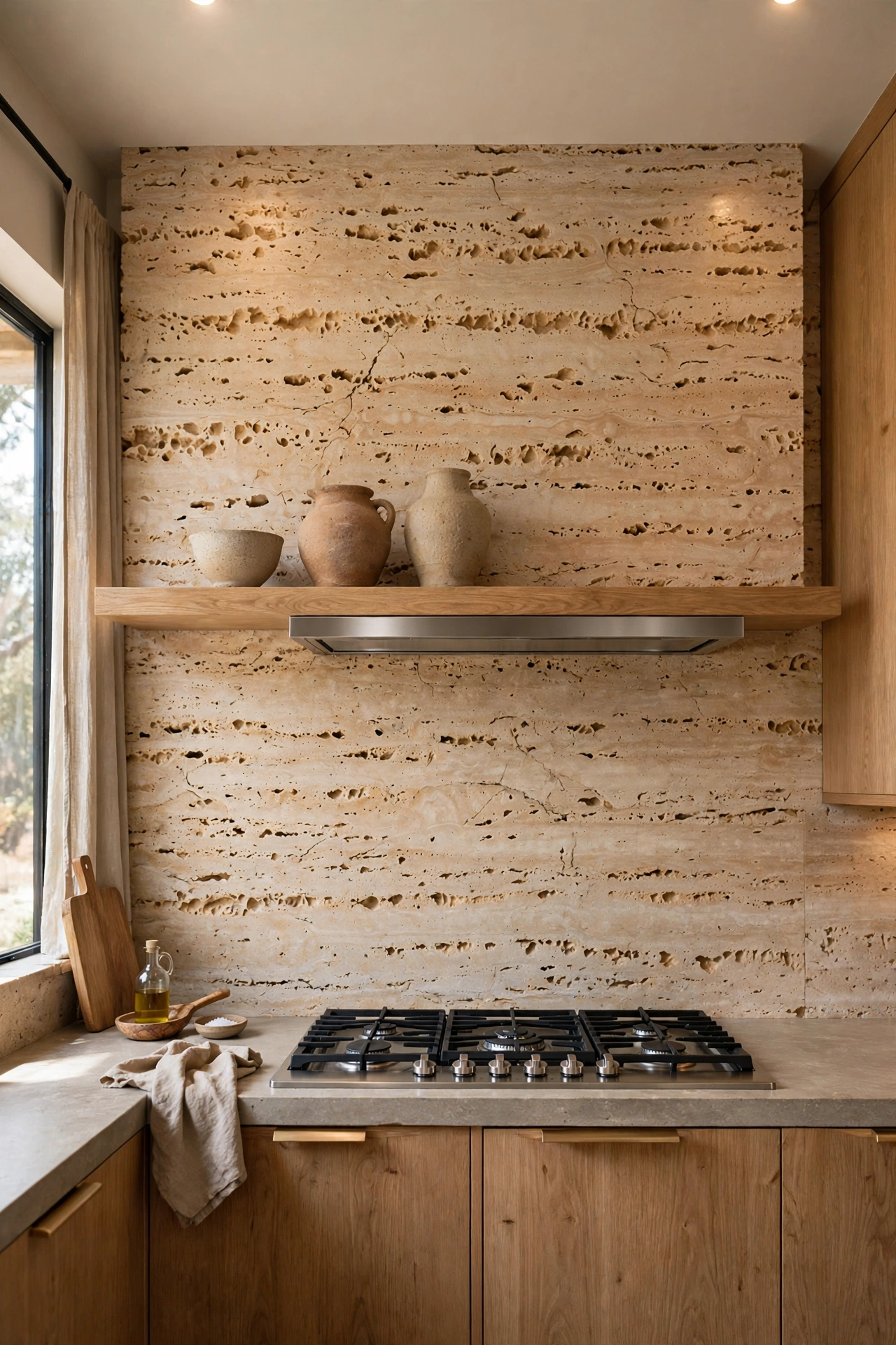
Forget little subway tiles. Run one full slab of travertine from the counter to the ceiling behind the range. No grout lines. No pattern. Just one continuous sweep of warm stone with all its natural pitting and veining. It looks like the wall was carved, not built.
Travertine is warm in a way marble sometimes is not. It has honey and oatmeal tones baked right in, so it glows against oak cabinets and brass fixtures. The filled and honed finish is the practical choice. It wipes clean and does not trap cooking splatter the way unfilled stone can. Behind a range, always go filled and honed.
Pair it with a floating oak shelf and three pieces of handmade pottery. That is all the styling this wall needs. The stone is doing the talking. You just have to give it room to speak.
7. One Dramatic Veined Marble Moment
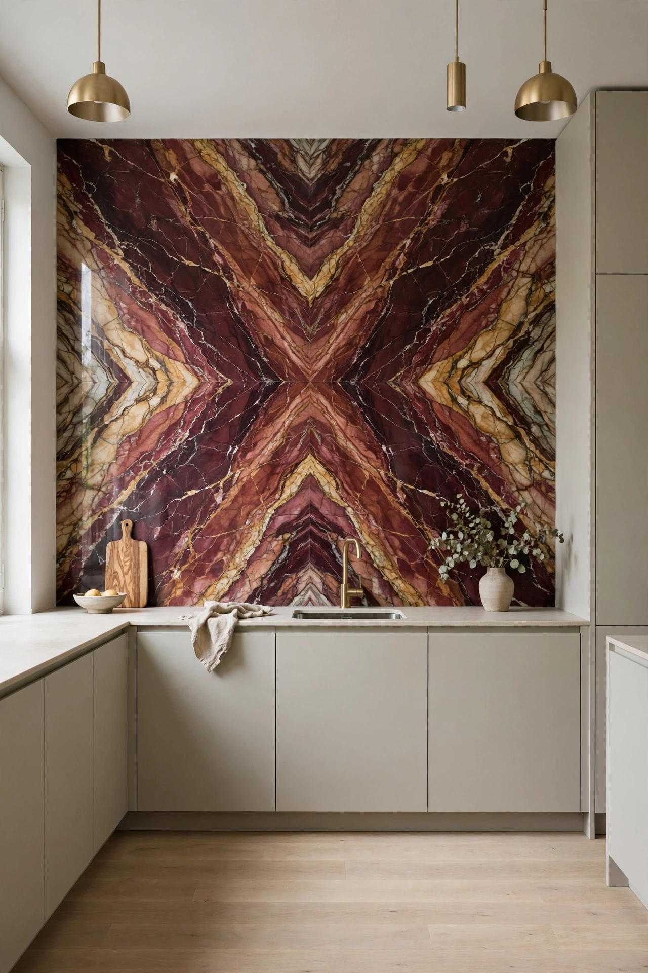
Here is where contrast becomes seasoning, not the meal. One wall, one splashback, one unforgettable slab of marble with bold burgundy and gold veining. Everything around it stays quiet. Oatmeal flat front cabinets. Pale oak floors. Brushed brass faucet. The marble gets the spotlight and nothing competes.
The key is choosing veining with warm undertones. Burgundy, rust, caramel, gold. Cool gray veining will fight the warm palette and turn the room chilly. Hold the sample against your cabinet color in daylight before you commit. Warm veins plus warm cabinets equals magic.
This is also the smartest place to spend money in the whole kitchen. One dramatic slab costs less than marble everywhere, and it has ten times the impact. Guests will remember this wall long after they forget the cabinets.
8. Microcement Floors Under Warm White Walls
Microcement is the quiet luxury of European floors. It is a thin cement coating troweled over your existing floor, seamless from wall to wall. No grout. No breaks. Just one continuous surface in warm greige that flows under the cabinets like still water. It makes the whole kitchen feel bigger and calmer at once.
The color choice is everything. Go warm. A greige with oatmeal undertones, never cold gray. Cold gray microcement turns a kitchen into a parking garage. Warm greige turns it into a gallery. The matte finish drinks the light instead of reflecting it, which is exactly the soft glow this style wants.
It is also wonderfully practical. Seamless means nothing for crumbs to hide in. It is warm underfoot with radiant heat. And it pairs with literally everything in this post. If you are renovating down to the studs, this floor is worth every penny.
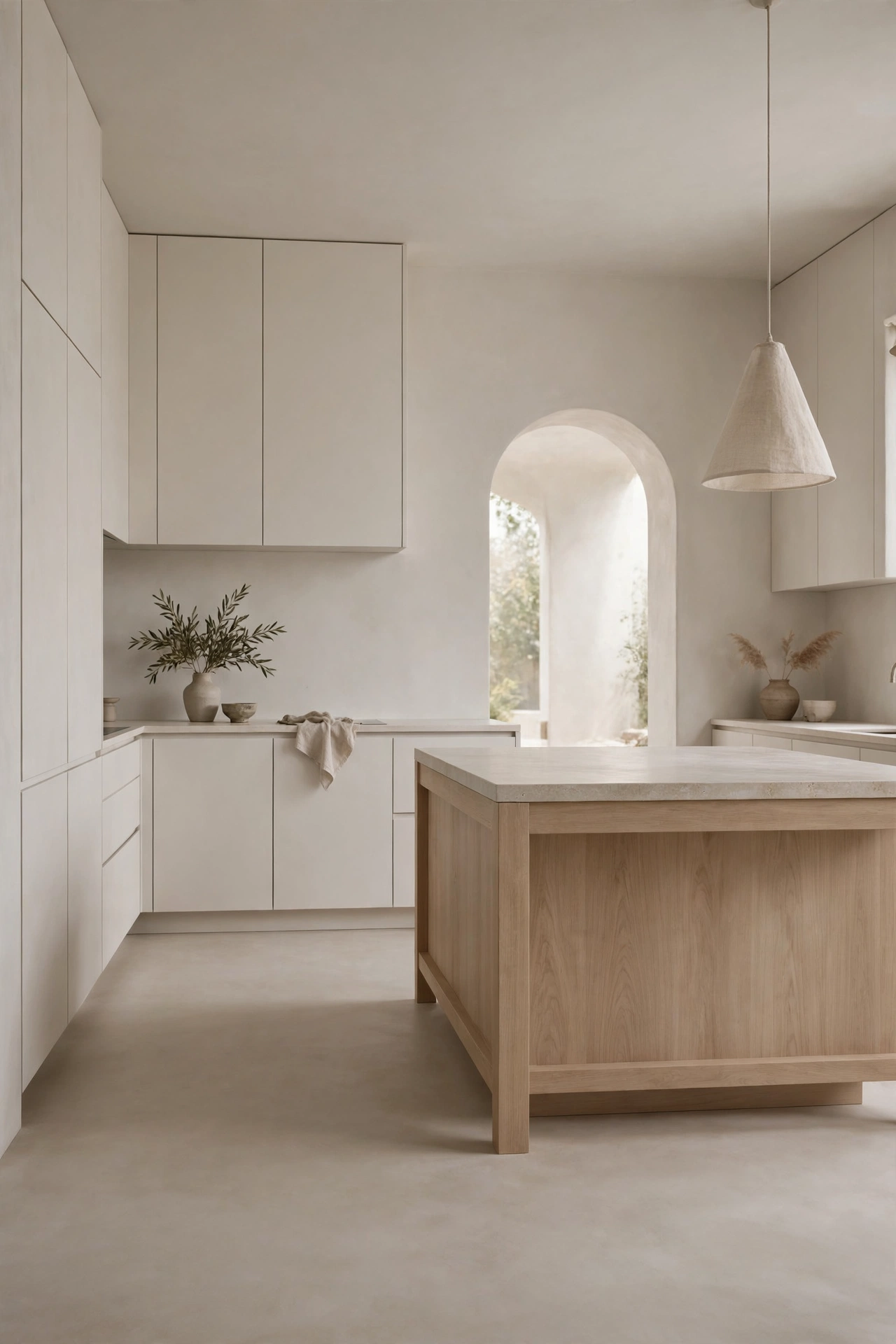
9. The Chocolate Plaster Range Alcove
Every kitchen needs one moment of drama, and this one puts it over the fire. A range alcove wrapped in chocolate brown plaster, hand troweled, with a thick oak mantel shelf. It is earthy and sculptural at once. Like something in an old villa, except it works perfectly in a new build too.
The magic is in the texture. Hand troweled plaster catches light in the softest way, so the alcove glows instead of looming. Chocolate brown is the bravest dark in this post, and the plaster keeps it warm instead of heavy. Set a row of brass framed art or simple stoneware on the oak shelf and the whole wall feels collected over years.
Plaster also ages beautifully. It develops a patina instead of showing wear. If you cook big messy Sunday sauces like I do, this wall forgives everything. Contrast is a seasoning, not the meal, and this alcove is the perfect pinch.
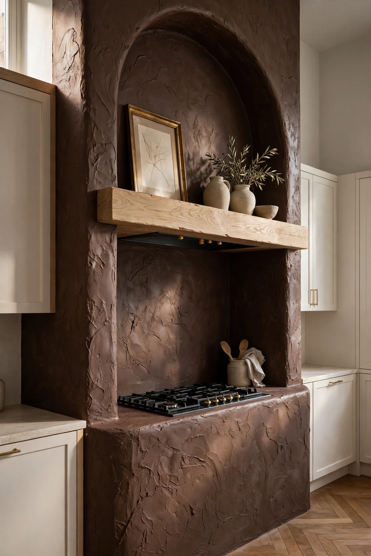
10. The Oversized Honed Island
Go big. A truly oversized island in honed marble or limestone, seating for six, room to roll pasta on one end while someone chops on the other. In European kitchens the island is not a feature. It is the room. Everything orbits around it.
Honed is the key word. Polished stone is shiny and formal. Honed is matte and soft, with a depth that makes you want to touch it. It also hides real life. Water rings, crumbs, the chaos of Tuesday dinner. All of it disappears into the matte finish in a way polished stone never allows.
Keep the base simple so the stone shines. Flat panel cabinets in warm white or pale oak. A row of three brass pendants above, hung low enough to feel intimate. And leave one end clear of stools. That open stretch is your workspace, your buffet, your homework station. The hardest working six feet in the house. When friends come over, this is where everyone gathers without being asked. The island does the hosting for you.
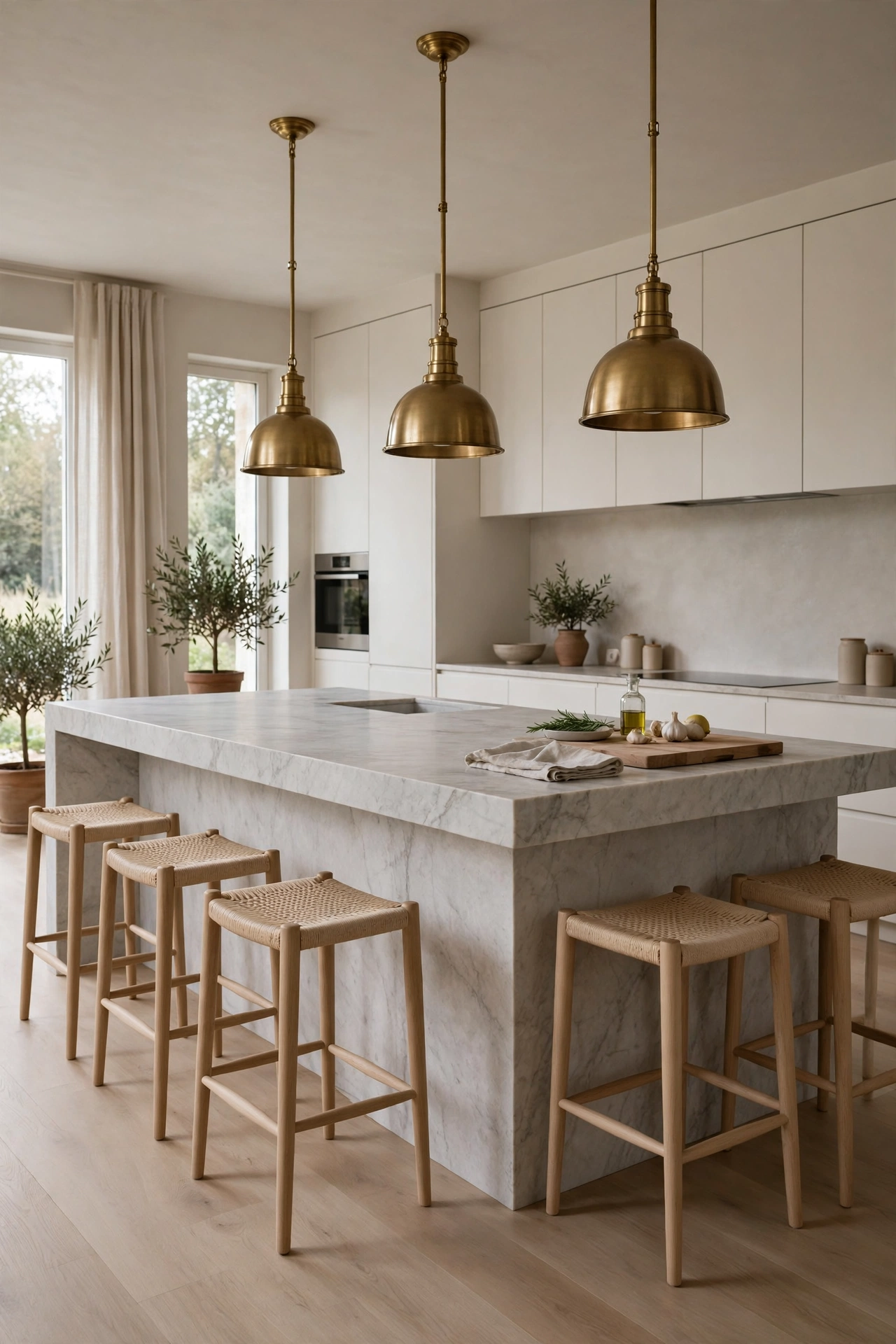
Warmth, wood, and light
Stone gives the kitchen its bones. These five ideas give it a heartbeat. Wood, brass, linen, and light layered until the room glows.
11. Aged Brass at the Sink
The faucet is the jewelry of the kitchen, so make it count. An aged brass bridge faucet with cross handles, mounted on a deep apron front sink, set into honed stone. It looks like it belongs in a Paris apartment, and it makes the most mundane task feel a little bit ceremonial.
Aged brass is the finish to choose, not polished. Polished brass is bright and a little bit loud. Aged brass has depth and shadow. It looks like it has stories. It also hides water spots beautifully, which matters at a hardworking sink. Pair it with a simple brass rail on the wall for hanging a linen towel and a wooden brush.
Keep everything else at the sink quiet. No cluttered windowsill. No sponge caddy chaos. One beautiful soap dispenser, one small plant, done. The brass is the whole show.
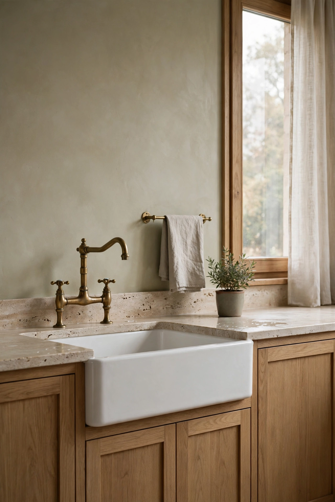
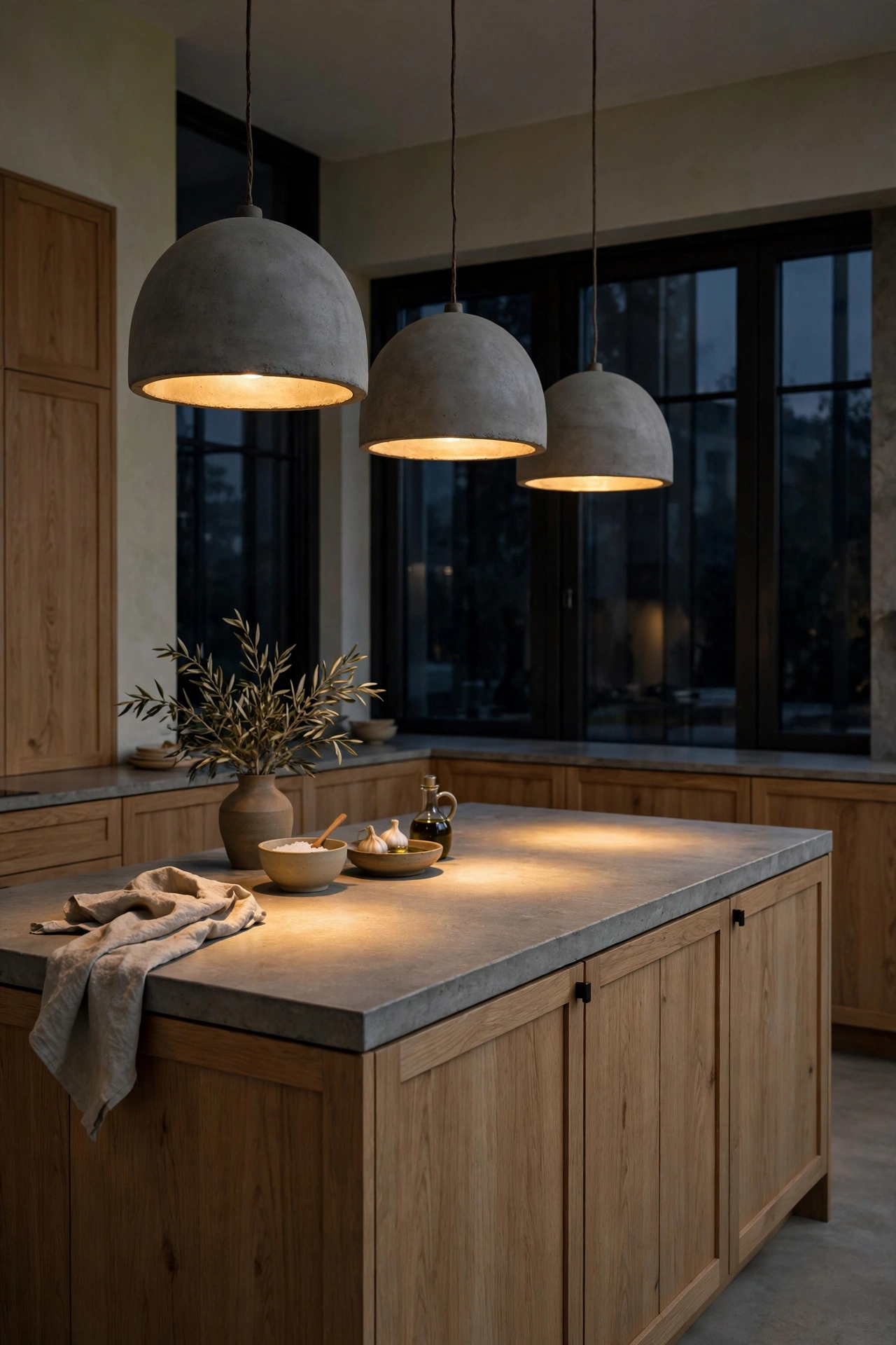
12. Concrete Pendants with a Soft Glow
Over the island, hang pendants with weight. Concrete or cast plaster pendants in soft dome or drum shapes. They are sculptural by day and pure atmosphere by night. The heavy material says permanence. The warm bulb inside says come sit down.
Scale matters more than style here. In a European contemporary kitchen, pendants should feel substantial. Small glass minis get lost over a big island. A concrete dome has presence. It anchors the island the way a good light fixture anchors a dining table. Hang them low, around thirty inches above the counter, so the light pools on the stone.
Put them on a dimmer. Everything in this post goes on a dimmer. Bright for chopping, low for lingering. That one switch is the difference between a kitchen and an evening.
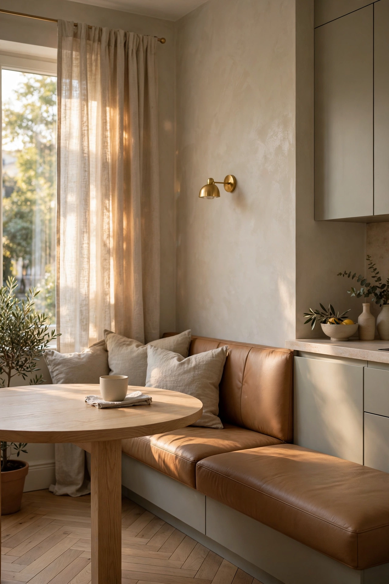
13. The Camel Leather Banquette Nook
Tuck a banquette into the sunniest corner and watch it become the favorite seat in the house. Camel leather upholstery, a round white oak table, oatmeal linen curtains filtering the light. It feels like a corner table at a tiny restaurant in Rome, except the coffee is free and the company is yours.
Camel leather is the perfect banquette material. It is warm, it is durable, and it gets better with every year. Scratches and softening just add character. Darker than tan, lighter than chocolate, it sits beautifully against oak and stone. The round table matters too. No corners to bump, everyone faces everyone, conversation flows.
Build storage into the base. Deep drawers under the seat swallow table linens, placemats, and the board games that migrate to every kitchen table. And add one small brass sconce on the wall. That evening glow is what turns a breakfast corner into a midnight corner.
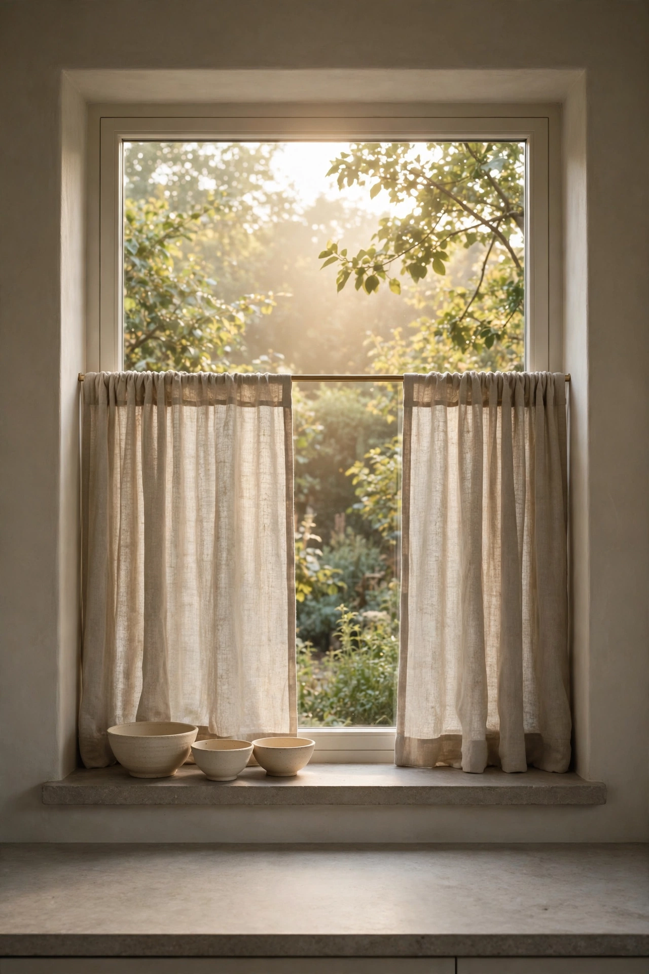
14. Oatmeal Linen Cafe Curtains
The softest idea on this list is also the cheapest. Oatmeal linen cafe curtains on a slim brass rod, covering just the lower half of the kitchen windows. They filter the light into something golden and hazy. They add movement and softness to a room full of hard surfaces. They cost almost nothing and change everything.
Cafe length is the key. Full length curtains in a kitchen feel fussy and get dirty. Cafe curtains give you privacy and glow while leaving the top of the window open to the sky. The linen should be washed and rumpled, never crisp. Crisp linen belongs in a hotel. Rumpled linen belongs in a home.
Hang the rod a few inches above the window frame and let the curtains just kiss the sill. One panel per window is enough. This is softness, not drapery. And when the evening sun hits them, the whole kitchen turns to honey.
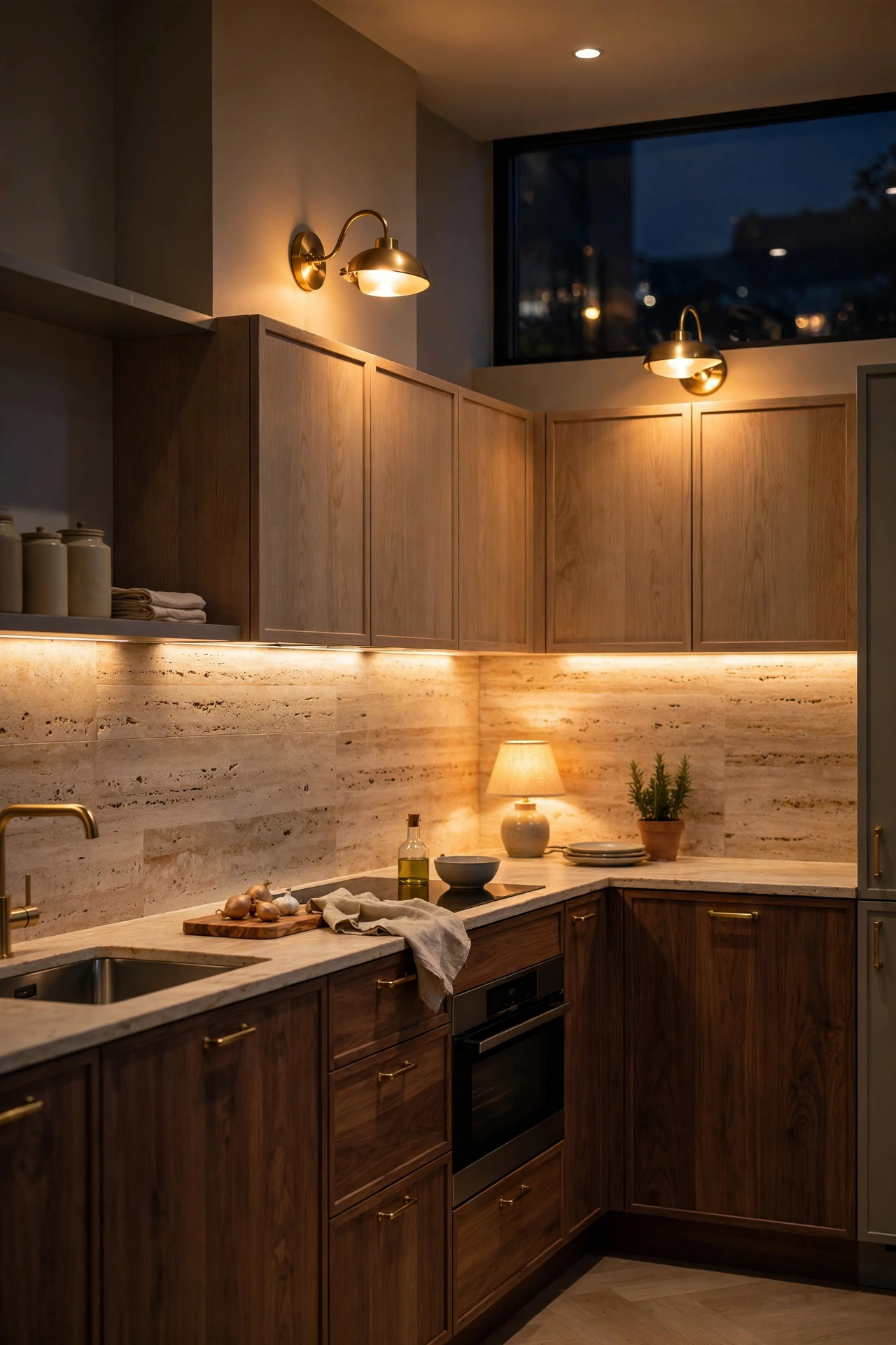
15. Layered Evening Lighting
Here is the secret nobody tells you about those glowing European kitchens. It is not one light. It is five. Pendants over the island. A brass sconce by the banquette. Warm strips under the upper cabinets. A tiny lamp on the counter. Maybe a candle or two. Layered light is what makes a kitchen feel like evening instead of like an office.
The rule is simple. No single overhead light after six o clock. Overhead light flattens everything and kills the mood. Instead, turn on the small warm sources and let the room go golden. Undercabinet strips wash the backsplash with light. Sconces paint the walls. The little counter lamp makes the whole kitchen feel like a living room.
Every light goes on a dimmer, and every bulb stays around 2700K. That warm temperature is what makes walnut glow and brass shimmer and travertine look like honey. Cool white bulbs will undo every beautiful choice in this post in one click. Do not let it happen.
The collected layer
The bones are built. The stone is in. The light glows. Now comes the part I love most. The collected layer that makes it feel like a home, not a showroom.
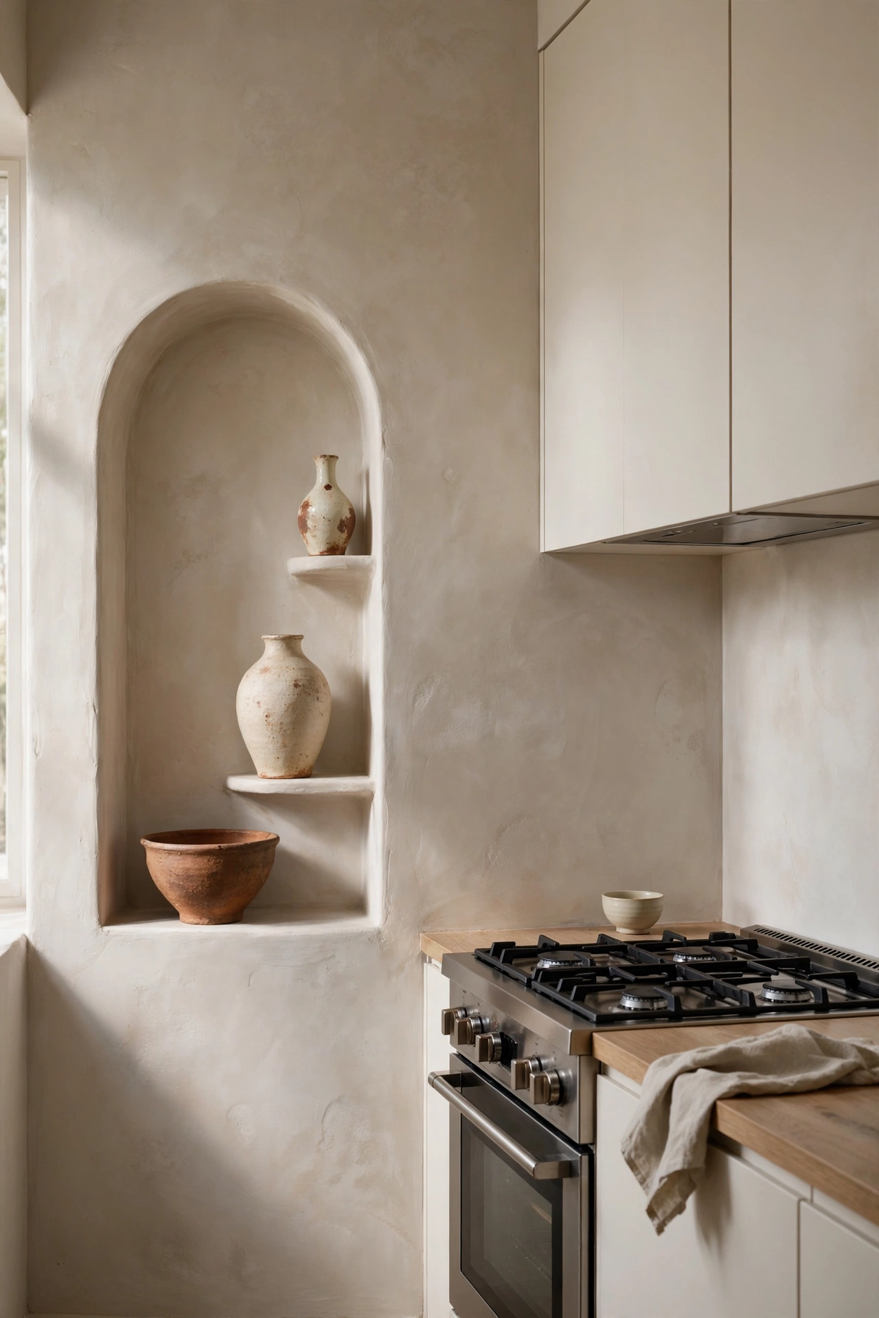
16. The Arched Plaster Niche
Arches are the signature curve of European design, and a plaster niche is the loveliest way to bring one into the kitchen. Carve an arch into the wall beside the range or over a counter run. Plaster it smooth. Set three pieces of handmade pottery inside. Done. It is architecture and art in one move.
The arch softens everything around it. All those flat cabinet fronts and straight stone lines need one curve to lean against. The plaster texture catches the light differently than the flat walls, so the niche glows a little. Keep the styling minimal. Three objects, different heights, one material family. A tall vase, a low bowl, something in between.
This is a weekend project if you are handy, or a small job for a plasterer. Either way it reads as original architecture. Guests will assume it was always there. That is the highest compliment a detail can get.
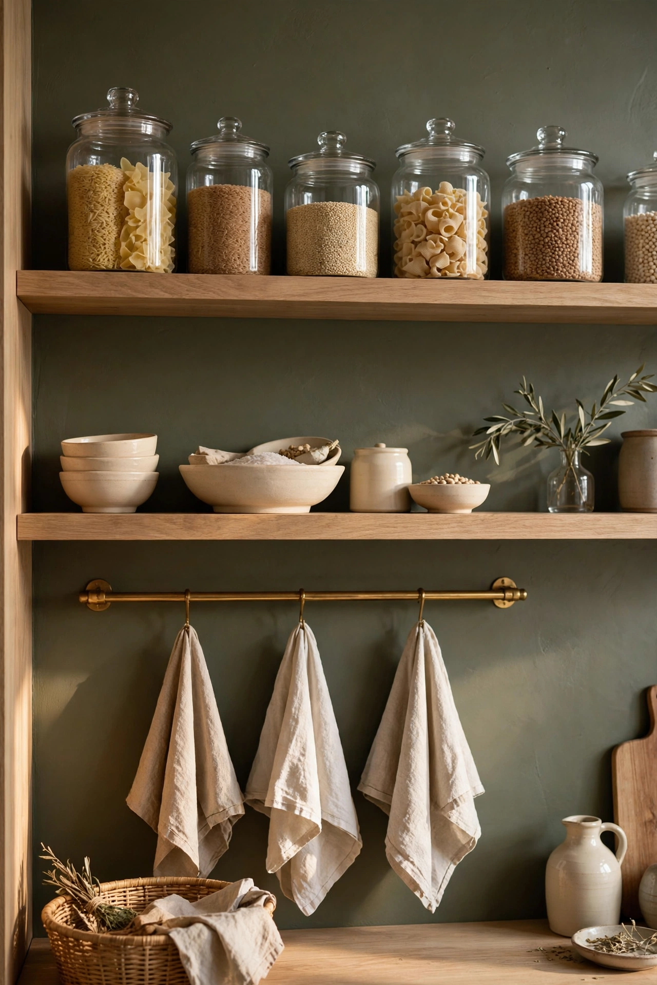
17. The Olive Pantry Wall
Paint one wall olive and watch the whole kitchen relax. A deep muted olive on the pantry wall or the back of open shelving is color for people who are scared of color. It reads as a neutral. It loves oak, brass, cream stoneware, and warm white. It makes everything around it look richer.
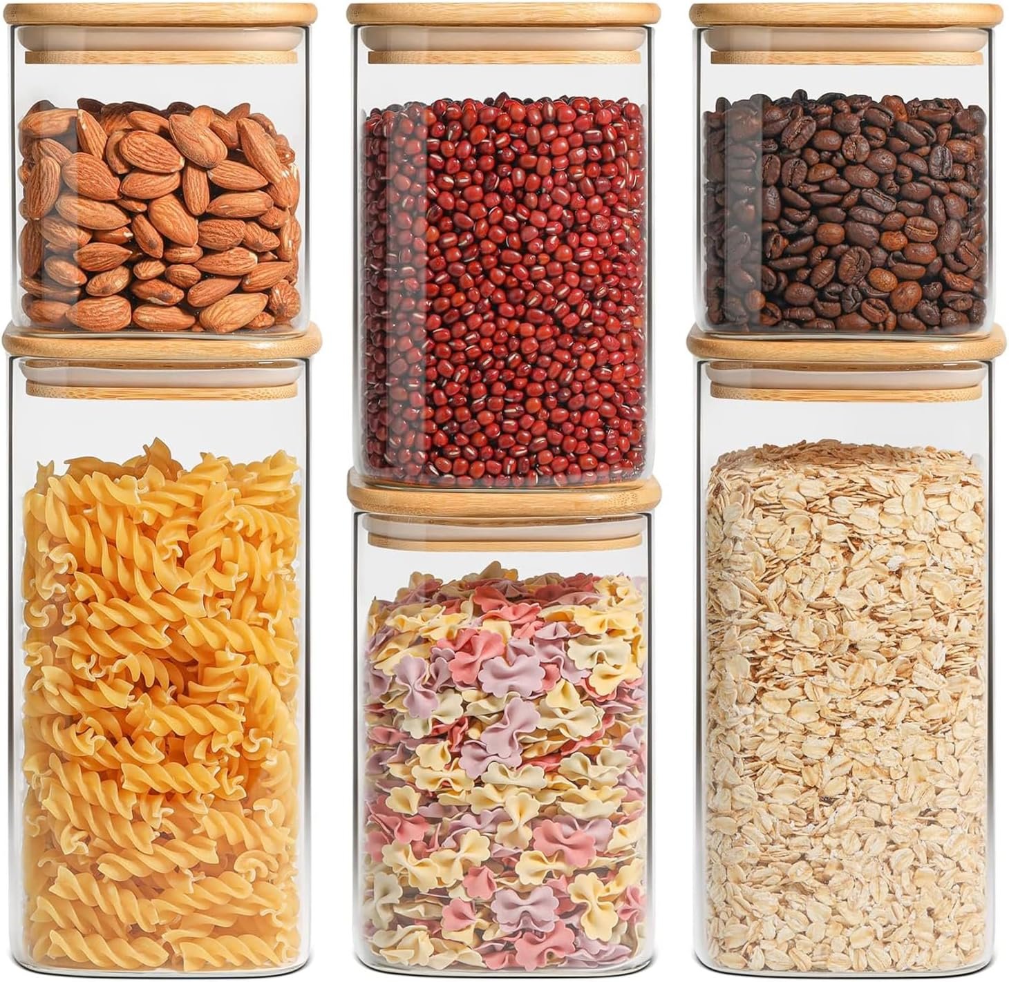
Style open oak shelves against the olive with everyday beautiful things. Glass jars of grains and pasta. Cream stoneware bowls stacked simply. A brass rail underneath for hanging linen towels and a wooden spoon or two. This is the European way. Useful things, shown off, becoming the decor. Hide the work, show the beauty.
Olive also photographs beautifully in every light. Morning, noon, evening. It never goes flat or cold. If you want one brave move in your kitchen, this is the one I would pick. Paint is cheap. Regret is rare.
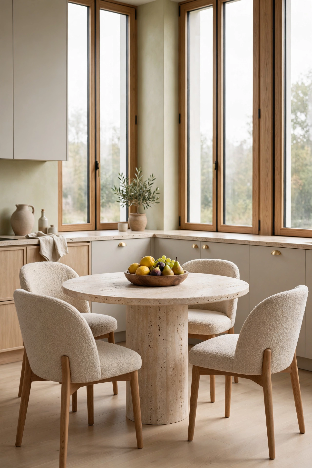
18. A Round Travertine Table in the Kitchen
If you have the space, give the kitchen a real table. A round travertine pedestal table with four boucle chairs, sitting in the brightest corner. It is sculptural by day and the best seat in the house by night. Round means no head of the table. Everyone belongs equally. That is a very European idea.
Travertine as a table is unexpected and wonderful. The stone is warm to the touch in a way glass or lacquer never is. The pedestal base keeps the floor visually clear so the corner feels open. Boucle chairs in oatmeal add the softness the stone needs. One low bowl of fruit in the center. That is the whole styling.
This table earns its footprint ten times over. Morning coffee. Afternoon homework. Evening wine with a friend while dinner simmers. The kitchen stops being a workspace and becomes the living heart of the home. Which is what it was always meant to be.
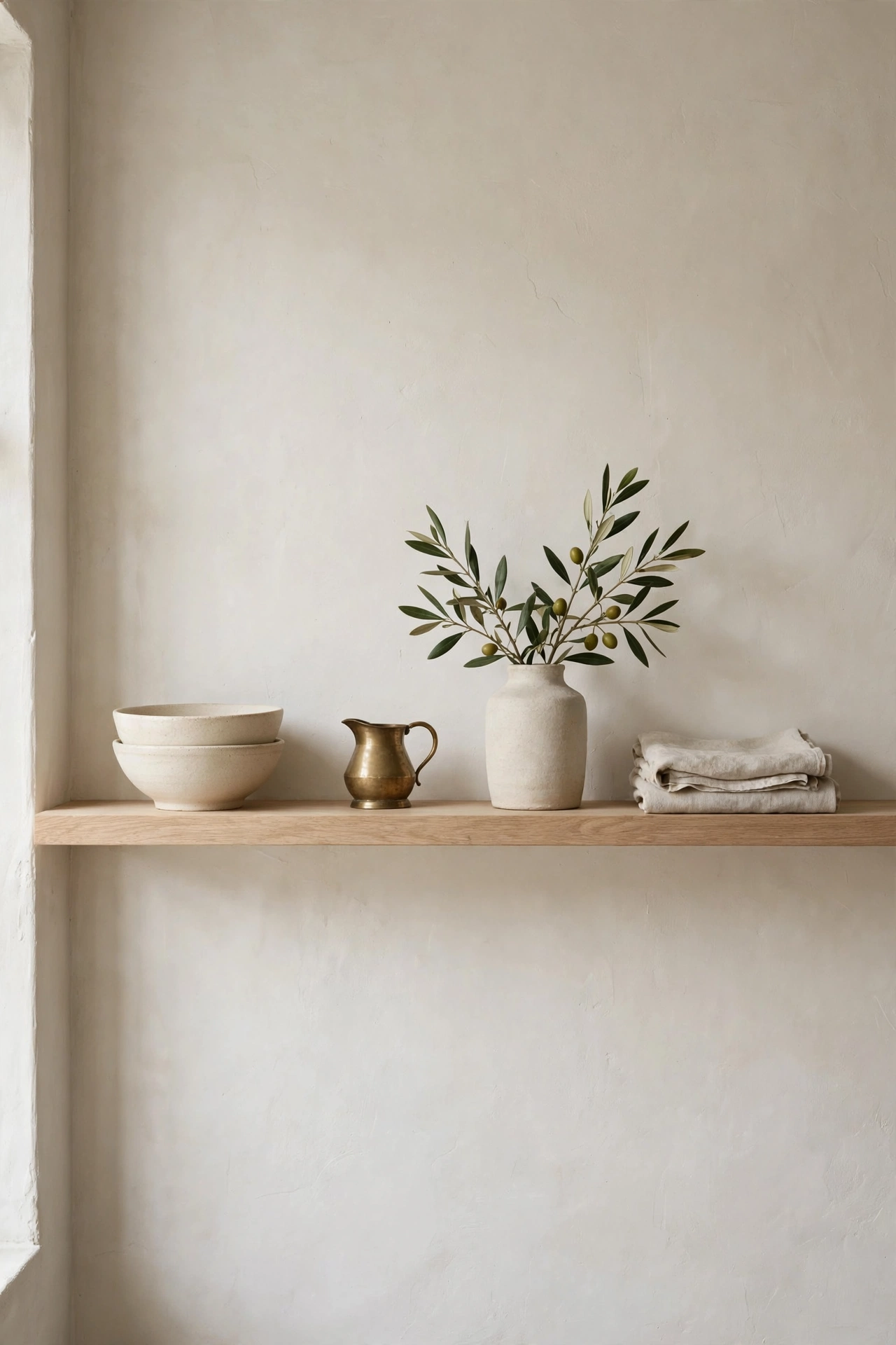
19. The Single Styled Shelf
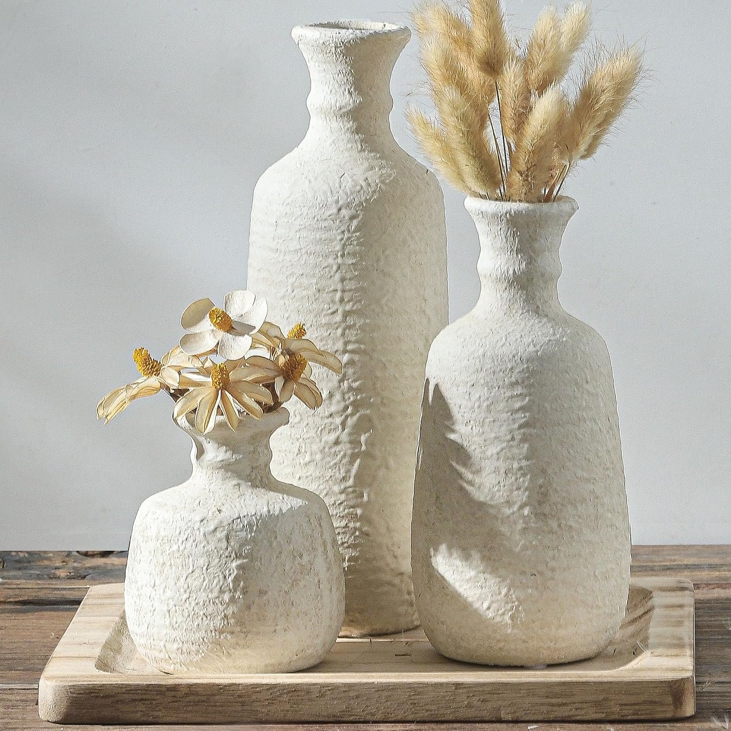
We end with the smallest idea and maybe the most powerful. One open oak shelf. Styled the European way. Cream stoneware bowls stacked in twos. A small brass pitcher. A sprig of olive in a stoneware vase. A folded linen towel. Breathing room between everything. That is it.
The discipline is the design. One shelf forces you to choose only what is beautiful. No filler. No cute signs. No clutter creeping in from the sides. Every object earns its place or it leaves. And because everything on the shelf is something you actually use, it never feels like a museum. It feels like a life, well kept.
Change it with the seasons if you like. A bowl of lemons in spring. Dried wheat in fall. The shelf is a living thing. But keep the rule. Fewer, better, breathing room. Let the materials be the decoration, all the way to the very end.
More Favorites
This post contains affiliate links. If you buy through them, I may earn a small commission at no extra cost to you.
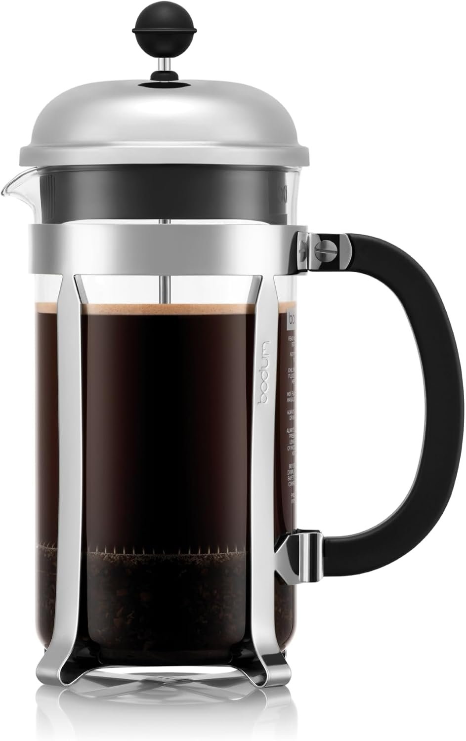
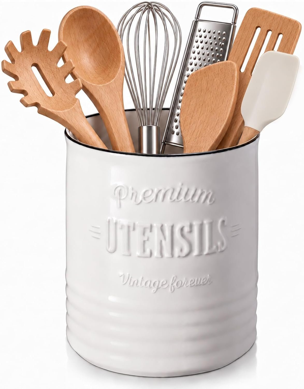
A few more favorites from the ideas above:
Bring the old world home
You do not need all 19 ideas. Please do not try all 19 at once. Pick the one that made you exhale when you read it. Maybe it is the handleless walnut cabinets. Maybe it is the little arched niche that feels like a secret. Start there.
The formula for a European contemporary kitchen is simpler than it looks. Quiet bones, beautiful stone, warm wood, glowing brass, light layered like evening. Let the materials be the decoration. One hero per kitchen. Hide the work, show the beauty. Keep those in your pocket and you cannot go wrong.
If this style has you wanting more, my light and airy spring farmhouse kitchen post keeps the warmth going in a different key, and the European Contemporary Kitchen design guide has the full palette and pairings if you want to go deeper.
Start with one beautiful material, warm up the light, and leave some space empty. Let the room breathe and it will reward you every single evening. Your kitchen will thank you.
With love and light
Get Fresh Home Ideas Every Week
Seasonal decor ideas, organizing tips, and cozy home inspiration, straight to your inbox.
More Kitchen Ideas You Will Love
Keep browsing for more seasonal inspiration: