
Close your eyes and picture your kitchen on a Saturday morning in October. Pale light is coming through the window. Coffee is steaming. The island is clear except for a runner, a low bowl of pears, and one candle you lit just because. It feels calm. It feels gathered. Nobody is rushing to clear clutter before they can set down a mug.
Now picture the same kitchen at seven in the evening. The overhead lights are off. The island is glowing with candlelight, amber glass catching the flames, something that smells like cinnamon on the stove. Your people drift toward it the way they always do. Because here is the truth about kitchen islands. They are the magnetic center of the house. Homework happens there. Snacks happen there. Long talks happen there with elbows on the counter. So when the island looks beautiful, the whole house feels beautiful.
Here is my honest confession. For years my island was a landing strip. Mail, school papers, a random sock, three water bottles, and a candle I kept meaning to light. I would clear it in a panic when friends came over and it would look bare and sad. Then I watched how designers style islands in magazines and realized they are not doing anything magical. They are following a few simple rules, over and over, with restraint. And once I learned the rules, my island went from cluttered to calm in about twenty minutes.
The first rule is the one everything else hangs on. Style in thirds, not in a line. Mentally divide your island into three zones. Dress two of them and leave the third one open. That open third is what makes it look designed instead of crowded. It gives the eye somewhere to rest, and it gives you somewhere to set down a cutting board when real life happens.
The second rule is that odd numbers win. Three candles, five bud vases, one big bowl. Even numbers look like a store display. Odd numbers look like a person with taste arranged them. I do not know why this works, but it works every single time.
The third rule is height. Every beautiful island has a tall moment, a middle moment, and something low. A tall branch arrangement, a medium lantern, a low bowl of fruit. When everything sits at the same height, the eye gets bored. When the heights step down like a little skyline, the whole thing comes alive.
And the fourth rule is the one that keeps it real. Leave room to live. Your island still has to work for homework and chopping and coffee. A designer island is not a museum display. It is a working surface that happens to look gorgeous. If you cannot set down a cutting board without moving six things, you styled it too tight. Pull one thing off and try again.
The palette for all of this is my favorite muted harvest mix. Rust and camel and oatmeal. Olive and chocolate and a little burgundy. Brass for the glow. No bright orange anywhere, because we are going for sophisticated, not craft store. Everything in this post lives in those tones, so you can mix and match any of the ideas and they will all play nicely together.
So here are 19 designer styling ideas for your fall kitchen island, grouped the way a designer would actually work: foundation first, then glow, then harvest, then the finishing touches. You do not need all 19. Pick the ones that made you exhale. If you are building a whole fall kitchen mood, my fall coffee bar ideas pair beautifully with the drink corner in idea ten.
Love these ideas? Get more every week.
Join the newsletter for seasonal decor and cozy home inspiration.
Start With the Designer Foundation
Before a single pumpkin touches your island, get the bones right. Designers always start with the foundation: something soft under everything, one anchor that holds the composition together, and a plan for where things go. These first five ideas are the structure. Everything after them is decoration.
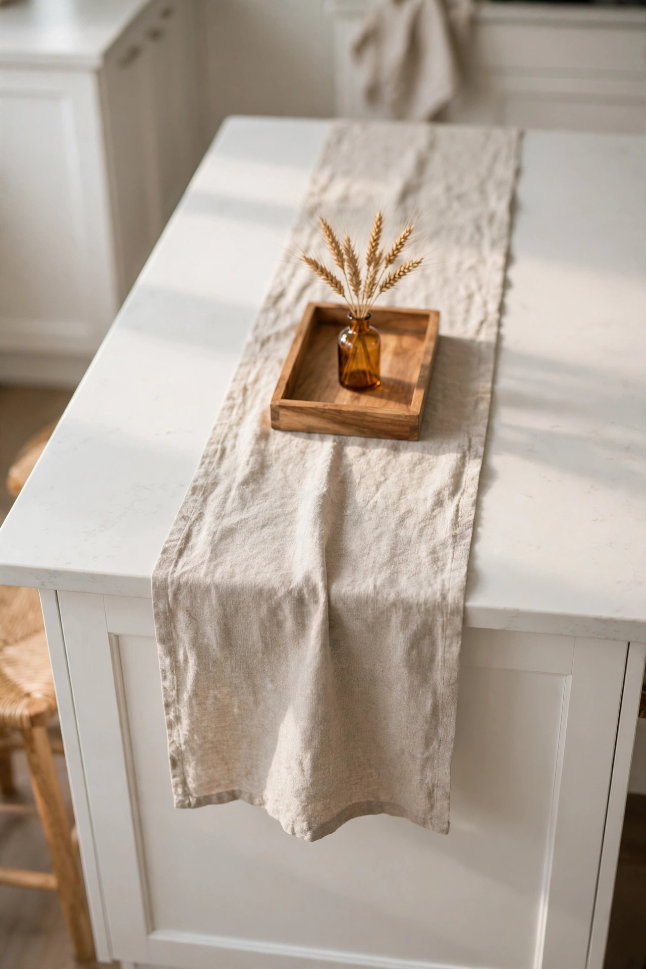
1. Lay a Linen Runner Down the Middle
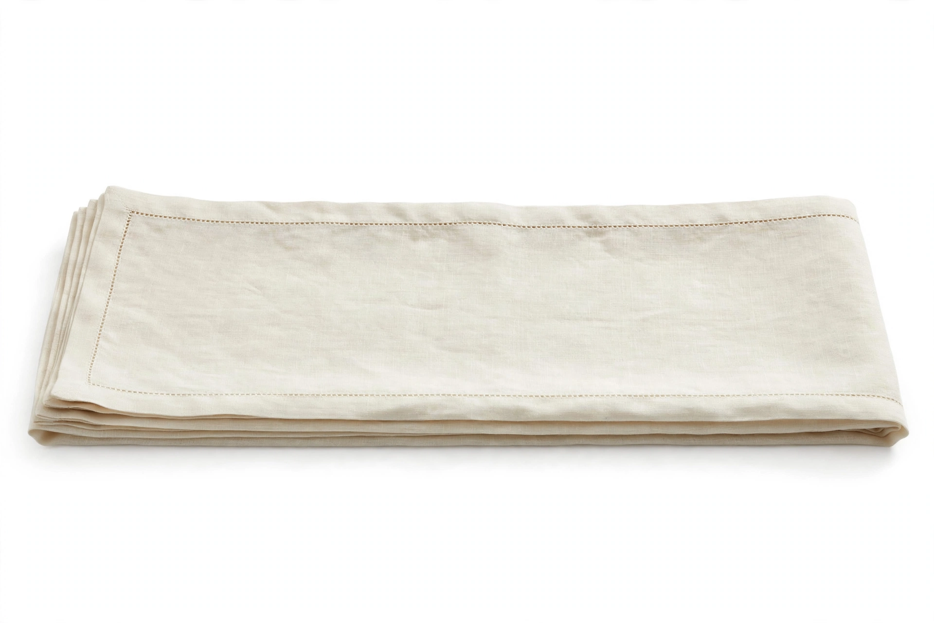
A runner is the fastest way to tell the eye that this island is styled on purpose. It draws a soft line down the center, it warms up a cold stone countertop, and it gives every object a home base so nothing looks like it just landed there. I use a natural oatmeal linen runner with a simple hemstitch edge, and it works with literally everything else I own.
The trick is proportion. Your runner should cover the middle third of the island and leave generous counter showing on both ends. Too short and it looks like a placemat that got lost. Too long and it hangs over the ends and gets in the way of stools. Measure your island, then buy a runner that leaves at least a foot of clear counter on each end. That breathing room is what makes it look designer instead of fussy.
Linen is the right fabric because it wrinkles beautifully. Do not iron it. The soft rumples are the whole point. They catch the light and add texture, which is something a flat cotton runner can never do. If you spill on it, and you will, linen washes like a dream and looks even better after a few rounds.
Shop This Look
This post contains affiliate links. If you buy through them, I may earn a small commission at no extra cost to you.
A few favorites featured in the ideas above:
2. Anchor Everything on One Big Tray
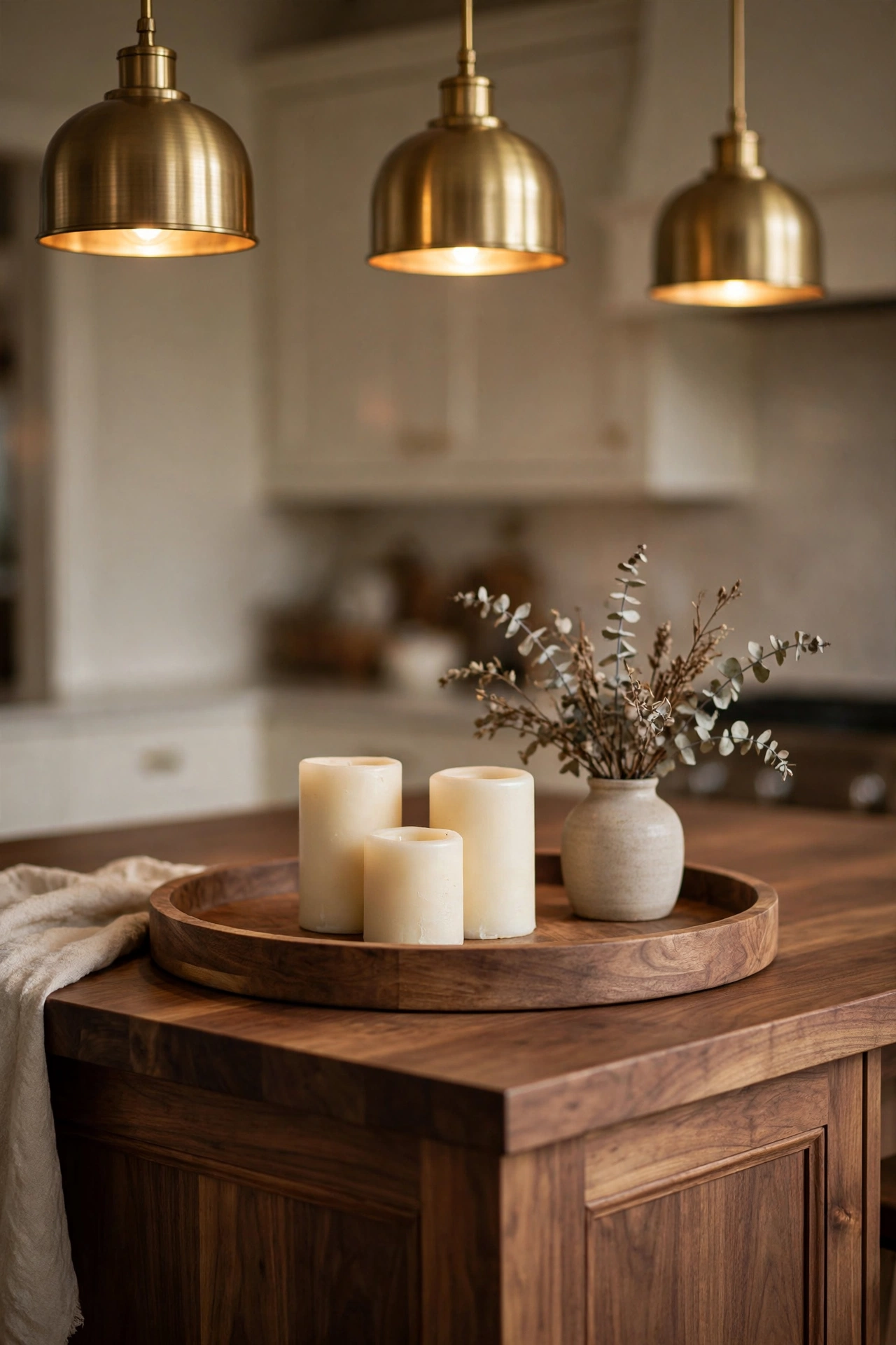
If the runner is the line, the tray is the anchor. Designers use trays the way painters use frames. A tray gathers small objects into one intentional composition, and it tells the eye exactly where to look. Without a tray, five pretty objects can look like clutter. With a tray, those same five objects look like a still life.
Go big here. A tray that is too small makes everything look crowded, like too many people in a small elevator. You want a tray that holds your objects with room to spare around them. Round trays are my favorite for islands because the circle breaks up all the straight lines of the cabinetry. Wood is the right material for fall. Acacia has that warm honey tone that glows against marble or white quartz.
Here is the part people forget. A tray is also practical. When you need the island for rolling out pie dough, you lift one tray and the whole styled moment moves at once. No picking up six separate things. No losing the composition. When you are done, you set the tray back down and the island is beautiful again in three seconds. That is designer thinking and real life thinking at the same time.
3. Divide the Island Into Thirds
This is the designer rule I promised you, and it is the single biggest difference between a styled island and a decorated one. Stand at the end of your island and divide it into three zones in your mind. Left, middle, right. Now style two of them and leave the third one beautifully empty.
The empty third is doing more work than you think. It gives the styled zones room to breathe. It keeps the island functional, because that is where the cutting board goes, where the kids do homework, where someone sets down a grocery bag. And visually, it creates rhythm. Styled, styled, open. Your eye moves across the island and rests, instead of bouncing from object to object with nowhere to land.
Which third stays open is up to you. I usually leave the end closest to the stove clear, because that is where cooking actually happens. Some people leave the middle open and style the two ends, which looks gorgeous and symmetrical in a formal way. Try it both ways and stand back. You will feel which one is right for your kitchen the second you see it.
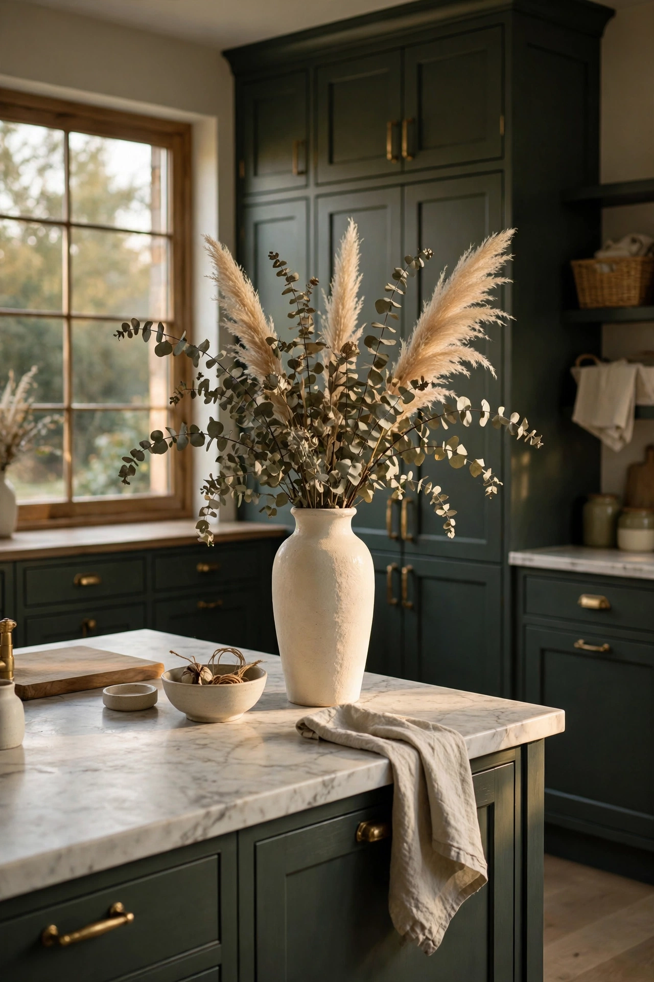
4. Give It One Tall Moment
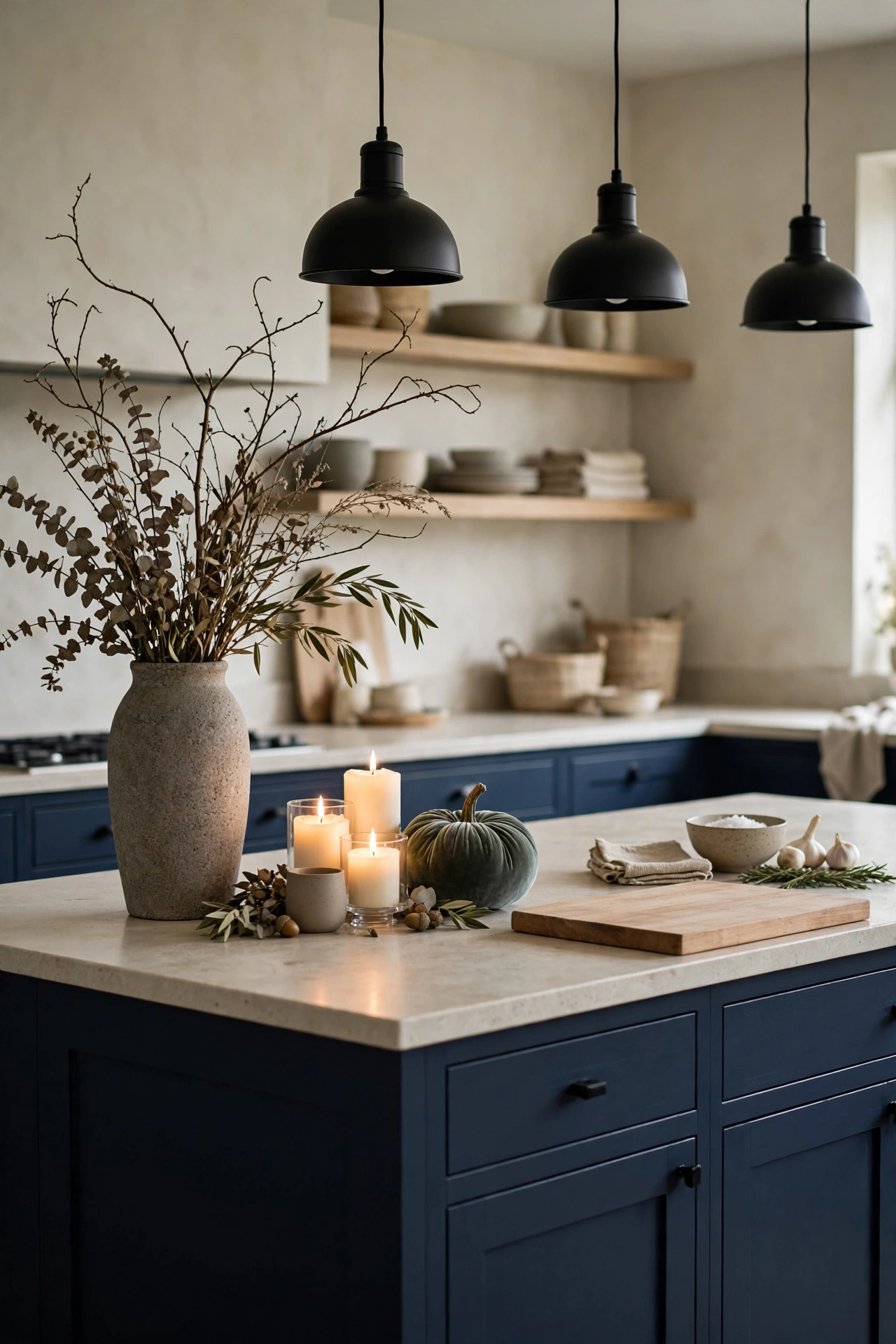
Remember the height rule. Every island needs a tall moment, and fall gives you the best tall materials of the year. A bundle of dried eucalyptus, a sheaf of wheat, pampas grass plumes, tall branches with the leaves still on. Put them in a substantial vase and you have instant architecture.
Tall is doing two jobs here. It draws the eye up, which makes the whole kitchen feel grander, and it balances all the low flat things like runners and trays and bowls. Without something tall, an island can feel squat and heavy, like all the decor sank to the counter. One vertical gesture fixes it completely.
Scale matters more than the stems you choose. Your tall arrangement should reach about halfway to your pendant lights, never touching them. Too short and it looks timid. Too tall and it fights the pendants for attention and blocks sight lines across the island. When you can still see the face of the person on the other side, you got it right.
5. Ground It With Something Low
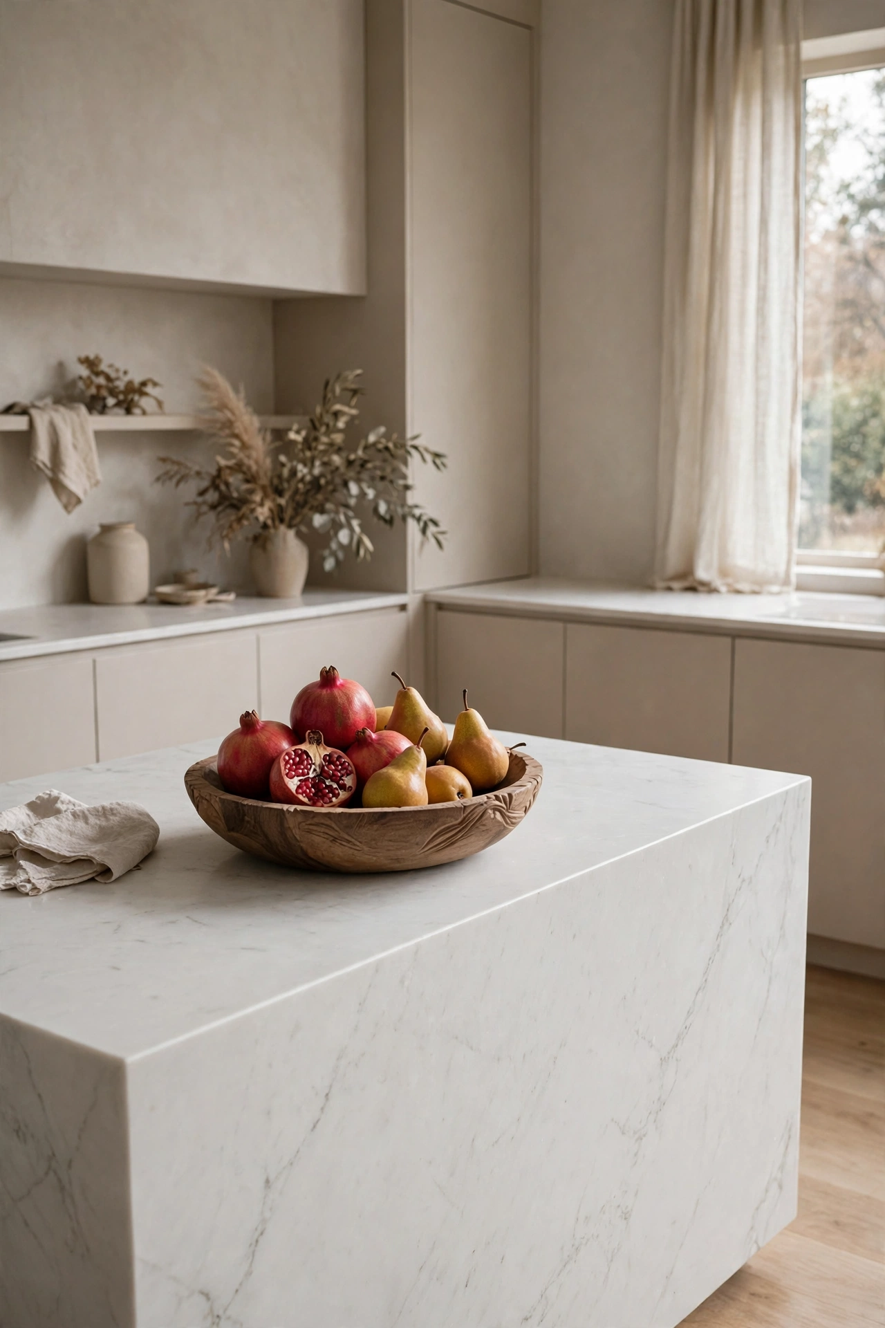
Now the other end of the height story. After the tall moment, you need something low and generous to ground the composition. A wide wooden bowl of pomegranates. A low basket of pears. Something with weight that sits close to the counter and says this island is abundant and welcoming.
Low bowls work because they invite touch. A tall arrangement is for looking at. A low bowl of fruit is for grabbing a pear on your way past, which is exactly what a kitchen island is for. I love this contrast. The beautiful thing you look at and the beautiful thing you use. That is a kitchen that feels alive instead of staged.
Choose fruit in your palette and it doubles as decor. Pomegranates in deep burgundy, golden pears, dark figs, a few walnuts in the shell scattered around. Skip anything bright or neon. A bowl of limes might be cheerful in July, but in October we are doing moody and rich. Eat the fruit during the week and top up the bowl on grocery day. It never looks tired because it is always fresh.
Layer In Warmth and Glow
The foundation is set. Now we add the thing that makes a fall island feel like fall. Light. Low, warm, flickering light is the difference between a kitchen that looks nice and a kitchen that feels like a hug. Designers layer light the way they layer texture, and these next five ideas are all about glow.
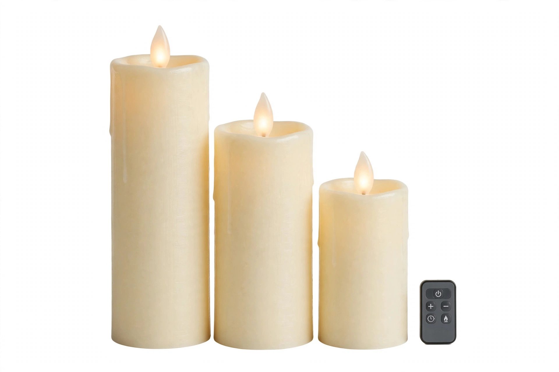
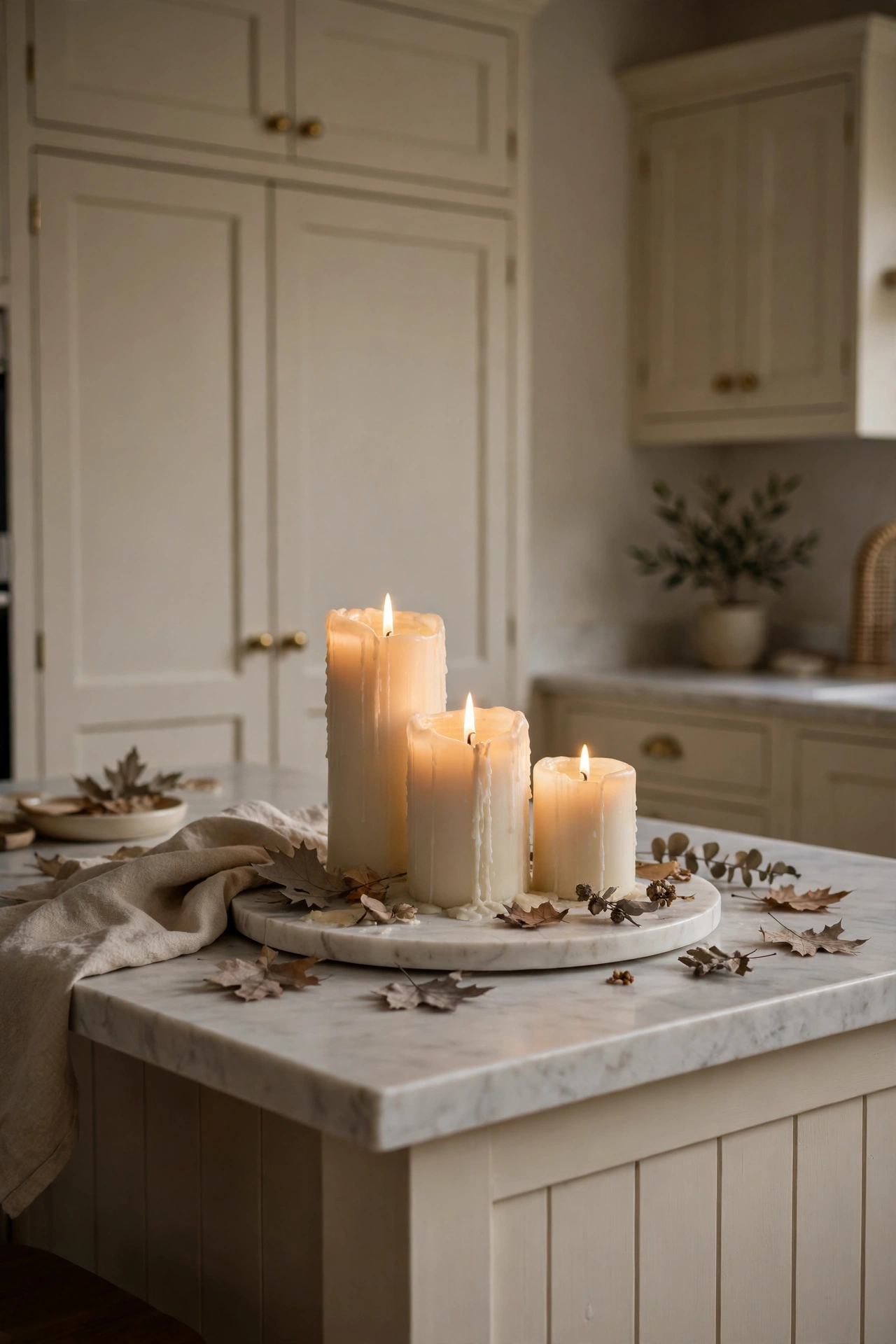
6. Cluster Candles at Three Heights
One candle is nice. Three candles at three different heights is a design moment. The varying heights create that little skyline I told you about, and the cluster reads as one intentional object instead of three random ones. This is the odd numbers rule doing its quiet magic.
I am a recent convert to flameless pillar candles for the island, and I will defend this choice. Real flames on a working kitchen island make me nervous with kids and cooking and sleeves. The good flameless ones are real wax on the outside with a flicker that genuinely fools people. Put them on a timer and your island glows every evening at dusk without you touching a thing. It feels like the house is taking care of you.
Arrange them on a small tray or a round marble board so the cluster stays tight. Tallest in the back, shortest in front, medium in the middle. Tuck a few dried leaves or a velvet pumpkin at the base to root them in the season. When the timer clicks on at six and the kitchen fills with that warm glow, you will wonder why you waited so long.
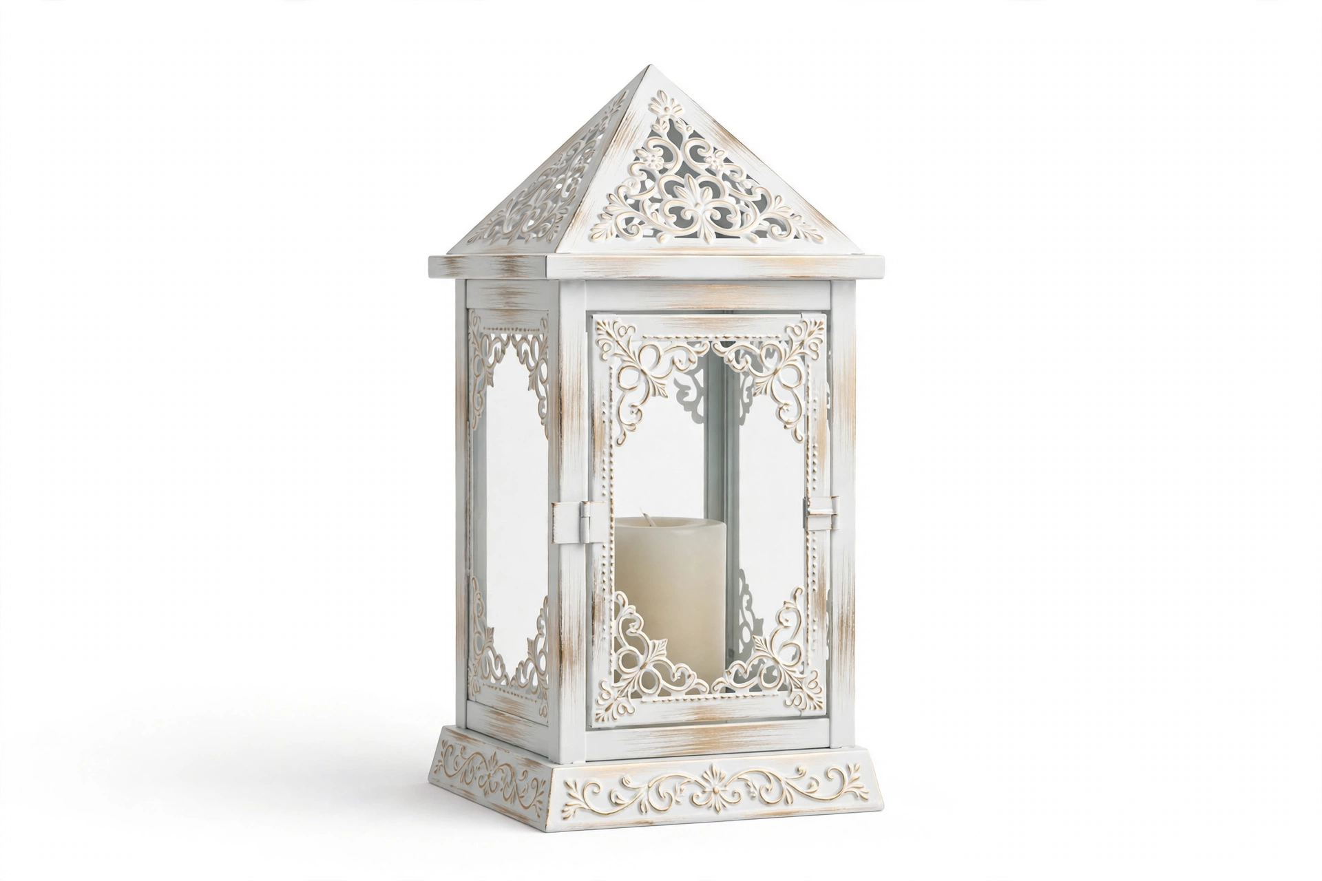
7. Set a Lantern in the Center
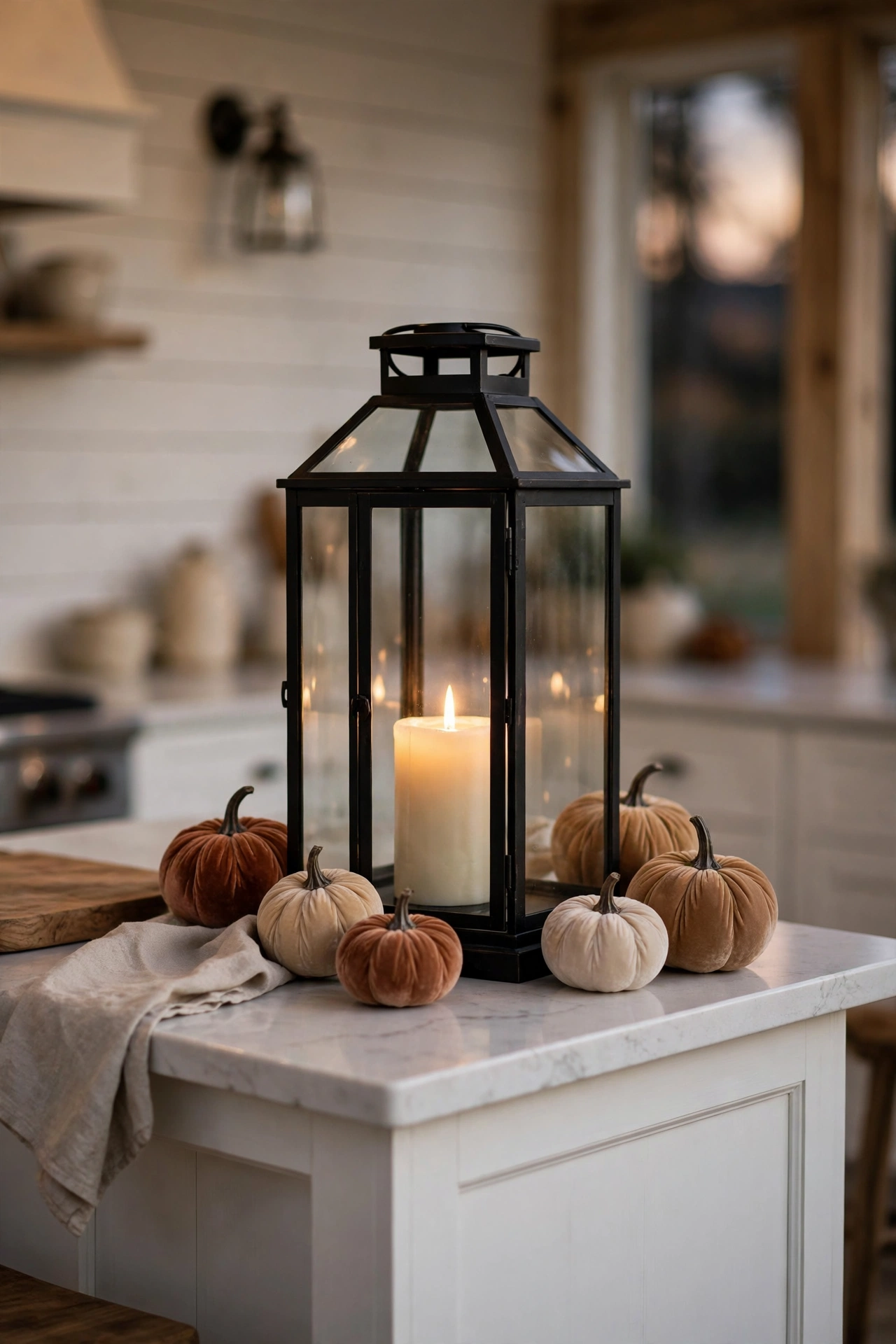
If the candle cluster is pretty, a lantern is a statement. One large lantern in the center of the island has the presence of a sculpture. It is tall enough to count as your tall moment, it glows from within, and the glass and metal add a material contrast that wood and linen cannot give you.
Scale is everything with a lantern. It should be the biggest object on your island by a clear margin. A timid little lantern gets lost among the fruit bowls and vases. Go for something with real height, ten inches or more, and let it be the star. Then keep everything around it quiet. A few small pumpkins at the base, maybe a sprig of eucalyptus. The lantern does the talking.
Black metal lanterns are my pick for fall because they ground all the soft textures around them. The dark frame makes the candlelight inside look even warmer by contrast. If your kitchen is very modern and black feels heavy, a brass or aged gold lantern gives the same glow with a softer edge.
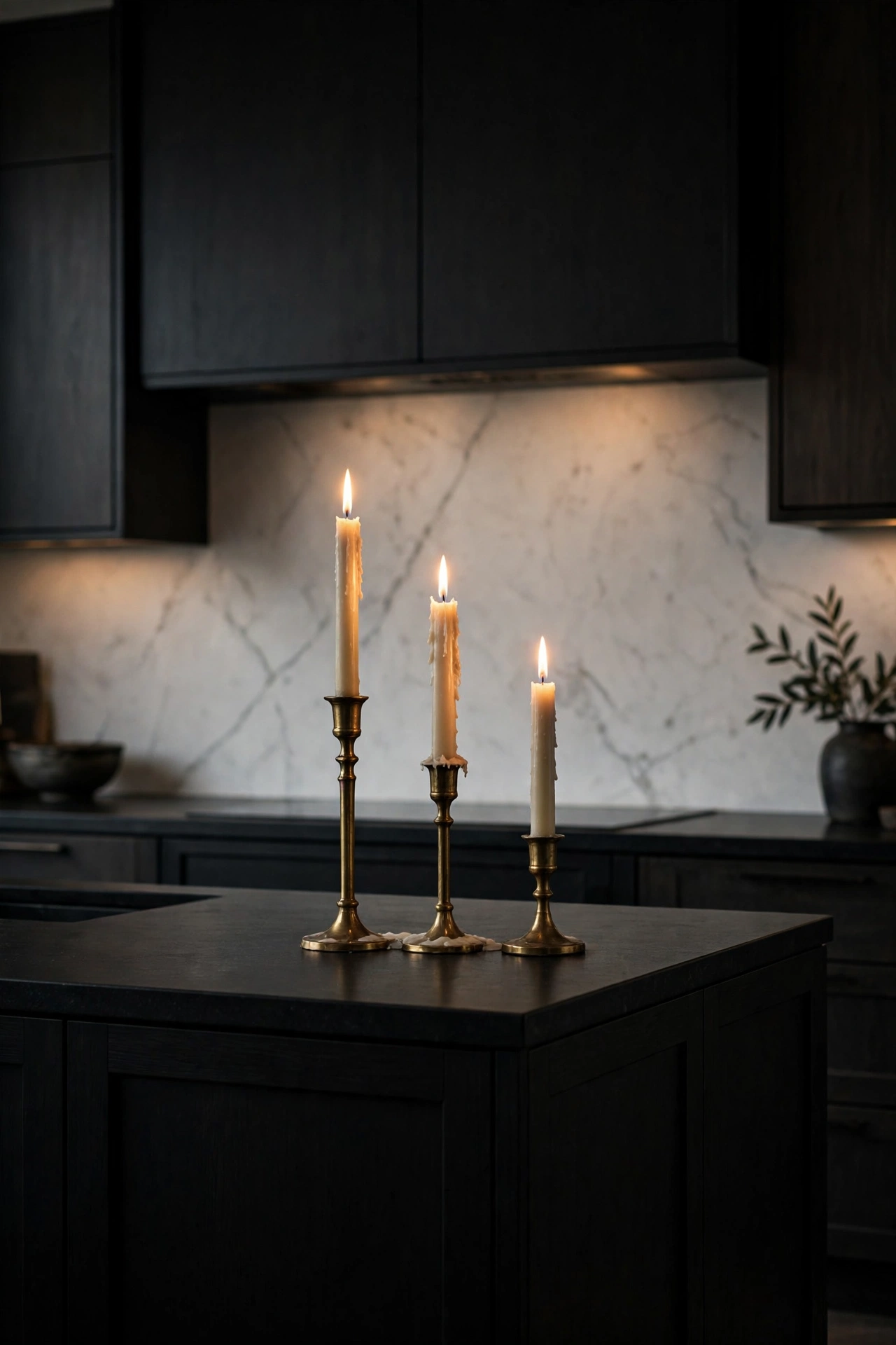
8. Line Up Brass Tapers
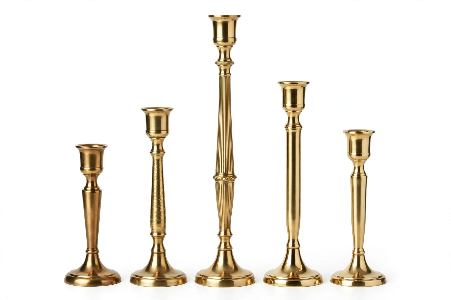
Taper candles are having a moment, and brass holders are the reason. There is something about that warm metal catching candlelight that makes an island feel expensive. Three brass taper holders in a row down the center of the island look like a restaurant you would pay too much to eat at, in the best way.
The trick is staggered heights. Buy holders in two or three heights, or cheat by trimming your taper candles to different lengths. Light them at dinner and the flames dance at different levels, which is endlessly more interesting than a straight row of identical soldiers. Odd numbers again. Three or five holders, never four.
Brass mixes with everything in our palette. It warms up white marble, it glows against dark green cabinets, it looks rich next to walnut. And unlike a trendy finish, brass has been beautiful for about four thousand years. It is not going anywhere. Wipe the holders with a soft cloth when they get dusty and they will outlive us all.
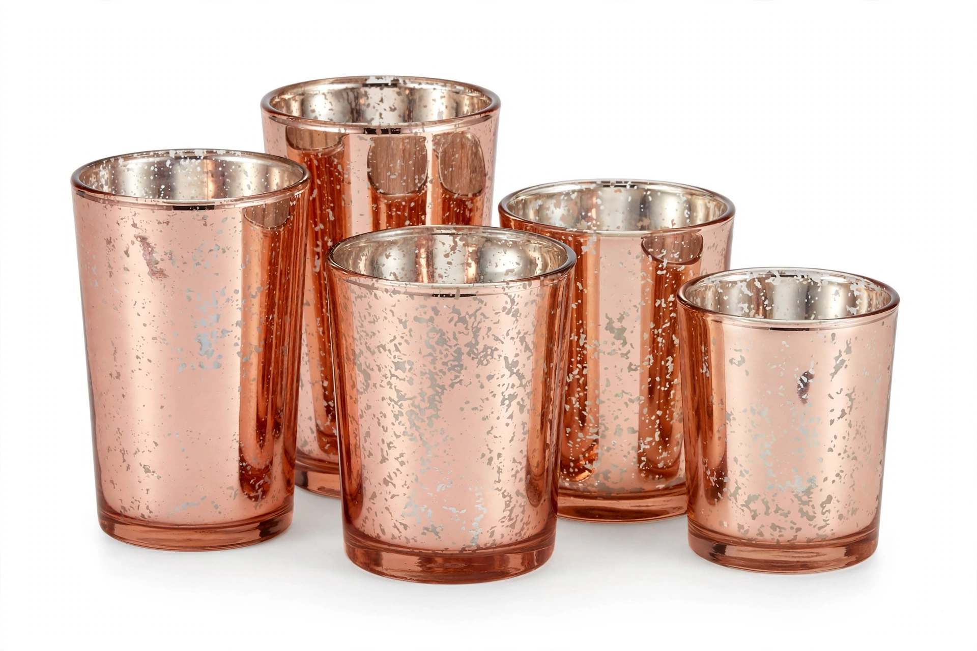
9. Scatter Amber Votives
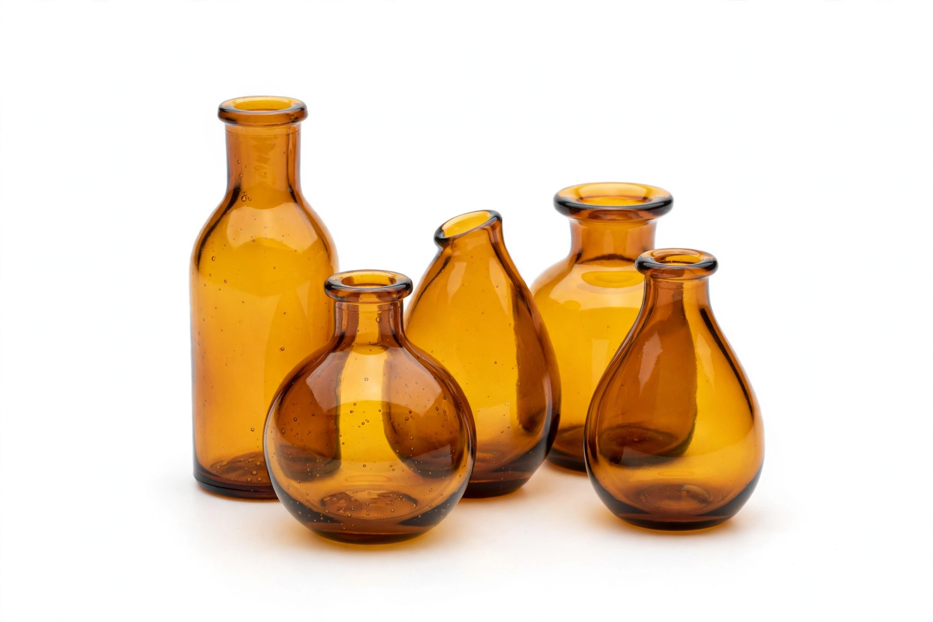
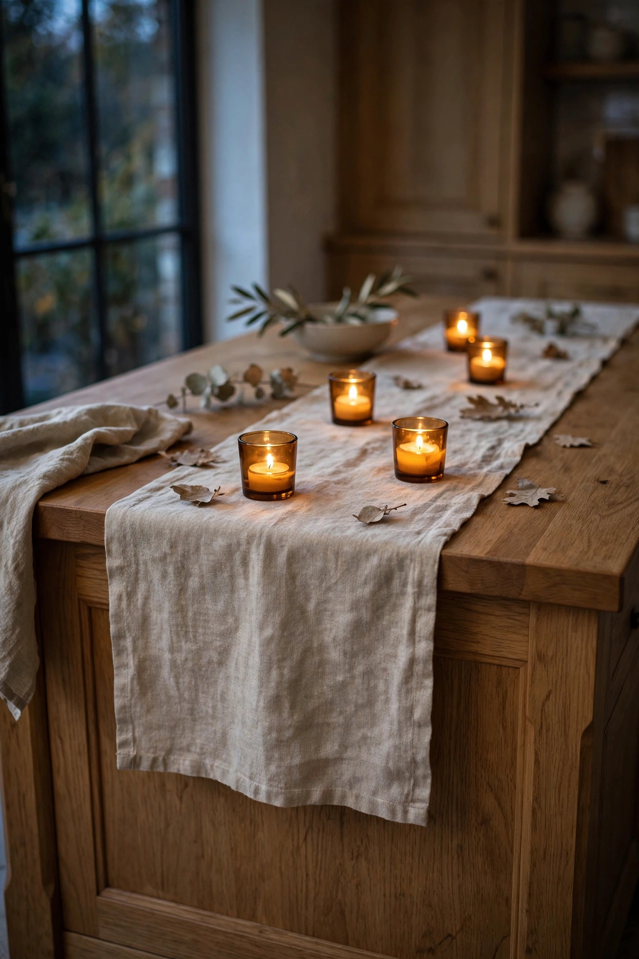
Here is the glow idea for people who love candlelight but hate commitment. A handful of small amber glass votives scattered along your runner gives you that scattered starlight effect with almost no effort. Light them all at once and the whole island twinkles.
Amber glass is the secret weapon of fall styling. The glass itself is the color, so you do not need colored candles or fussy holders. Plain tea lights inside amber glass glow like honey. During the day the little amber cups catch the sun and look like jewelry on the counter. At night they turn the island into the coziest spot in the house.
The word scatter is doing real work here. Do not line them up in a perfect row. Cluster two together, leave a gap, put one on its own near the fruit bowl, tuck one behind the vase. Imperfect placement looks natural and collected. Perfect placement looks like a hotel lobby. You want the collected look.
10. Build a Little Drink Corner
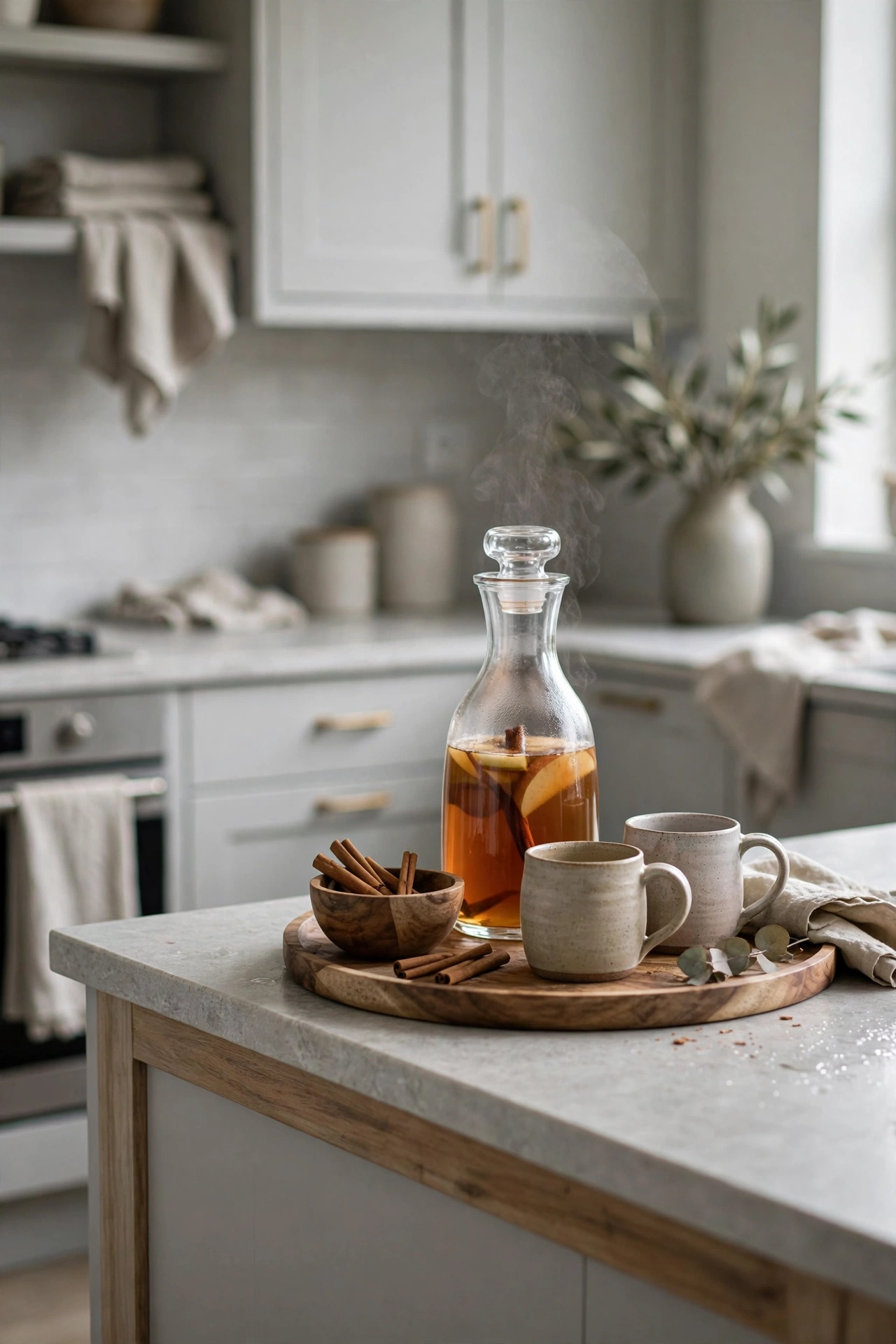
This is my favorite idea in the whole post, and it is pure designer thinking. Instead of styling one end of the island with objects, style it with an invitation. A small drink station says someone is welcome here, help yourself, stay a while. No object on earth communicates warmth like a ready mug.
Keep it simple. A carafe of apple cider or a French press of coffee on a small tray. Two or three handmade mugs, not the chipped ones from the back of the cabinet. A little bowl of cinnamon sticks for stirring, which makes the whole corner smell incredible. That is it. Three elements on a tray, and one end of your island just became the best seat in the house.
This works in the morning with coffee and in the evening with cider, which means the styling earns its keep all day. Refresh the carafe, swap the mugs, and it never looks stale. And when friends drop by unexpectedly, you look like the kind of person who is always ready. Which, with this corner in place, you are.
Bring In the Harvest
Foundation, glow, and now the part that makes it unmistakably fall. Harvest styling is about abundance. Bowls that overflow, stems that reach, fruit that looks almost too beautiful to eat. These five ideas bring the season onto the island in the most generous way, and every one of them stays in our muted palette.
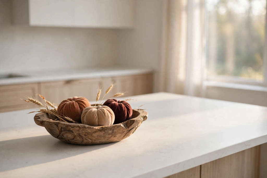
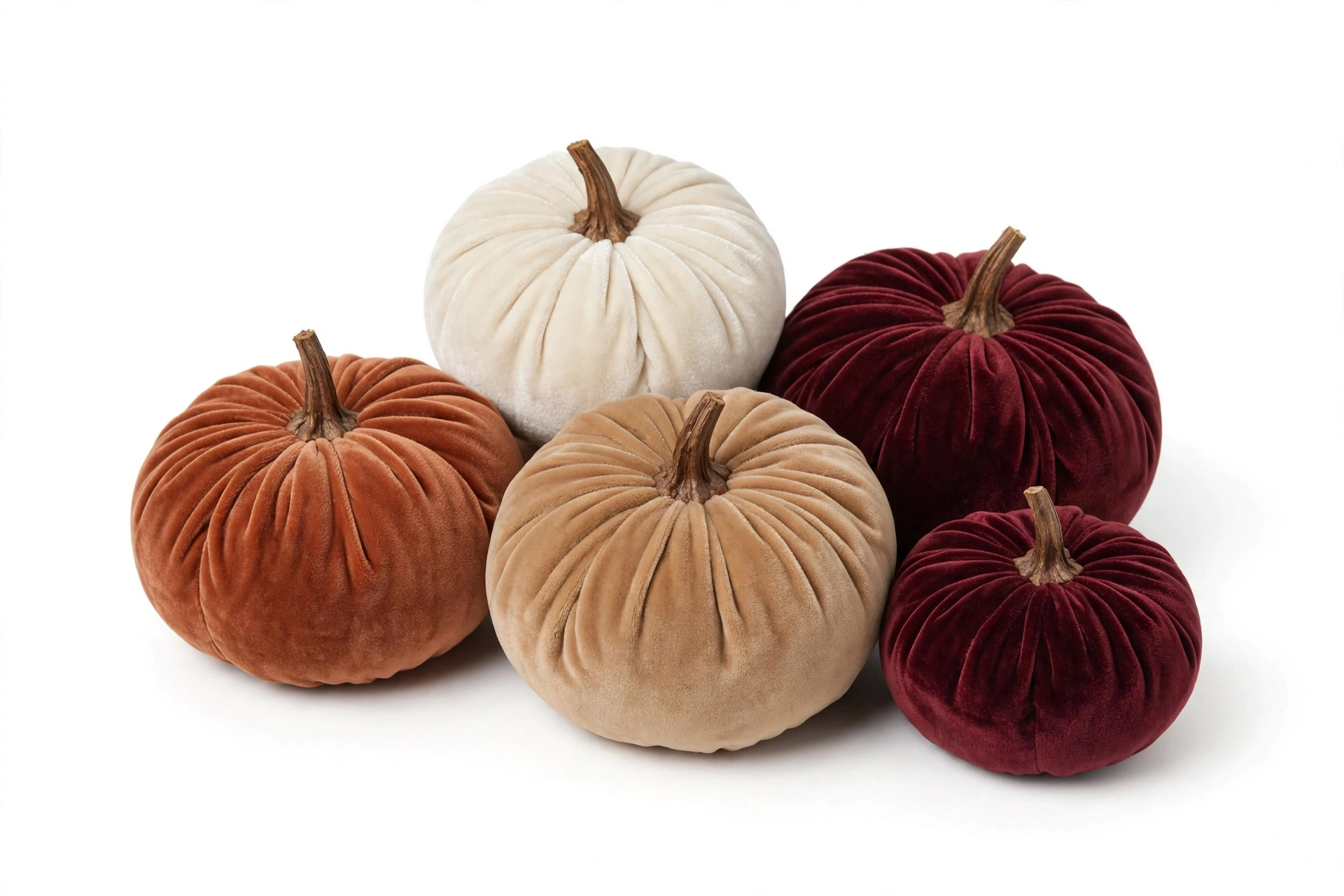
11. Fill a Dough Bowl With Velvet Pumpkins
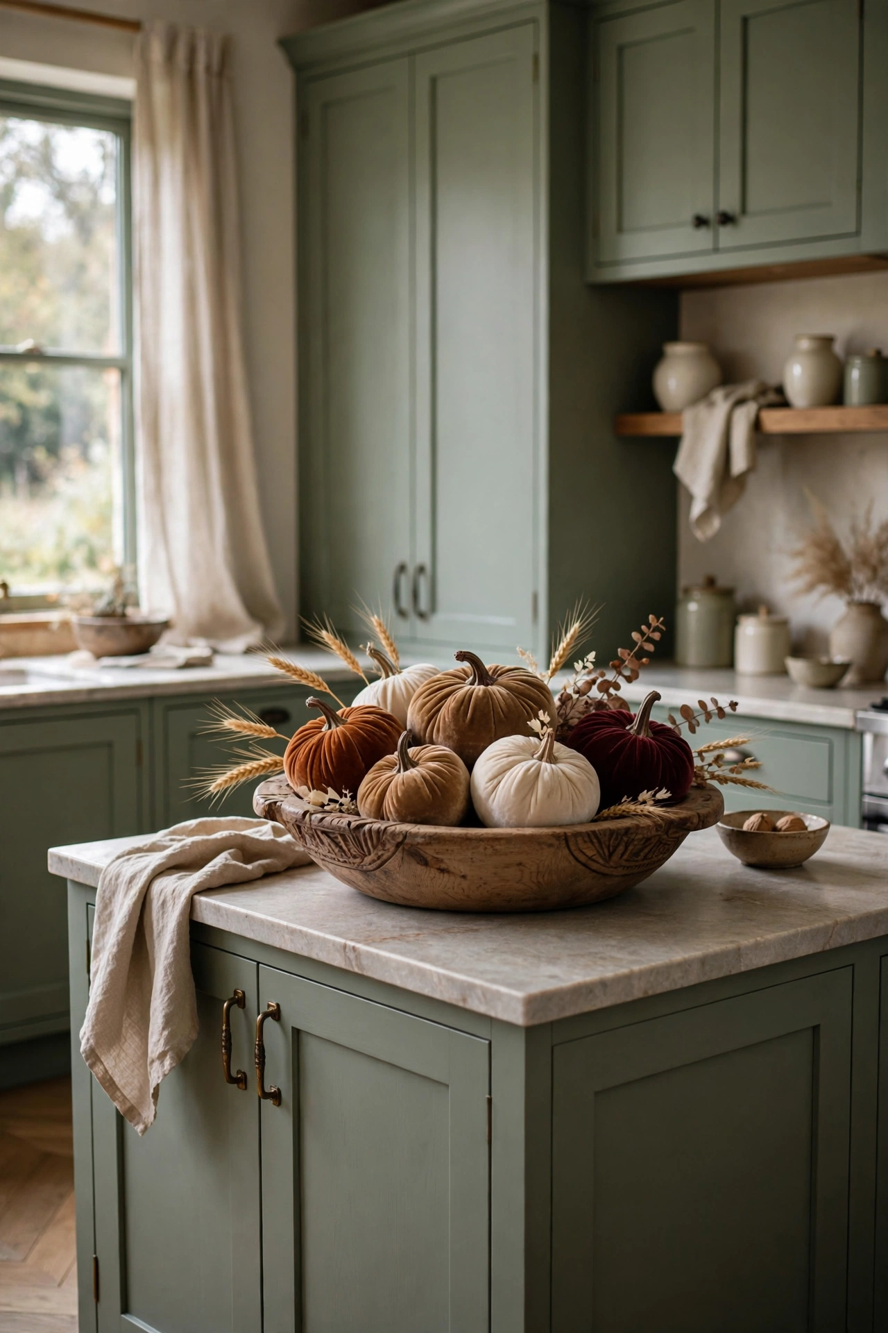
The dough bowl full of pumpkins is the fall island classic, and it is a classic for a reason. A long, low wooden bowl has the perfect shape for an island. It follows the line of the counter, it sits low so it never blocks conversation, and it holds a glorious tumble of pumpkins that reads as pure autumn abundance.
Velvet pumpkins are the upgrade that makes this look designer instead of craft fair. The matte fabric catches light softly, the colors stay in our muted family, and they last for years. Mix your tones the way nature would never dare. Rust next to camel next to cream with one deep burgundy for drama. Tuck a few dried wheat stems in among them so it looks gathered rather than arranged.
Size the bowl to your island. It should span about half the length of your styled zone, generous but not greedy. If the bowl is eating the whole island, it is too big. You want room for the candle cluster beside it and that open third we talked about. Abundance with breathing room. That is the whole game.
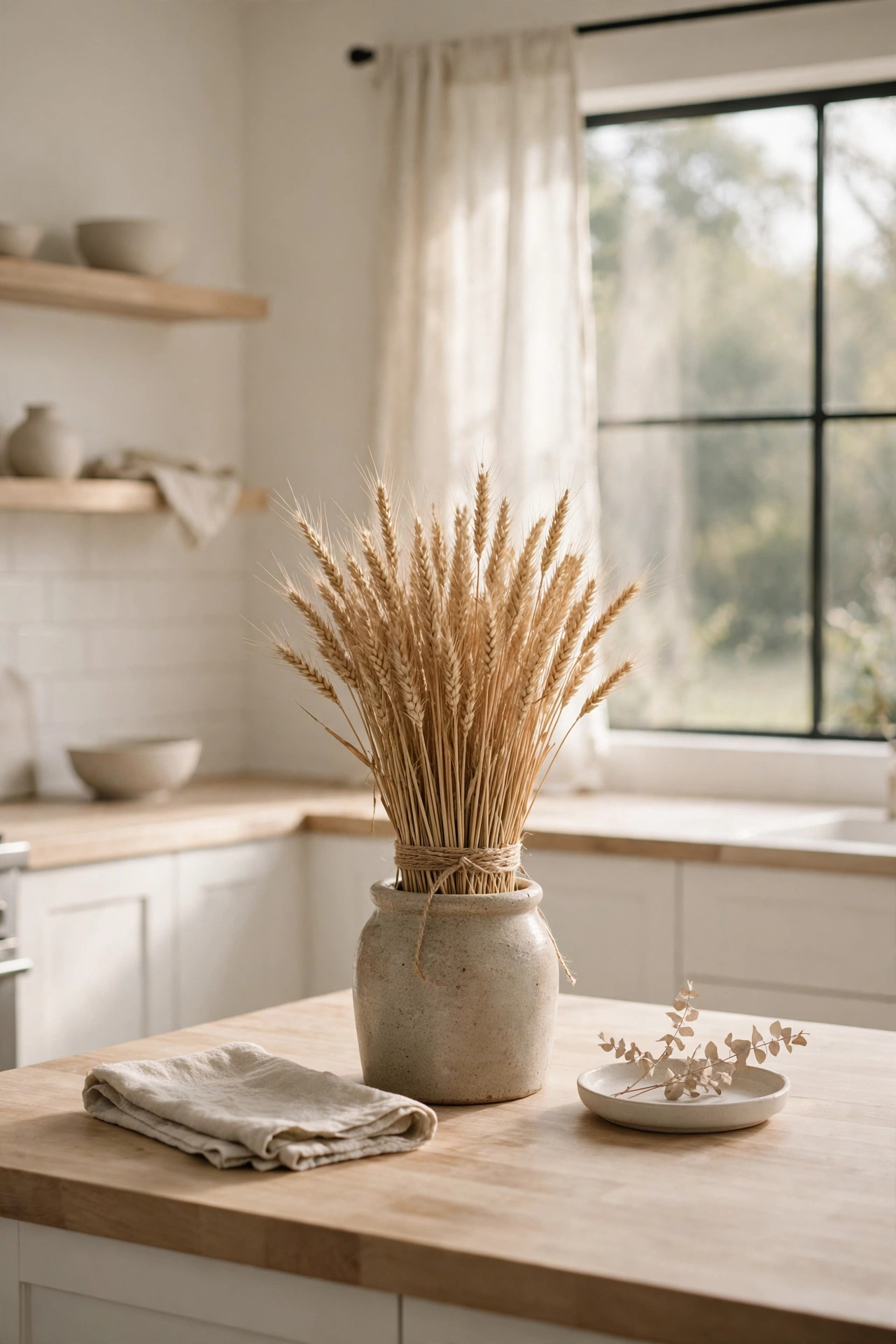
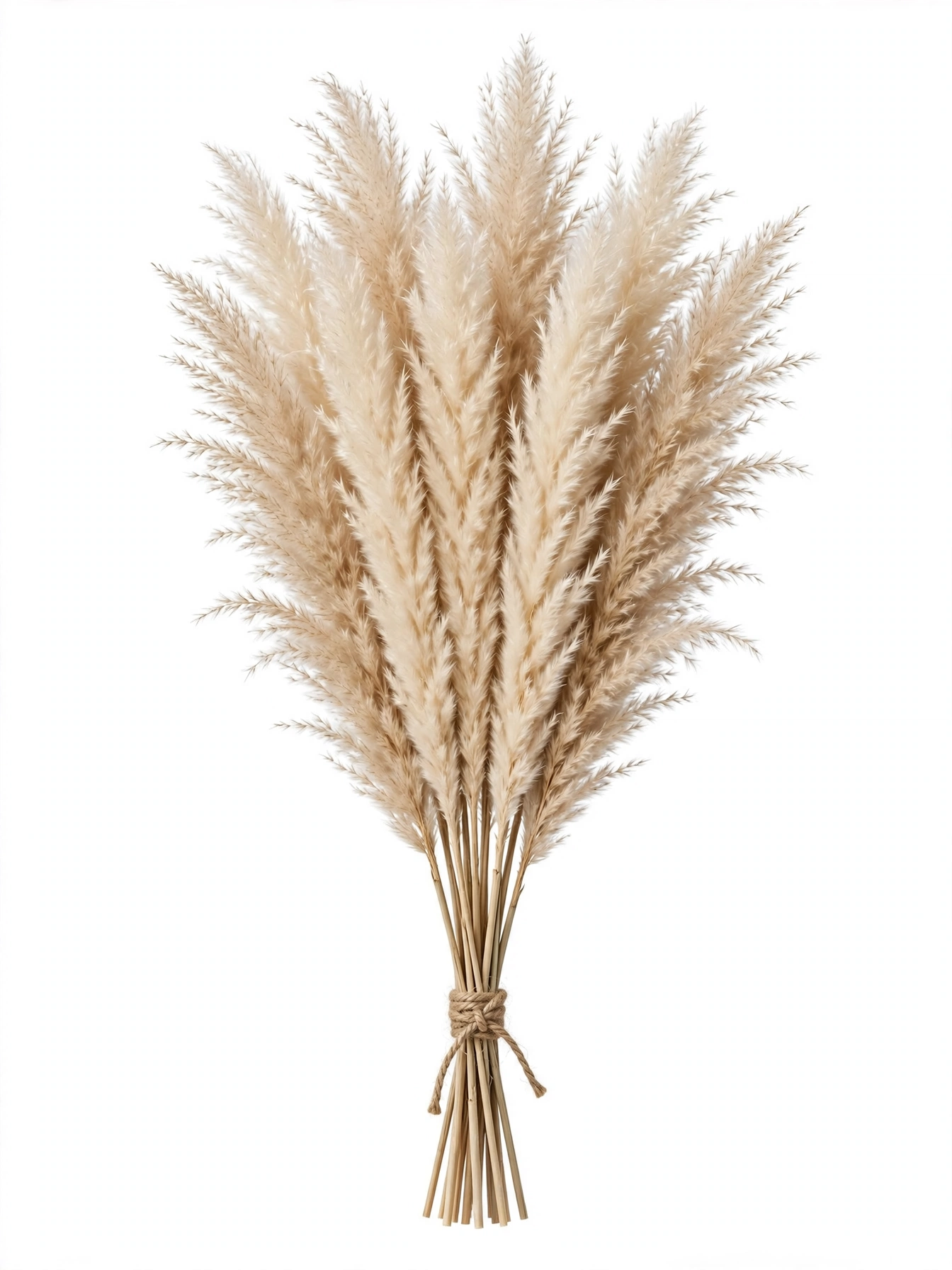
12. Tie Up a Bundle of Wheat
Sometimes the most designer move is the simplest one. A bundle of dried wheat tied with twine and stood in a crock is about as elemental as fall gets. It is tall, it is textural, it is golden without being orange, and it costs almost nothing. I have had the same wheat bundle for three years and it still looks perfect.
This is your tall moment if you skipped the branch arrangement, or it can stand beside it if your island is long enough for both. The wheat brings a countryside softness that balances sleeker elements like brass and marble. It is the thing in the composition that feels handmade and honest, which keeps the whole island from feeling too polished.
The twine matters more than you would think. A neat bow in natural jute twine finishes the bundle and echoes the rustic textures elsewhere. Skip ribbon, skip raffia in bright colors. Plain twine, tied simply, is the whole aesthetic. Stand the bundle where it catches window light and the wheat practically glows.
13. Row Amber Bud Vases Down the Center
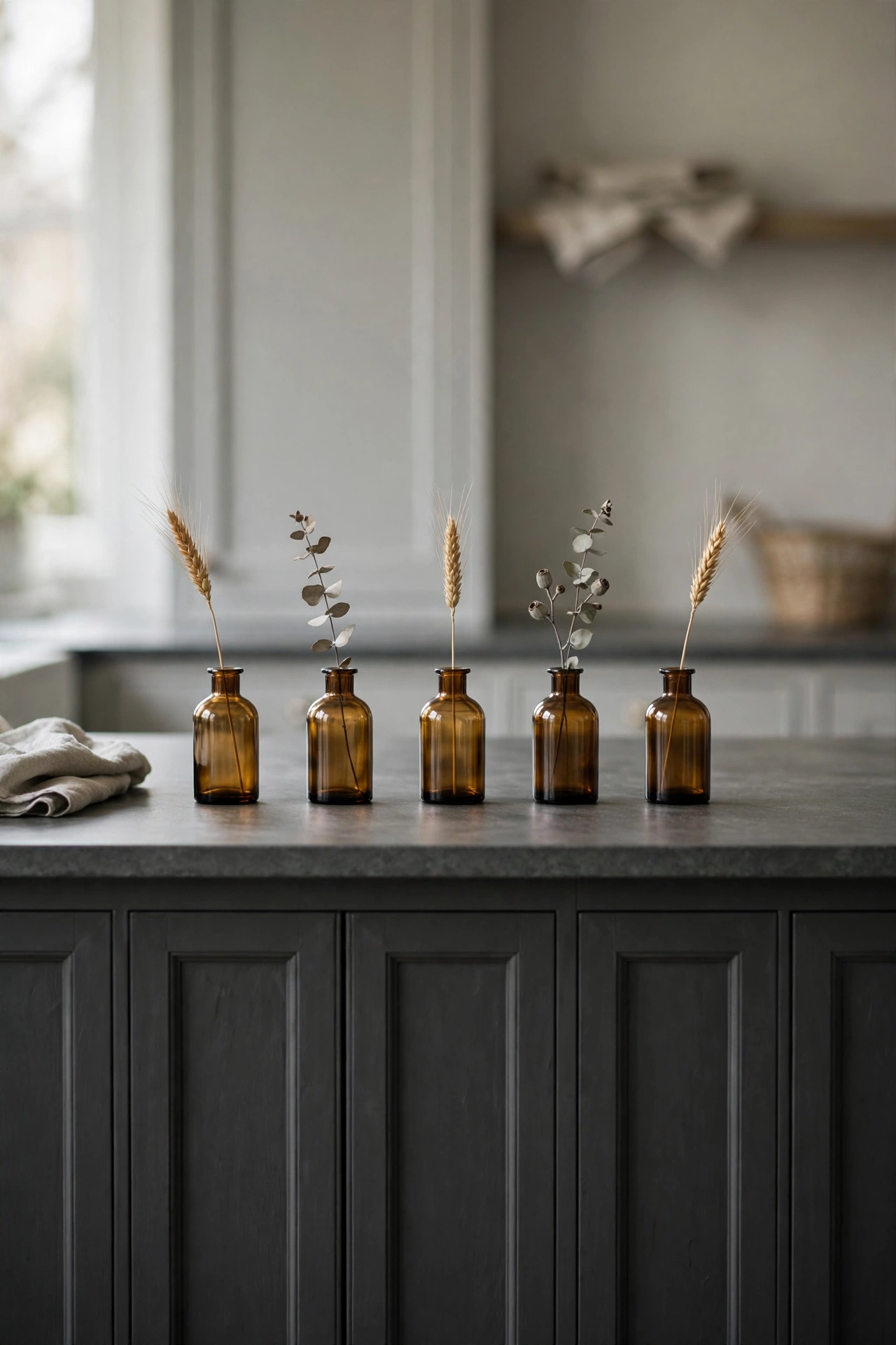
This is the minimalist harvest idea, and it might be the most elegant thing on this list. A row of small amber bud vases, each holding a single dried stem, spaced down the center of the island. It is rhythmic, it is refined, and it takes about four minutes.
The power here is repetition. One bud vase is a sweet detail. Five identical bud vases in a row are a design statement. The repetition creates a visual beat that pulls the eye down the whole length of the island, which makes the island feel longer and more gracious. Vary the stems slightly, wheat in one, a eucalyptus sprig in the next, so it feels collected rather than manufactured.
Keep the vases small and the stems short. These are whispers, not shouts. Each stem should rise just a few inches above its vase. If the stems get tall and wild, the row loses its tailored calm and starts competing with your tall moment. Short, sweet, repeated. That is the recipe.
14. Cascade Fresh Fruit on a Board
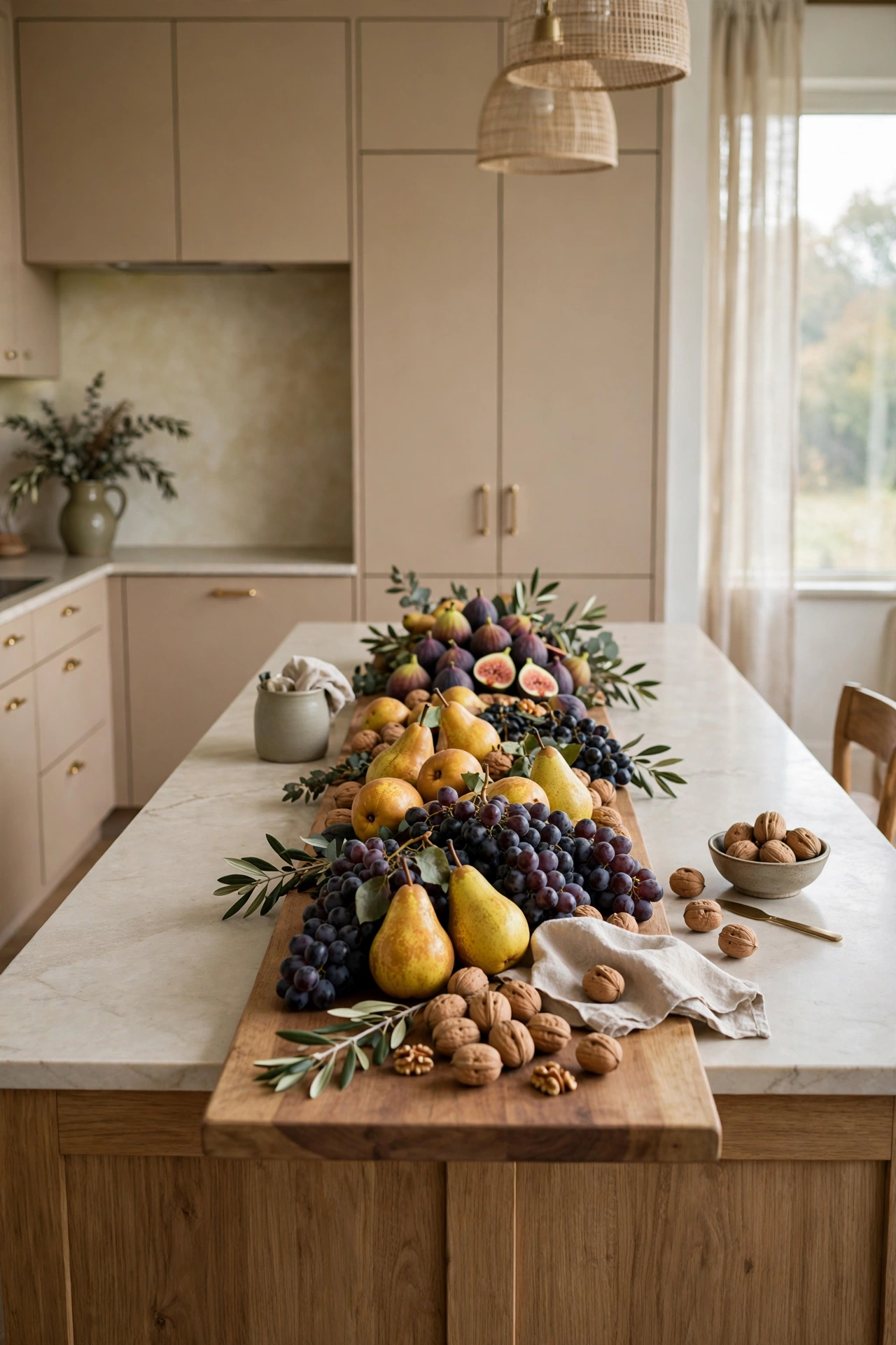
If the low fruit bowl is the everyday version, this is the entertaining version. A long wooden board down the center of the island, cascading with figs, pears, grapes, and walnuts, is the most generous thing you can do to a kitchen island. It is decor you can eat, which is my favorite kind.
Think in drifts, not piles. Start with the board and lay the fruit in a loose flowing arrangement that follows the length of the wood. Cluster the figs here, let the grapes trail there, tuck walnuts into the gaps. It should look like abundance happened naturally, not like you engineered it. Step back and squint. If you see one continuous flow of color and texture, you nailed it.
This is the idea to use when people are coming over. Build it an hour before guests arrive and the island looks like a magazine shoot. Guests graze from it all evening, which means it is both the decor and the appetizer. When the party is over, whatever is left goes back in the fridge. Nothing wasted, everything beautiful.
15. Drape a Garland Along the Edge
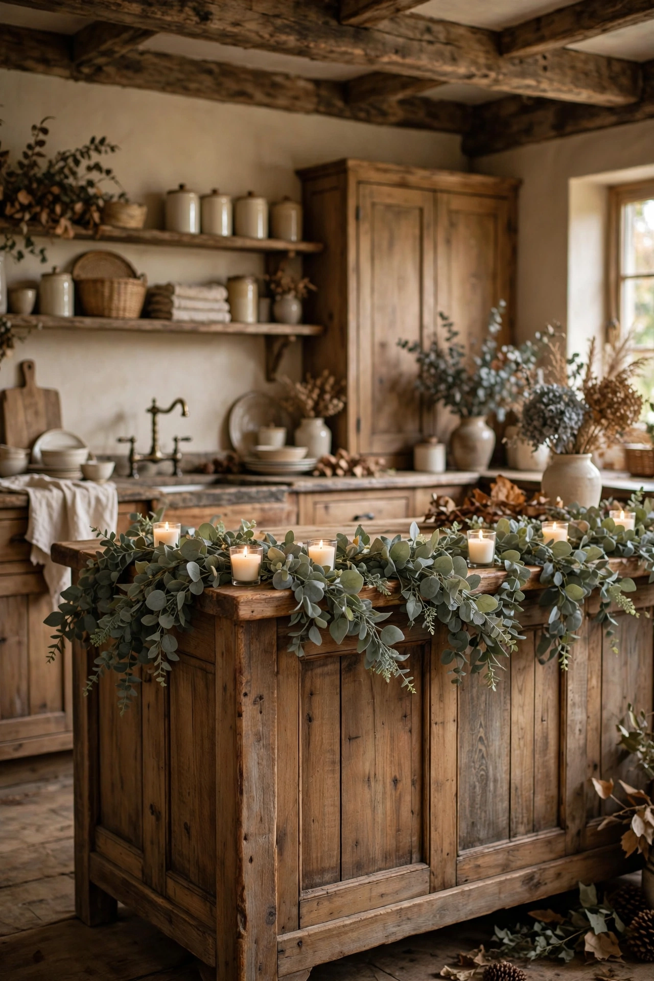
We usually style the top of the island and forget the front. Draping a garland along the front edge is the designer trick that makes the whole island feel dressed, not just decorated. It softens the hard line of the cabinetry and adds fall texture at eye level for anyone sitting at the stools.
Eucalyptus is the right garland for this. The muted green gray tone sits perfectly in our palette, the leaves are substantial enough to read from across the room, and it drapes with a natural casualness that fussy garlands cannot fake. Lay it along the front edge so it spills just slightly over, and tuck a few votives into the greenery for evening glow.
Secure it simply. A couple of small clear adhesive hooks under the counter edge hold the garland without damaging anything. Do not let it hang so low that knees catch it. It should kiss the edge of the island, not curtain it. Think of it as a necklace for your island. Present, not overwhelming.
Finish Like a Designer
The foundation is set, the glow is layered, the harvest is in. These last four ideas are the finishing touches, the small details that make guests say your kitchen looks like a designer did it. Each one takes five minutes and costs almost nothing, which is the best kind of design.
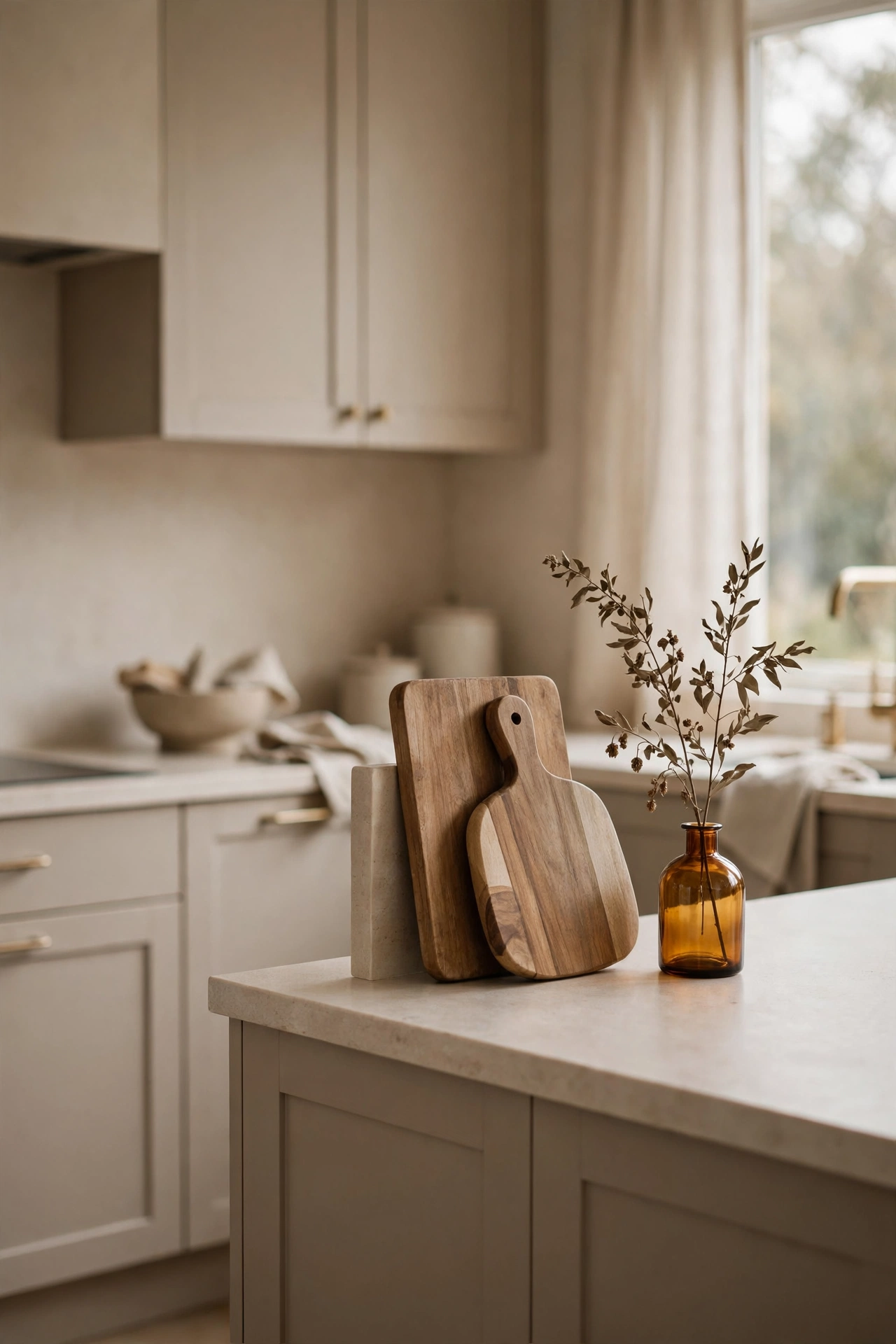
16. Prop Up Layered Cutting Boards
Walk into any designer kitchen photo and you will find cutting boards styled like art. Layer two or three wooden boards in different shapes at one end of the island, leaning casually, and suddenly a workaday object looks intentional. It is the easiest idea on this list and one of the most effective.
The layering is the whole trick. One board leaning alone looks like you forgot to put it away. Two or three overlapping, a round one in front of a rectangular one, looks styled. Vary the wood tones slightly for depth. A pale maple board in front of a dark walnut one gives you contrast without any new color in the palette.
Angle them so they lean against something solid, a wall, the side of a tray, or each other. They should look effortless, which secretly means they need to be stable. Nothing ruins the designer illusion like a cutting board clattering to the floor when someone walks past. Wedge the front board against the back one and they will hold each other up.
17. Stack Cookbooks With a Vase on Top
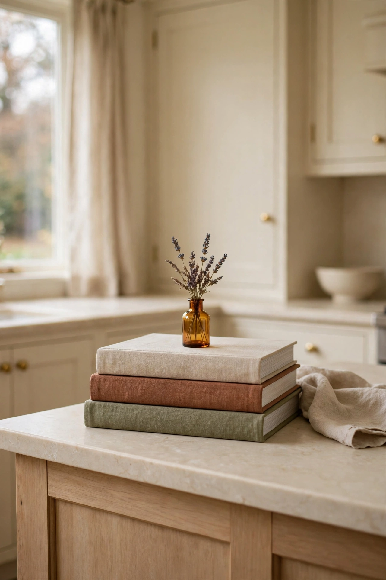
A stack of cookbooks is a pedestal, a color story, and a personality statement all at once. Choose three books with covers in our palette, oatmeal, rust, olive, and stack them largest to smallest. Top the stack with a tiny bud vase and you have a miniature still life that takes thirty seconds.
This works because books add intellectual texture. They say someone cooks here, someone reads here, this kitchen has a history. A stack of beautiful books feels personal in a way that a row of identical objects never can. And the varying heights of the spines give you that stepped silhouette designers love.
Be honest about which books you choose. The ones with the pretty spines that you actually open. There is something lovely about a flour dusted cookbook in the stack. It is proof of a kitchen that gets used, which is infinitely more charming than a kitchen that just gets photographed.
18. Style Copper at One End
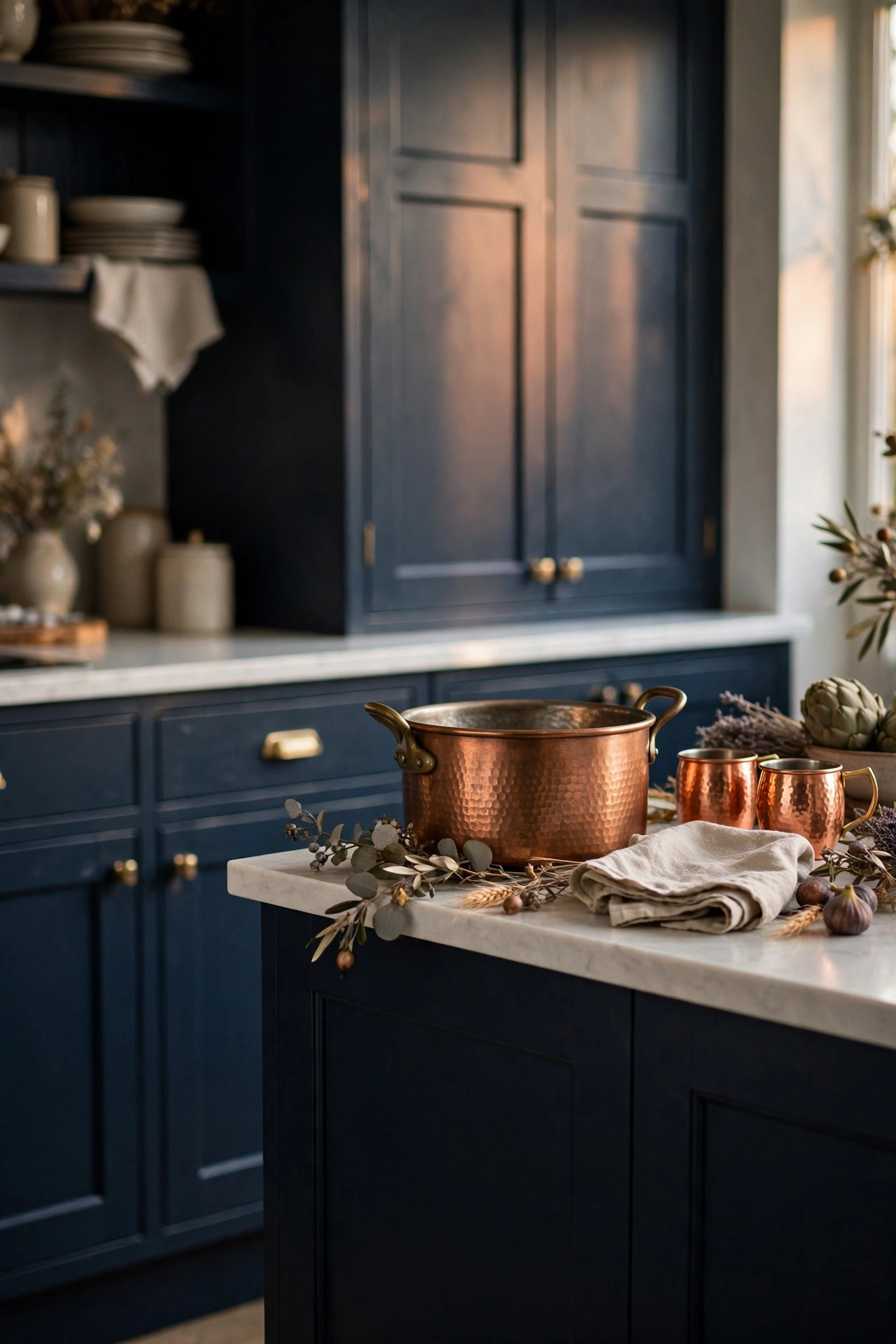
Every designer kitchen has a metal moment, and for fall that metal is copper. A hammered copper pot or a small cluster of copper mugs at one end of the island brings warmth that no other material can. Copper glows. It catches window light by day and candlelight by night and throws it back into the room.
You do not need a full copper collection. One beautiful piece is enough. A hammered pot, a pair of mugs, even a copper measuring cup set hung simply. The key is letting the metal be the star of its zone. Give it space around it and keep neighboring objects quiet so the copper can do its glowing work.
Copper loves our palette more than any other metal. It sits between the rust and the brass, warm and rosy and rich. If your kitchen leans modern, copper softens it. If your kitchen leans farmhouse, copper elevates it. It is the rare material that flatters every style, which is why designers reach for it constantly.
19. Tuck In Something Alive
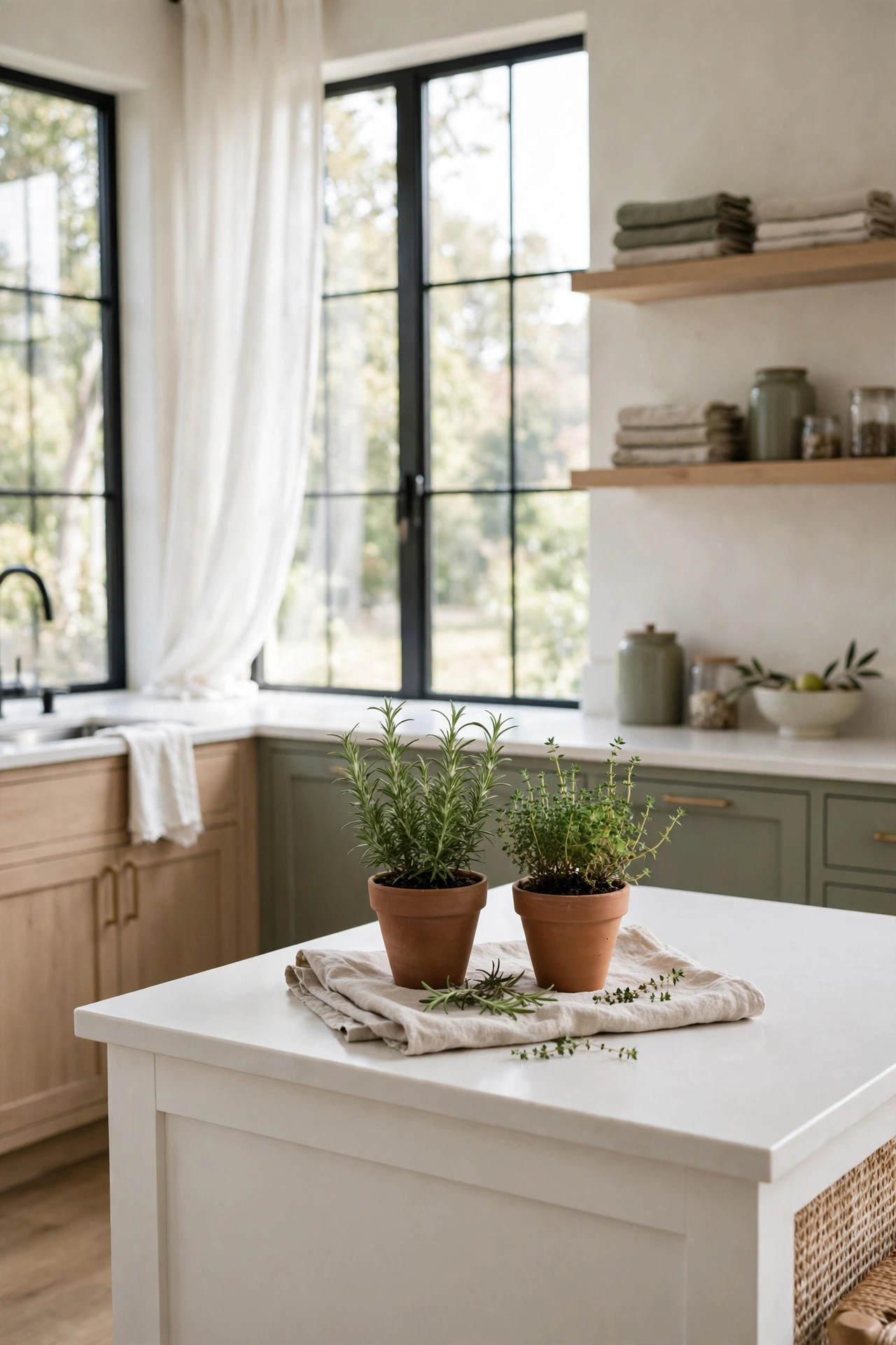
After all the dried stems and velvet and candlelight, your island needs one living thing. A small pot of rosemary, a little thyme plant, something green and breathing. It is the contrast that makes everything else look richer, the way a fresh sprig makes a whole bouquet look alive.
Herbs are the obvious choice because they earn their place twice. They look beautiful in a simple terracotta pot, and you can snip from them while you cook. Put the pot on a folded linen cloth to protect the counter and add softness. Two small pots beat one big one here. Odd numbers, remember, and small scale keeps it sweet.
This is also the idea that carries your styling past fall. When the pumpkins go back in the box and the wheat comes down, the rosemary stays. It is the perennial anchor of your island, the one living thing that makes the kitchen feel cared for in every season. Start with fall, keep the herbs forever.
More Favorites
This post contains affiliate links. If you buy through them, I may earn a small commission at no extra cost to you.
A few more favorites from the ideas above:
Style It Tonight, Enjoy It All Season
Here is the beautiful truth about everything you just read. You do not need a weekend and a shopping spree. You need twenty minutes, a runner, a tray, and the four rules. Style in thirds and leave one open. Odd numbers win. Give it a tall, a middle, and a low. Leave room to live.
Start with the foundation ideas, because everything else sits on them. Lay the runner. Set the tray. Divide the island into thirds in your mind and dress two of them. Then add glow, because candlelight is the fastest mood change in home decor. Then the harvest, a bowl of something, a bundle of something tall. Then one or two finishing touches and you are done.
Pick three to five ideas that made you exhale when you read them. Maybe it is the runner and the candle cluster and the dough bowl of velvet pumpkins. Maybe it is the drink corner and the brass tapers and the rosemary pot. There is no wrong combination because every idea lives in the same muted palette. Rust, camel, oatmeal, olive, chocolate, burgundy, brass. Mix any of them and the island looks like one thoughtful composition.
If you are carrying this cozy feeling into the rest of the kitchen, my soft contrast kitchen guide is full of ideas that pair beautifully with fall styling, and the fall front entryway ideas keep the welcome warm from the curb to the island.
Light the candles, pour the cider, and take one photo of your island before everyone gathers around it. Then put the phone down. The best styled island is the one with people leaning on it.
With love and light
Get Fresh Home Ideas Every Week
Seasonal decor ideas, organizing tips, and cozy home inspiration, straight to your inbox.
More Fall Ideas You Will Love
Keep browsing for more seasonal inspiration: